| Image |
Comment |
| 06/10/2004 12:21:45 AM |
Ho Humby BobsterLobsterComment: Very nice portrait. The blown out area really works as negative space. |
 Photographer found comment helpful. Photographer found comment helpful. |
| 06/10/2004 12:20:51 AM |
B Byronby beeteeComment: This is such a wonderfully expressive capture. Despite it's technical problems (you've cropped a person in half and cut off a section of the main subject's head) it is really enjoyable. One of my favorites of this challenge. |
| Photographer found comment helpful. |
| 06/10/2004 12:19:05 AM |
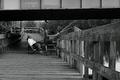
Patienceby TooCoolComment: This is the best fishing shot I've seen in this challenge. It goes beyond the poster type image and tells the story of this man. I think part of the reason for this is the shopping cart. I really like the deep depth of field. It is a much different perspective on the fishing shot then the others used. Great job. |
| Photographer found comment helpful. |
| 06/10/2004 12:17:41 AM |
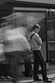
Waiting For The Number 10by browntComment: Thi sis a very amusing capture. The old man in the advertisement appears to be looking over the girl's head. I like the motion blur behind her. Great job. |
| Photographer found comment helpful. |
| 06/10/2004 12:16:48 AM |
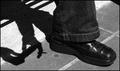
waiting and smokingby carodaniComment: I really like the way this photo works; we see the foot of the person while the shadow tells the rest of the story. Nice crisp focus with good capture of highlights and good contrast on the shadow.
One of my top picks. |
| Photographer found comment helpful. |
| 06/10/2004 12:13:53 AM |
Hurry, I got to go!by SonifoComment: This looks like such a natural shot whether it's a set-up or not. I really like the blown out area above her. I'm sure you will suffer in the voting for this but I think it adds to the mood. This was my top pick. |
| Photographer found comment helpful. |
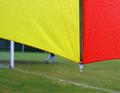
| 06/09/2004 01:09:46 AM |
Rainy sundayby TedvandenBerghComment: I don't know why a couple people saw a person in jeans as one of the soccer players...whatever. This should have done so much better. I gave it a 9; a very rare score from me. It seems like if I like a photo a lot it is doomed to place lower than it deserves. |
| Photographer found comment helpful. |
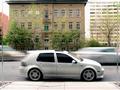
| 06/07/2004 07:09:51 PM |
Trafficby C-town driverComment: While motion blur can add visual interest to a photo I'm not finding that it's working very hard in this shot. Perhaps if all the cars didn't seem to be the same color? The whole scene appears rather mundane and grey. |
| Photographer found comment helpful. |
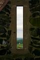
| 06/07/2004 07:06:02 PM |
Tower Windowby imolaavantComment: This is an interesting approach to framing a landscape. The foreground is very dark, however, and it doesn't appear to be in as sharp focus as the background which needs to be the case in order to illustrate deep depth of field. The foreground fills a bit too much of the frame. The subject in the background is so far off all I can tell about it is it's a white building of some sort. A frame like this can be helpful in leading the eye to a far off subject but in this case it is just overwhelming the subject. |
| Photographer found comment helpful. |
| 06/07/2004 07:03:16 PM |
Wrap Around Bayby TommyMoe21Comment: This place looks like a nice photo subject. The composition doesn't work for me; the line of the rocks just leads the eye around the rather dull trees and right out of the frame. The lighting is very ho-hum. Try returning to this scene at a time of day when the light is more dramatic. Also, pay attention to the objects in a composition that create imaginary lines and ask yourself if you have framed the scene in a way that uses these lines to the best advantage. |
| Photographer found comment helpful. |
Home -
Challenges -
Community -
League -
Photos -
Cameras -
Lenses -
Learn -
Help -
Terms of Use -
Privacy -
Top ^
DPChallenge, and website content and design, Copyright © 2001-2025 Challenging Technologies, LLC.
All digital photo copyrights belong to the photographers and may not be used without permission.
Current Server Time: 08/26/2025 08:42:13 AM EDT.