| Image |
Comment |
| 06/24/2004 02:18:13 PM |
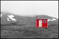
Emergency Shelterby tyrkinnComment: I like the approach and the scene. The foreground looks a bit murky and out of focus. Perhaps adjusting the contrast a bit first and than doing the desaturation technique may have brightened it a bit. As it is, the b&w appears very dull with almost no darks. |
 Photographer found comment helpful. Photographer found comment helpful. |
| 06/24/2004 02:15:48 PM |
Yellow Carsby alanfreedComment: Nice idea. The tight cropping and overhead view makes for an interesting abstract composition. I would suggest elevating the contrast first, perhaps darken some of the greys, saturating the yellow, and then move on to the selective desaturation. As it is now, the yellow really doesn't quite pop and there are just too many middle values and not enough lights and darks to really make this composition sing. Also, even though there may have been five yellow cars on the lot, it may have been more interesting if you had just selected the one with the trunk open to really make a strong statement. The yellow placement in this composition is just rather random. Nice effort. |
| Photographer found comment helpful. |
| 06/24/2004 02:08:43 PM |
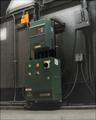
Don't touch that dialby awpollardComment: It looks like you managed the technique pretty well. Although I appreciate the pattern the boxes make, somewhat, I don't find this angled view that appealing. A straight-on composition would have flattened the shapes into a more abstract composition of squares and llines and added interest to what is essentially a very mundane subject. |
| Photographer found comment helpful. |
| 06/24/2004 02:04:53 PM |
The farm's roofby rhipsterComment: I like the composition but it is awfully small. I imagine that is because of the panoramic effect. It is hard to get a panorama with a 640 pixel maximum, I imagine. It looks like this has nice crisp detail but it is really hard to tell from the small size. Sorry. |
| Photographer found comment helpful. |
| 06/24/2004 02:03:18 PM |
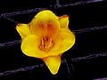
Yellow Day Lilyby Crafty SueComment: This looks weirdly over-manipulated on my monitor. There is an odd solarized or posterized effect running across the black background like it may have been a wire fence? The edges of the flower look posterized also. I'm not sure if this was the intention. It looks very weird. |
| Photographer found comment helpful. |
| 06/24/2004 02:01:21 PM |
She Wore Pink Shoesby Herblacklist12Comment: Interesting idea. The background has seams in it that kind of make me think it is a skirt or something. Next time you might want to purchase some black velvet or even just some colored paper. The lighting isn't very good. It just looks like you used the flash in your camera. The shoes have shiny hot spots and the color lacks depth. |
| Photographer found comment helpful. |
| 06/24/2004 01:58:19 PM |
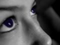
Eyes to the Skyby ClickyChickyComment: I'm sure you have probably read this by now, by her eyes are very out of focus. I don't know if it is because of the technique or not, but iher eyes have a very milky, glazed appearance which is exteremlely creepy. A closer look makes me suspect you painted the color in somewhat transparently and this is probably what gives them the unatural appearance. The photo was out of focus to begin with, so it really wasn't the best choice for an entry, particularly a tricky one like this. |
| Photographer found comment helpful. |
| 06/23/2004 05:00:00 PM |
Wedding Season Has Arrivedby PaigeComment: Hmm...this could work as a more formal set-up shot for the Lifestyle section I suppose. So, I'll give you the benefit of the doubt that you actually tried to create a journalistic shot and this isn't just a shot of some friend's wedding.
Photographically, it isn't great. If this was meant to be a candid, their faces should be visible. If it is meant to be a more formal kind of shot depicting one aspect of a traditional wedding, the glass in the foreground should have been removed. It adds nothing to the composition. The harsh midday light is hurting this shot. The whites are extremely blown out. There is virtually no detail to the icing on the cake or in the fabric of her gown. His suit is also lacking detail. What I'm suggesting is, pay attention to those middle values. They are what give a photo depth. Unless you are going for a very abstract high contrast quality (which is rather inappropriate for the subject matter) you need those middle values.
The focus looks a bit too soft to me which doesn't work well with the harsh light and extreme shadows. |
| Photographer found comment helpful. |
| 06/23/2004 04:47:23 PM |
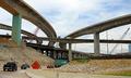
Construction delays postpon new highwayby DefyTimeComment: I think you need a proofreader next time you submit. LOL!
This is a good effort. The subject has relevence and the headline is factual and to the point (one of the few I've come across so far). Unfortunately, the photo doesn't really make that much of an impact. A traffic jam, indicating the need for the new highway would add immediacy to the story. As it is, it doesn't look like the delayed construction is causing problems for anyone. A photo for a story like this should reveal some kind of conflict or tension and I'm just not seeing it here. |
| Photographer found comment helpful. |
| 06/23/2004 04:29:52 PM |
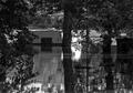
Flooding Continuesby weavercComment: Flooding continues where? How long has it been going on? Days, weeks, months? Let's remember you are trying to inform a wide public. As a journalistic effort this works okay but it lacks the human element required for a greater sense of immediacy. There is no real sense of the impact the flooding has had on the community. Without the human factor, in this peaceful setting, it has more of a formal landscape feel than a journalistic one.
Photographically, it's a compelling subject and decent composition but it lacks midrange tonal values. Some dodging of highlights in the middle to create greater contrast between the very dark trees and the water which is nearly as dark.The white structure appears quite grey.Then there is the matter of that large white reflective area behind the middle tree. That is a very distracting element that is not helping the composition. |
| Photographer found comment helpful. |
Home -
Challenges -
Community -
League -
Photos -
Cameras -
Lenses -
Learn -
Help -
Terms of Use -
Privacy -
Top ^
DPChallenge, and website content and design, Copyright © 2001-2025 Challenging Technologies, LLC.
All digital photo copyrights belong to the photographers and may not be used without permission.
Current Server Time: 08/26/2025 01:21:16 PM EDT.