| Image |
Comment |
| 06/28/2004 02:20:14 PM |
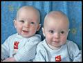
got twins?by soniecatComment: The models are cute. They are a little too close to the background. They should be placed about a foot and half away and then a separate light should be directed at the background to eliminate shadows. |
 Photographer found comment helpful. Photographer found comment helpful. |
| 06/28/2004 02:17:51 PM |
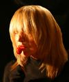
MyTootsieby neilmwilsonComment: This is disturbing rather than mysterious or sexy. The reason for this is all we can see are the white of her right eye which makes it appear hollow, blank, and spooky rather than seductive. The lighting is good. The pose is kind of unnatural--it looks like she is kissing the Tootsie pop. |
| Photographer found comment helpful. |
| 06/28/2004 02:15:04 PM |
My Little Angelby briphotoComment: Her lipstick is very overdone and unnatural looking. Also, there is an unappealing white highlight or line running the entire length of her lower lip. The subject needs to be further away from the backdrop---about a foot and a half. Then, a separate light can be directed at the backdrop to further eliminate shadows. The lighting on her face is awfully harsh. Her arms received more flattering light than her face. The subject is cute and her outfit is very appropriate. |
| Photographer found comment helpful. |
| 06/28/2004 02:42:51 AM |
Relaxing pose between two shotsby menardmamComment: Her expression looks more like smirking than relaxing. Her eyes have that half-shut, snapshot look. Because of this angle, there is more emphasis being placed on the top of her head, her shiny lower lip, and her cleavage than her face. |
| Photographer found comment helpful. |
| 06/28/2004 02:37:52 AM |
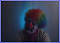
Send in the Clownsby Prime_TimeComment: The lighting is way too dark. You can barely see the subject's face. You need a spotlight somewhere near the clowns face to make a strong statement about theater, etc. The clown make-up looks amateurish (the white is very streaky looking) |
| Photographer found comment helpful. |
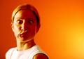
| 06/28/2004 02:35:46 AM |
Save a Horse, Ride a Cowboyby L1Comment: His face looks very made-up and shiny. Not too appealing on a woman---really bad on a guy. The lighting looks decent. |
| Photographer found comment helpful. |
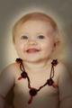
| 06/28/2004 02:34:21 AM |
Where's the Party?by photomComment: This guady necklace on the baby is really inappropriate. The big red beads look somewhat like globs of blood. The colors are a bit desaturated which only heightens the weird contrast between the baby's soft coloring and the garish beads. Really odd choice of prop.
The baby is a bit too close to the background. |
| Photographer found comment helpful. |
| 06/28/2004 02:31:51 AM |
Carmela Violaby johnmComment: I like the background and the lighting. They are terrific. I don't really like this pose from what is clearly a beautiful model. I guess this was part of the intent. Maybe something a bit more toned down but still playful? |
| Photographer found comment helpful. |
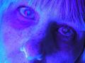
| 06/28/2004 02:30:17 AM |
The Moon Studioby WildpurpleComment: This is really just weird and unappealing. I don't mind overmanipulated portraits like this but there isn't anything to creative at work here--it just looks like you did some radical hue adjustments in selective color. |
| Photographer found comment helpful. |
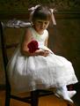
| 06/28/2004 02:26:58 AM |
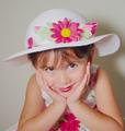
Bella Fioreby scalvertComment: Too much make-up on the girl--not very subtle. The ribbons and the rose overwhelm her a bit. The rose is almost as big as her face. Next time, I suggest less fussy hair and make-up and a softer colored, smaller flowers more appropriate to the age and innocence of the child. |
| Photographer found comment helpful. |
Home -
Challenges -
Community -
League -
Photos -
Cameras -
Lenses -
Learn -
Help -
Terms of Use -
Privacy -
Top ^
DPChallenge, and website content and design, Copyright © 2001-2025 Challenging Technologies, LLC.
All digital photo copyrights belong to the photographers and may not be used without permission.
Current Server Time: 08/26/2025 03:58:46 PM EDT.