| Image |
Comment |
| 08/23/2004 04:46:43 AM |
Defeatby moviemanComment: very hard hitting. I must say the lower portion of this image would get a 10 from me if it was the only part of the photo. Th dark tones and high contrast along with a perfect pose bode very well to me. As it is, with a bright white background it looks as if it's floating in mid air which hinders my vote.
|
 Photographer found comment helpful. Photographer found comment helpful. |
| 08/23/2004 04:45:05 AM |
Nipple in spotlightby kevrobertsonComment: Seems a bit like a point and shoot job to me - sorry.
The breast is well placed, but really should be crisp and in focus. |
| Photographer found comment helpful. |
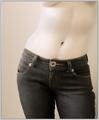
| 08/23/2004 04:44:29 AM |
Denim Dreamsby lizzyc3Comment: I imagine a lot of people will mark you down for not being nude - but i think this is good enough at suggesting nude as it is.
I think it's too soft though, and too much attention to denim rather than that very pretty waist line. - there seems to be a lot of noise under the breasts which really isn't god.
|
| Photographer found comment helpful. |
| 08/23/2004 04:38:46 AM |
Serenity by grigrigirlComment: And we have a winner :D
Probably the best model out of all of them which really helps. Doesn't matter how good your photo is, if your model isn't all that then the photo will suffer.
Her pose seems very professional, as if she knows what she is doing. Her feel are nicely arched as is her back and neck. She seems to have perfect tension running through her muscles which is something a lot of shots fail to capture - resulting in lots of loose flabby skin.
The lighting I am not 100% keen on, but comparatively it's great. I can't make my mind up if i like the highlights in the background or not.
Superb capture though all round. 9 |
| Photographer found comment helpful. |
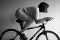
| 08/23/2004 04:34:21 AM |
Olympic Dreamsby blemtComment: Honestly, this probably has the most potential out of the lot. The composition and profile is very strong given the body shape of the subject.
Pose is spot on too and looks ready to burn some rubber. Leaving the socks on just finishes this off and kind of confirms my thoughts of an black comedy picture.
I would dearly love to see this with more contrast and more thought on the background - perhaps black or brick.
An 8 as it is. |
| Photographer found comment helpful. |
| 08/23/2004 04:30:00 AM |
A subtle patience by heidaComment: A nice shoot here overall.
I think the idea and lighting is great - her hand position equally as good. The things that let this image down is the face position and softness. To me she looks very uncomfortable bending her neck like that - it's putting a strain which shows in her face. If she was in perfect profile I feel this would be much stringer composition wise.
Apart from that, i do like it, and I like the edge burning bringing your eyes into the middle.
|
| Photographer found comment helpful. |
| 08/23/2004 04:26:50 AM |
Black Mistby NatatorComment: Great lighting here - really like the spot behind her - giving her a defined edge.
The tones and colors are ideal, and almost a grainy feel which i like a lot.
My only dislike is the way in which the fabric has been placed - I like the textures that come with it, but in the middle it's so creased up it looks like tissue paper which gives at an amature feel to an otherwise professional looking shot.
More careful positioning would aid this image. Maybe nice to have it covering her whole body as it does give off great textures and tones.
|
| Photographer found comment helpful. |
| 08/23/2004 04:23:19 AM |
Squeeky Cleanby HeavyComment: Is this your shower door? If so then it's pretty funky. If not then I can't see why you have done that.
The two parts don't seem to bond well together in my opinion. I think the shower door (the white part_ would have worked quite well on it's own as it contains a very strong pattern.
|
| Photographer found comment helpful. |
| 08/23/2004 04:21:21 AM |
Self-Censoredby annasenseComment: I really like your idea here - very much indeed!
Kind of punky, rorcky type idea which works very well. But i think the execution has let it down - the white sheet I feel should eb pure white, as it is it looks like a bed sheet which really hinders a photographan nd gives it a real amature feel.
Perhaps in black and white with some more contrast would help it. |
| Photographer found comment helpful. |
| 08/23/2004 04:18:34 AM |
mother natureby SeanachaiComment: Quite a Nice composition, kind of statue-esq if you like. I am guessing that is why you decided to make her Grey? I think this scene has a lot of potential, but that has been wasted by the selective desaturation.
The right arm behind the back looks uncomfortable. |
| Photographer found comment helpful. |
Home -
Challenges -
Community -
League -
Photos -
Cameras -
Lenses -
Learn -
Help -
Terms of Use -
Privacy -
Top ^
DPChallenge, and website content and design, Copyright © 2001-2025 Challenging Technologies, LLC.
All digital photo copyrights belong to the photographers and may not be used without permission.
Current Server Time: 06/18/2025 05:53:05 PM EDT.