| Image |
Comment |
| 01/29/2008 06:30:46 AM |
|
 Photographer found comment helpful. Photographer found comment helpful. |
| 01/29/2008 06:28:50 AM |
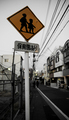
urban childhoodby kolasiComment: mmmmm, been doubting what to vote on this one. I like the fact that the pole clearly stands out, and I am in general a fan of diagonals and vanishing points, both of which are clearly present in this pic. On the other hand, there's many distractions, giving the picture a snapshottish feel. Seems to me the sign is in Korean and finding an urban area in Korea without many distractions is near impossible, but than again you might want to try to avoid the distractions a bit more. Had you for instance taken one step to the left, then the electricity pole would have disappeared behind the sign, whereas now, the power lines lead my attention right to it.
Hope it helps. 6 |
| Photographer found comment helpful. |
| 01/29/2008 06:19:02 AM |
Playing Dress-Upby myraComment: Yeah, I still do that too.
Ooops, there goes my little secret. :0 :P
Seriously, nice pic, white balance seems to be a bit too warm and there's some blown highlights, but not very disturbing. 7 |
| Photographer found comment helpful. |
| 01/29/2008 06:16:47 AM |
Needing Annby LydiaComment: I wonder how many people will vote you down because there is a child in the picture. I like the concept, but I think it would have worked better with a lower camera angle. 6 |
| Photographer found comment helpful. |
| 01/29/2008 06:15:21 AM |
|
| Photographer found comment helpful. |
| 01/29/2008 06:14:27 AM |
|
| Photographer found comment helpful. |
| 01/29/2008 06:13:56 AM |
|
| Photographer found comment helpful. |
| 01/29/2008 06:09:45 AM |
End of the dayby the99Comment: hmmmm, not too happy with the high angle and the tilted water lines |
| Photographer found comment helpful. |
| 01/29/2008 06:08:43 AM |
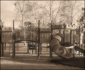
Childhood memoriesby ScapeshotsComment: I feel the quasi old look of the picture does not fit in at all with the plastic playground material. You might have tried a washed 70s kind of toning, but not sepia |
| Photographer found comment helpful. |
| 01/28/2008 05:20:29 AM |
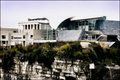
huntermuseum.jpgby TCGuruComment: I get the 'diffuse glow' feeling with this picture. Not sure if you used this filter, but it 'feels' like it. I think this pic has some appaeling features and some that are less appaeling (what else is new?). I like how the buildings stand out from their surroundings. I also like the contrast in the pitcure, though I think you've gone a bit too far on the bright side. The sky and some of the brighter parts in the picture are burnt or close to that. The arced roof is hard to distinguish from the sky.
I think this pic might benefit from a little more depth, either an element somewhat closer to the photographer or more detail in the sky (clouds, if available) |
| Photographer found comment helpful. |
Home -
Challenges -
Community -
League -
Photos -
Cameras -
Lenses -
Learn -
Help -
Terms of Use -
Privacy -
Top ^
DPChallenge, and website content and design, Copyright © 2001-2025 Challenging Technologies, LLC.
All digital photo copyrights belong to the photographers and may not be used without permission.
Current Server Time: 08/22/2025 05:49:17 PM EDT.