| Image |
Comment |
| 02/16/2008 08:28:13 AM |
|
 Photographer found comment helpful. Photographer found comment helpful. |
| 02/16/2008 03:43:16 AM |
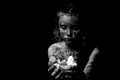
I made you a sandwich!by pwncakesauceComment: This is not an appealing picture, but somehow I get the feeling the unappealing aspect fits in very well. Feels like there is a story behind this, without exactly being clear what. 7 |
| Photographer found comment helpful. |
| 02/16/2008 03:37:28 AM |
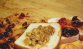
Fresh Baked Wheatby KatmystiryComment: Nice shot. I like the lighting and the composition. I think it's a bit dark overall though, causing the jam to blend in with the background. For my taste, the dof is a bit short as well. |
| Photographer found comment helpful. |
| 02/16/2008 03:33:40 AM |
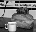
Grandmas Old Fashioned Bread Toasterby smardazComment: That's a funny gadget for sure. But is it also a good picture? I am sorry to say I think it is not. In my opinion it has several problems. First of all, the use of your onboard flash causes harsh light and hard shadows. Next time, try diffusing or bouncing the light of your flash with simple means like paper tissues. I also think the crop is too narrow on the bottom of your picture, causing the cup to be cut off. As a minor point, I would like to advise you to clean your workspace before taking a picture. |
| Photographer found comment helpful. |
| 02/13/2008 04:36:05 PM |
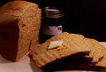
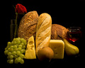
Still Life with Breadby banmornComment: This pic deserves some special attention, as it is clear that you have given it attention. Let me first congratulate on a great lighting job. The blacks are true black, but the dark parts of the pick still have detail. Also, the sharpness and texture are fine. I do have a problem with the composition though. The composition has the 'required' diagonal in it, but I think it is too formal. Looking at classic (painted) still lifes, they often look as if the stuff was just left there without any purpose. This one is clearly set up to make a picture. I would have liked it better if you cut up at least one of the breads and arranged it seemingly random (while keeping a diagona of course).
The elements in the still life are also a bit awkward to me. I can imagine a wine still life, featuring bread, cheese and grapes. But for that setting, a couple of slices would have been sufficient. Three full breads look like breakfast to me, but that makes the wine obsolete. I see no use for a rose, a pear and an apple in any of these settings, they would be great in a fruit still life or a cornucopia. Do you get where I am going? The elements should belong together and be well balanced.
Just two minor points to finish with: I see a wire (?) running to your right hand cheese and part of the grapes are covered by black cloth. |
| Photographer found comment helpful. |
| 02/13/2008 04:17:43 PM |
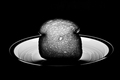
Silhouette of Yeastby jelloeaterComment: Nice, I like it. The lighting and minimalist approach work well for me. I also appreciate the near abstract nature of the pic. I just wonder about the crop. You have now cropped this pic to an image with very non-photographic dimensions (which suggests you haven't thought enough about composition before shooting). I would have liked it even better if you just had a standard 3:2 portrait, with a lot of empty space on the left hand side. 7 |
| Photographer found comment helpful. |
| 02/13/2008 03:16:39 PM |
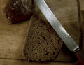
bread on a plateby codysComment: Good thinking, bw works well here. I would have liked it even better if the upper crust of the bread would have a slight 'hairight' to make it come loose from the background. |
| Photographer found comment helpful. |
| 02/13/2008 03:14:31 PM |
Room For Moreby taljComment: I am a sucker for minimalism and just love empty space. But this one does not work for me, because your subject is too far to the edges of the pic. This would have worked so much better if you left some room around the subject instead of just to the right of it. Execution is fine though. |
| Photographer found comment helpful. |
| 02/13/2008 03:12:01 PM |
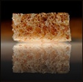
Freshly slicedby IreneMComment: Nice pic. Love the sharpness and the texture. Reflection fits in nicely as well. 8 |
| Photographer found comment helpful. |
| 02/13/2008 02:58:02 PM |
Simple Stuffby raishComment: I like the overall composition and the textures on this one. I think a slightly wider view would have worked better. |
| Photographer found comment helpful. |
Home -
Challenges -
Community -
League -
Photos -
Cameras -
Lenses -
Learn -
Help -
Terms of Use -
Privacy -
Top ^
DPChallenge, and website content and design, Copyright © 2001-2025 Challenging Technologies, LLC.
All digital photo copyrights belong to the photographers and may not be used without permission.
Current Server Time: 08/22/2025 03:37:46 PM EDT.