| Image |
Comment |
| 05/03/2007 09:16:32 AM |
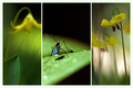
it's that time of the yearby ursulaComment: Nice selection of three complementary images. I like the blur effect on the left and in the background on the right, offset by the sharp flower and a nice macro to round it all out. 9 |
 Photographer found comment helpful. Photographer found comment helpful. |
| 05/02/2007 05:52:53 PM |
I'm not in Kansas anymoreby LanceWComment: Hey lance, nice job, great sky as others have commented, and I love the light on the snow capped range in the distance. Looks like you had a great time on your trip out west. |
| Photographer found comment helpful. |
| 05/02/2007 09:44:56 AM |
Love - Desire - Harmonyby MichaelCComment: nice, but three pics are too similar and don't illustrate the three concepts in your title. too much shadow on the faces for me as well. |
| Photographer found comment helpful. |
| 05/02/2007 09:43:53 AM |
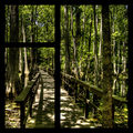
The Aquatic Forestby Elvis_LComment: nice pic, but not sure the triptych works here. Only the lower left "shot" would work on its own. |
| Photographer found comment helpful. |
| 05/02/2007 09:42:11 AM |
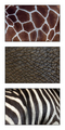
Skinby RissaComment: Absolutely wonderful. Three different images that each stand on their own but go together wonderfully to make a great triptych. This one gets a 10 from me on the first look -- something I rarely do. |
| Photographer found comment helpful. |
| 05/02/2007 09:37:57 AM |
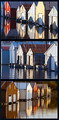
Boat House Reflectionsby alexjackComment: Nice pictures, but too similar for a triptych. One of these shots, a tight shot on one boat house, and maybe a third smaller detail shot would have been better for me. |
| Photographer found comment helpful. |
| 05/02/2007 09:35:21 AM |
The Basicsby smardazComment: Nice and simple. Shouldn't the spoon be on the right? ;>P |
| Photographer found comment helpful. |
| 05/02/2007 09:32:36 AM |
Walking in Romeby Rino63Comment: Nice layout and I really like the two shots on the left, but the one on the right is hard to look at -- overall focus is soft and eye can't tell whether to focus on the statue or the buldings in the background. I would have used a softer background color as well. |
| Photographer found comment helpful. |
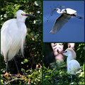
| 05/02/2007 09:26:57 AM |
Genera Egrettaby idnicComment: The upper right picture is great -- nice composition and exposure. The other two are too similar. Would have liked to have seen one swapped out for a nice tight shot on the bird's head. |
| Photographer found comment helpful. |
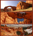
| 05/02/2007 09:25:18 AM |
Natural Bridgesby Nikolai1024Comment: Each of these pictures is wonderful on its own, but together there is just too much competition for the viewer's attention. I would have picked one as the main subject, and then used two detail shots to help explore it more, and made those detail shots smaller than the main subject. |
| Photographer found comment helpful. |
Home -
Challenges -
Community -
League -
Photos -
Cameras -
Lenses -
Learn -
Help -
Terms of Use -
Privacy -
Top ^
DPChallenge, and website content and design, Copyright © 2001-2025 Challenging Technologies, LLC.
All digital photo copyrights belong to the photographers and may not be used without permission.
Current Server Time: 08/07/2025 05:07:16 PM EDT.