| Author | Thread |
|
|
05/07/2007 07:00:09 AM |
Hello from the Critique Club,
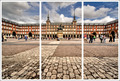
I didn't vote in this challenge so this is the first look I've had at your image. My first impression is that all three pictures look very nice but the combination of the three doesn't quite look balanced. Reading through the comments you received, many of the voters agreed. This was a good solid entry into this challenge and your score reflects it. I've always like waterfront images and all three of these are nicely captured.
To me, the most logical focal point in the collection is the red boathouse. You captured this boathouse in two of the three images but need to include it in the middle image. If you can go back and re-shoot, I would suggest a straight on shot with the red boathouse in the center to act as a transition between the two perspectives shown in the top and bottom images.
Feel free to PM me if you have any questions regarding this critique.
Tim
|
|
 Photographer found comment helpful. Photographer found comment helpful. |
Comments Made During the Challenge  |
|
|
05/02/2007 09:37:57 AM |
|
Nice pictures, but too similar for a triptych. One of these shots, a tight shot on one boat house, and maybe a third smaller detail shot would have been better for me. |
|
| Photographer found comment helpful. |
|
|
05/02/2007 05:52:38 AM |
|
I find them all a little too similar. |
|
| Photographer found comment helpful. |
|
|
05/01/2007 08:24:41 PM |
|
Great set - But the colours seem a little washed out. |
|
| Photographer found comment helpful. |
|
|
05/01/2007 01:56:20 PM |
|
For me, this would've flowed better if the middle and top sections were seperated. The direction of the boat houses is the same, but then different on the bottom. Kind of lacks balance, imo. But great colors and reflections on the water. |
|
| Photographer found comment helpful. |
|
|
05/01/2007 01:20:53 PM |
|
I really like that the boat houses are the same for the top and the bottom picture, except at a diffrent angle. |
|
| Photographer found comment helpful. |
|
|
04/30/2007 09:26:07 PM |
|
A super charmer of lovely images. |
|
| Photographer found comment helpful. |
|
|
04/30/2007 08:31:54 PM |
|
I am thinking if you had placed the 3rd photo in the middle it would be a more balanced presentation. Right now it doesn't really flow. I also don't like the blue border around each photo. The photos themselves are nice, I like the bold colours. |
|
| Photographer found comment helpful. |
|
|
04/30/2007 12:51:45 AM |
|
I like this although the last one doesnt really tie in with the other 2 because of the warmt ones |
|
| Photographer found comment helpful. |
Home -
Challenges -
Community -
League -
Photos -
Cameras -
Lenses -
Learn -
Help -
Terms of Use -
Privacy -
Top ^
DPChallenge, and website content and design, Copyright © 2001-2026 Challenging Technologies, LLC.
All digital photo copyrights belong to the photographers and may not be used without permission.
Current Server Time: 06/29/2026 09:01:20 AM EDT.