| Image |
Comment |
| 03/09/2008 11:36:33 PM |
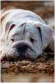
my bulldog puppyby jamesfraterComment: Greetings from the Critique Club:
Very creative photo. Expression is good, exposure is good.
Composition: this is where you could have scored better. As your commentors have mentioned, the foreground detracts from the image. I would remove all of the out of focus foreground and leave enough of the rug to frame his face.
The image as a whole needs some sharpening. I would start with the face and allow the focus to go towards his face by making it sharper in contrast to the out of focus background. This will allow his face to pop a bit more and stand out.
Might even desat the brown in the background a bit so it does not detract from that face. Use of levels and brite/contrast on face only would help as well
Great submission, Keep up the good work.
alexzen |
 Photographer found comment helpful. Photographer found comment helpful. |
| 03/08/2008 12:59:28 AM |
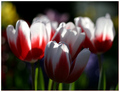
Dreaming of Springby jpochardComment: Great potential in this photo. But the first two things I notice is that shallow DOF works against it because there is no real clear focus of attention where the sharp focus would normally be. The three flowers in th background are very good and somewhat abstract. But in order to pull that off I think you might need to get that foreground flower out of the shadows and into sharper focus. If you selected out that front flow and used levels, maybe curves, sharpening and color brightening, I think this photo would have scored better.
Ttere is no real main focus and to the degree to which the front flower is the focus that flower really needs to highlighted.
Very creative.
zlexzen
|
| Photographer found comment helpful. |
| 03/07/2008 11:19:42 PM |
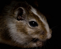
Agouti Gerbilby kashiComment: From the Critique Club:
Great photo. Beautiful tones and colors. Nicely in focus. And a surprise to see such a small creature so up close.
Darkness. My very first impression was that it was too dark. I think boosting the levels - selectively if necessary to preserve the black background - would have helped your score quite a bit. There is allot of beautiful tone and texture in the brown fur and whiskers and boosting the levels would allow these to 'pop'.
Composition. That big black eyeball is great. But it is almost centered. A different crop that put that eye on the thirds line would make this stronger. Probably cropping from the top and cropping from the left so you preserve those great whiskers. If you could get those whiskers to really jump out, you would have a very strong photo.
alexzen
|
| Photographer found comment helpful. |
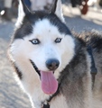
| 03/07/2008 11:08:55 PM |
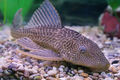
Dyson lurkingby SoulMan1978Comment: From the Critique Club:
Nice job and good subject.
Composition. The composition is good as the lines move diagonally across the frame. Eyes are on the thirds line.
Pretty good job of avoiding the glare from the tank. The shallow depth of field means that much of the photo is not in focus, but that does put the attention on the face. This scored a 5.5. A few things in post processing might have helped the score: Perhaps desaturate the intense green in the upper left hand corner since it detracts a bit. Some saturation of the purples could help. And some selective sharpening of the foreground - in particular the eyes. Probably sharpening is the most critical.
Great job.
alexzen |
| Photographer found comment helpful. |
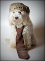
| 03/07/2008 10:40:45 PM |
After workby puzzledComment: From the Critique Club:
Absolutely wonderful. This is a very successful photo. This really stands out amongst all of the other dog images in this challenge.
Composition: I like the composition alot. The movement of the tie flowing to the foreground gives this photo a lot more depth and saves it from being just another portrait.
Lighting: Perfect. You did a very nice job with balancing the lighting and creating nice soft shadows that really support and enhance this photo. I think the background is as strong as the subject.
Thank you for the subtle border. Just enough. Only thing that I think detracts is the fact that her eyes are not as visible as I would want them to be. But that is the hair cut.
Great job.
alexzen |
| Photographer found comment helpful. |
| 03/07/2008 10:15:05 PM |
Bright Eyesby ZwieselDaveComment: From the Critique Club:
For your first entry I think you did pretty good. The quality of this image is above a 4.85.
You did a number of things right. The eyes are sharp and are almost on the thirds line which is good. You caught a good expression. And the background is very nicely out of focus.
I think the one thing that would really improve this photo is the cropping. The almost square crop takes away. The out of focus part of his back on the right does not add much so you could crop it out and make a more rectangular image.
The overall image needs to be sharpened. In post processing it could probably also use some contrast and levels adjustments and some work on the eyes to make them 'pop'. Congratulations on your new camera. Keep up the good work.
alexzen |
| Photographer found comment helpful. |
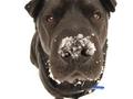
| 03/07/2008 10:06:37 PM |
Snowy Dog Daysby AllanaComment: From the Critique Club:
Very creative photo. I am trying to figure out where his body is. Good color, great idea, good use of wide angle distortion.
Composition: I think the tight crop at the top detracts from the photo. Showing his full face would have helped alot.
Focus: The eyes are in focus which is very important. But the nose is not in focus and that takes away.
Background. The white background makes for an interesting composition, but I think the image needs some more breathing room all the way around. A very simple (brown?) border would have helped frame the background and complete the photo.
But still, a very creative photo.
alexzen |
| Photographer found comment helpful. |
| 03/07/2008 09:58:27 PM |
Relaxing In The Snowby EssAreDubyaComment: From the Critique Club:
Wonderful photo. I imagine it would have scored higher if it had not been amongst dozens of other dog photos. Hard to stand out in this challenge.
Composition: Excellent. The very first place my eyes went were to your dog's eyes and I was able to take in the entire image and emotion of the photo immediately.
Processing: I appreciate that you did not over sharpen. His/her face is very nicely sharpened while the rest of the body fades into softer focus. Nothing is competing for attention. Color and levels are very good.
Distractions: I would have to say that the harshness of the background (or lack thereof) detracts a bit. Ideally you could have a had a softer background to work with.
This is a good portrait of your dog. However, I think that in order to score up in the mid-6's or higher you would really have to move to a more creative pose; something other than a centered pose. But I think you accomplished what you set out to do. Congratulations.
alexzen |
| Photographer found comment helpful. |
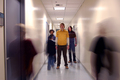
| 03/02/2008 11:09:22 AM |
Y O U T Hby FellSevenLeavesComment: From the Critique Club:
Great shot. In regards to subject matter, I do agree that the concept is implied rather than depicted. Once has to understand youth being misunderstood in order to get the message. The photo does not clearly convey that outside the context of this challenge.
But let's examine this strictly photographically.
Excellent use of perspective and time exposure. There is balance with the moving bodies on either side of the foreground. There is balance with the three boys in the mid-ground. The only thing I notice is that I think it would be better without the moving body on the left center - that takes away from the main subjects a bit. That is the one thing I would change.
You seem to have done a good job with exposure. Your main subjects are correctly exposed and in focus and you have controlled the lights in the ceiling from being blown out. The horizon is straight - as matched to the ceiling tiles.
I think as a photo this could have scored higher, but I imagine the vagueness of its connection to the challenge topic may have hurt the score a bit. |
| Photographer found comment helpful. |
| 03/02/2008 10:58:38 AM |
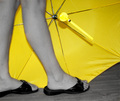
Rainy day Summer dayby nlghttrainComment: From the Critique Club.
Le me start by saying you have a great idea and have used selective desaturation in a great way. This did not score too high so let's explore things that could have made this better.
Composition. My eye is drawn to the center of the umbrella, yet that center is in an awkward place. Putting that umbrella on the thirds line would have strengthened this image. My eye wants it to be over on the right thirds line above half way down. The very bright butt end of the handle and the strap are the brightest part of the image, but it took me awhile to figure out what they were.
I think the biggest detractor is the fact that the legs are not in focus. That is the very first thing I notice about the photo. A smaller aperture is needed to give you more DOF. I also think having more distance between the legs and the umbrella would give the photo more depth. It appears a bit two dimensional.
Your title does not clearly propose a misunderstanding. I did not get it at first.
However, having said all that, I think you picked a great subject, you made good use of selective desaturation and with a bit more attention to focus and composition you could have a had a score in the mid to upper 5's.
|
| Photographer found comment helpful. |
Home -
Challenges -
Community -
League -
Photos -
Cameras -
Lenses -
Learn -
Help -
Terms of Use -
Privacy -
Top ^
DPChallenge, and website content and design, Copyright © 2001-2025 Challenging Technologies, LLC.
All digital photo copyrights belong to the photographers and may not be used without permission.
Current Server Time: 08/25/2025 09:07:07 AM EDT.