|
|
| Image |
Comment |
| 12/06/2007 05:21:37 PM | Santa's Helper (The North Pole)by psartComment: Greetings from the Critique Club :)
Certainly a cute picture. First impressions are technical. There is a lot of noise in this photo, particularly in the shadows. Perhaps you could have used a tripod, brought down the ISO, and used a wider aperture. You might find that your camera does not do well with higher ISOs, particulary in low light situations. Arifical light or a tripod could help you stay at ISO 100.
Focus:
The christmas tree is almost out of focus, but it could be better it if were more out of focus. F4 may have allowed you to get better bokeh, with less grain, and bring the focus back to the main subject.
Composition
My eye finds the red hat to be the main subject, but I think you wanted the dog's face to be the main subject. In this case, you could desaaturate the red (which is dominating the image) and do some post processing (dodge and burn, curves, levels) to bring the dog's face more to the forefront.
Noise
I think the noise is the biggest factor disracting from this photo. Knowing our camera's limits is important.
I hope this is helpful.
Please feel free to contact me via the PM system
Ken
alexzen
|  Photographer found comment helpful. Photographer found comment helpful. |
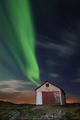
| 12/06/2007 04:57:32 PM | Living in an Old Shack on an Arctic Island Shooting Aurora by orvaratliComment: Greetings from the Critique Club :)
I am honored to be able to critique this photo.
Composition
This is a wonderfully composed with the barn anchoring the image and the way it appears that the Aurora is shooting out of the roof almost as if it is on fire. The Aurora is not just a background for the barn; they seem entwined.
The first time I saw this photo I noticed the fact that the barn leaning left bothered me. But your horizon is straight, so that must just be how the barn is.
Tonal range is excellent and the consistent lighting across the foreground adds much to this dramatic photo. The processing of the blue sky, green Aurora and orange city lights is very well done. I can assume they were not this complimentary to each other right out of the camera.
Nit Picky:
The stars appear oversharpend. From a distance they blend in nicely. At closer distance, on a monitor, they appear to be separate from the sky, as if placed on top of the image. They are not integrated into the sky. But a minor distraction.
Congratulations on a great photo and a great score with a ribbon.
Feel free to contact me via the PM system.
Ken
alexzen
| | Photographer found comment helpful. |
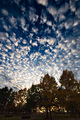
| 12/06/2007 04:40:22 PM | Walking in the Woodsby levyj413Comment: Greetings from the Critique Club :)
First impression is: great sky, boring foreground.
Composition:
The wide angle worked very nicely at making the sky quite dramatic. This is a unique composition by using it in portrait mode. I would be curious what the sky looked like horizontally. But in portrait mode the sky seems to be exploding upward. Wonderful.
Color:
Great color in the sky, good tonal range in both the sky and clouds. Focus in the sky seems good.
So why didn't it score better? Appears that the foreground really detracted from this image. The foreground does not add much other than a context. The trees are not particularly focused and they lack color. And since they are pointing into the center of the wide angle they in a way are fighting the exploding nature of the sky, almost trying to constrain the sky. It does create some interesting tension.
The objects at the botton of the image, by the road, do not add anything but clutter to the image and make it seem more like a snapshot. It is like the top 2/3rds of the image is a 6.3+ photo but as your eye moves down to the bottom it is anchored by a 5+ photo. Not sure how you can crop it to improve.
Execution and combining images is great. It is really only the composition and foreground that hurts this image.
Please feel free to contact me via the PM system.
Ken
alexzen
| | Photographer found comment helpful. |
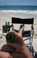
| 12/06/2007 04:27:24 PM | Wish you were hereby Delta_6Comment: Greetings from the Critique Club :)
I like this photo. Let me first make note of the things I think you did well:
Composition
The main subject seems well placed on the thirds line as does the horizon. Thank you for straightening the horizon. Your photo leads me from the mouth of the bottle, down the model's leg and to the beach and ocean. I feel like I AM the person in the photo. The diagonal line of the body works well across the image.
Focus
Good DOF. F22 kept the foreground and the background nicely in focus. You did well with this.
Tone
The skin tone is acceptable. The blue of the ocean and sky seem accurate.
So why didn't this score higher? It is lacking some 'pop'.
I would start with the lighting. It is very flat. Not much you can do mid-day at the beach. The obvious thing would be to wait until sunset and grab the drama created by a low, warm sun. Your colors would change and the shadows would add depth and emotion.
The sand is very flat, again because of the lighting and it detracts from the image. Regarding composition, I think the 6 pack detracts. The main subjects are the bottle, and the body leading me to the water and sky. The six pack, while adding to the story line, adds a distracting additional theme. Removing it could simplify the image and make it stronger.
It appears to me that the bottle opening is the primary subject, but it is in a shadow and the hand actually dominates that part of the image. Making the bottle neck and mouth 'pop' could help as well as allowing them to anchor the picture. Dodge and burn, curves?
Shooting at sunset would have made this an entirely differnt image, not for the sunset itself, but for the depth that the shadows would add.
Good shot for this challenge. I think you made more effort to meet the challenge than many entrants.
Please feel free to contact me via the PM system.
Ken
alexzen
| | Photographer found comment helpful. |
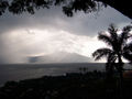
| 12/05/2007 10:04:59 PM | In The Raging Tempestby RosacalacaComment: Greetings from the Critique Club
I love the luminance in the photo. There is some real potential in this photo. Given that this was an advanced editing challenge you could have made this image pop.
First, the horizon is crooked. Second, the image is begging for some post processing using levels and curves. It appears to me that the main subject is the light streaming/streaking through the clouds, but that there is not enough contrast to make that light really work as well as it could. You could really make those streaks stand out. That is where the drama is in this photo. Contrast, some dodge and burn, etc.
The trees make a great frame for the scene, but perhaps you could use less of them. A tighter crop would focus the eye more on the drama of the storm. There seems to be a secondary theme happening in the foreground, but there is no shadow detail to support it. I think you could remove much of the lower foreground and get a stronger image.
Good image for straight from the camera, but in an advanced editing challenge voters are expecting a cleaned up, straightened image with some drama.
If you have any questions feel free to PM me.
Ken
alexzen
| | Photographer found comment helpful. |
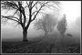
| 12/05/2007 02:01:18 PM | Where the Path Meets the Fogby arron_christensenComment: Greetings from the Critique Club
I am honored to be able to critique this image.
Composition
First impression is that this is a very successful photo. It conveys a simple message immediately. I won't comment on the appropriateness to the challenge since it was effectively a free-study. Excellent position of both the foreground tree on the thirds line and the row of trees fading into the fog on another thirds line. The leading lines pull my eye through the image very gently and very sucessfully. The darker foreground tree anchors the image very well allowing the eye to dance through the row of trees into nowhere.
Tone
Great tonal range. The contrast and tone of the foreground tree works very well in relation to the fog bound row of trees and background. Good work with levels and curves in not blowing out the fog and background and also preserving the detail in the shadows.
Focus
I might like the foreground tree to be a bit sharper and to show more detail. I imagine the full resolution image does much better in this area. 640x does not help in this area.
If I were to...
If I were editing this, I would experiment with cropping or removing the tree on the far right. It does detract a little bit from the leading lines. By removing it you leave only two main sets of objects that play off each other. This tree on the far right competes a little bit for my attention, detracting from the main interplay between foreground and background. It is a third player.
Last comment on this excellent image is that I am not sure that the relatively strong borders help the image. I am a fan of very thin, subtle borders. I think the strong black and white borders compete too much with the image and possibly a gray border may allow the image to speak on its own. There are no strong blacks or whites in the photo so the border may be a bit too strong.
Great photo. You just missed top 10.
If you have any questions please feel free to contact me via the PM system.
Ken
alexzen | | Photographer found comment helpful. |
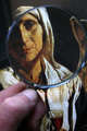
| 12/03/2007 06:18:55 PM | To study the light of the old mastersby Rino63Comment: Welcome from the Critique Club
Composition
The first thing I notice is that most of this photo is another piece of art. I think that must have effected the scoring. I like the position of the magnifying glass in relationship to the man's eye. The line between the eye and the middle of the glass draws me through the image. And the partial inclusion of the woman's face is nice as well.
The hand seems to detract from an otherwise interesting photo. The white balance for the skintone appears off as well. It seems that keeping the hand out of the photo might have helped it considerably.
I did not realize it was a magnifying glass at first. I think because the glass goes almost border to border, it does not makes itself clear. I think I would have positioned it so it was smaller relative to the overall image so it popped out more.
Focus
It is not clear that the magnifying glass has any dramatic impact on the viewer's view of the painting, so perhaps using a more dramatic shallow depth of field would have achieved that effect better, by allowing the background to blur and the image within the circle to be sharply in focus. F10 is going to keep alot in focus including background. I really want the glass to change my view of the painting, but the focus and magnification within the glass area is not much different than that of the background. Also, the actual frame of the glass is not in focus either. With basic editing you have to rely on the right DOF to achieve these effects and perhaps more attention in that area would have helped this image communicate stronger.
Summary
Basically this is an interesting interpretation of the challenge. If I could change just one thing, it would be to get that hand out of the image. If I could change a second thing it would be to change the focus and DOF to add drama and pop.
If you have any questions please feel free to contact me via the PM system.
Ken
| | Photographer found comment helpful. |
| 11/13/2007 08:19:53 PM | | | Photographer found comment helpful. |
| 11/13/2007 08:18:27 PM | | | Photographer found comment helpful. |
| 11/13/2007 08:17:51 PM | Mr. Bonsai my Room Mate :)by KrisbyComment: Very nice. The white border is a bit heavy for the subtle image, but I like the composition and lighting. The composition gives this great tension with the negative space. Well done. | | Photographer found comment helpful. |
Home -
Challenges -
Community -
League -
Photos -
Cameras -
Lenses -
Learn -
Prints! -
Help -
Terms of Use -
Privacy -
Top ^
DPChallenge, and website content and design, Copyright © 2001-2024 Challenging Technologies, LLC.
All digital photo copyrights belong to the photographers and may not be used without permission.
Current Server Time: 04/23/2024 08:00:32 PM EDT.
|