|
|
|
Showing 901 - 910 of ~2866 |
| Image |
Comment |
| 12/15/2005 06:02:13 PM | Green Magicby hannekeComment: from the secure ward of the Critique Club
Well, 23rd ain't so bad, huh? And a decent score with an image that has, i think, a couple of obvious flaws in terms of mass appeal. Those are:
1. Lack of visible detail in the spoon itself - that extreme edge view makes the image more 'about' (in terms of what grabs the interest of the viewer) the smoke than 'about' the spoon.
2. The composition of the flow of the smoke. It doesn't go far enough past the spoon, so you get a conflict of visual clues - the eye wants the spoon to be more at a strong point within that trail of smoke, and what you have shown is too far to the top of that trail. And the straight line going up from the spoon is odd: it doesn't fit with the organic curls of the rest of the smoke, nhor with the curves of the spoon - and in an advanced editing challenge you could easily have cropped out that line.
The smoke itself is also not quite strong enough - either more light or higher ISO or pushing in post-processing required - but in the end I think basically a faster shutter speed by whatever means to get it more still and sharp. Take a look at some of Kiwiness' smoke shots to see what gives real impact.
It's not a form of photography that holds any appeal for me, so I'm not going to get into an artistic discussion of it - but I think you did pretty well, with those reservations. |  Photographer found comment helpful. Photographer found comment helpful. |
| 12/13/2005 07:04:55 PM | Here Be Giantsby cpanaiotiComment: from the lee shore of the Critique Club
I think I'd prefer to take the approach that your depth of field here might be a deliberate thing, rather than making what seems to me to be a presumption that it must be a mistake. Similarly with the comment that the spoon 'seems to have a stain on it' - well? Let us presume you've committed to 'print' (in the sense at least of permanence) just what you meant to.
There are certain obvious choices that have been made - including this tendentious DOF. The quality of light, the colour (fact) and tonality of the image also, along with certain compositional elements. The depth of field forces the attention to particular areas of frame - the curve where the cup meets saucer, the edge of the suacer, the concavity of the spoon. The loom of the handle, being out of focus, parallels the distant edge of the table(?) in the background, giving a sense of a third dimension to this small world. And yet, what at first sight might be the primary force of interest here - the glow of ethereal light through the spoon's handle, is equally relegated by its out-of-focus quality. The interest here is evidently not one shared by the photographer.
In fact, all the force of composition in this shot tends to the head of that spoon - as, of course, it should in this challenge. It is placed at the apex of the curves of the saucer, and the obvious head of the leading lines of its own handle. And there is a depth to the reflections there - where all else in image is either flat white background or only partially seen reflections in the porcelain, here we know we have 'true' reflections of the environment - and yet they are as indistinguishable as anything. Even in the metal barrel of the spoon we see only a false distortion of a world we know is there - so warped as to be practically unrecognisable. So what is it that makes this certainty of a 'real' world - the antithesis of the block soft-light of the studio, the pointlessness of those controlled reflections, the paralysing sterility of the blank metal world?
There is of course the suspicion of windows in the reflections on the cup's handle, but I think it is more the ordinariness of the light - this presentation os no high-powered lighting genius at work: this is ordinary light, everyday light, the light of the world. This is quite naturally complemented by the equally everyday composition - even, perhaps, verging on the clumsy in the oh-so-sophisticated eyes of the composition faddists.
In taking the ordinary so far, in privileging the humdrum by this exhibition, this might be taken to be a subtle but quite stern point against the vacantly pretty, absolutely controlled world we are so often presented with.
Ed Message edited by author 2006-02-05 18:05:58. | | Photographer found comment helpful. |
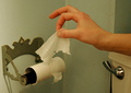
| 12/13/2005 03:25:16 PM | Potty Humorby ThomLeeComment: Lots of funny shots in this challenge. For impact, i think you could happily have cropped to remove the cistern and the handle - they're not needed for the joke (the paper roll is enough), and then you'd have the dynamic moment of the shot - the finger graping at the paper - in a much stronger point of frame. I'm no fan of set-up stuff, but with clean composition, and oerhaps a touch stronger contrast, this might also be a rather fine image. | | Photographer found comment helpful. |
| 12/13/2005 03:22:30 PM | Oops! Just Missedby amsterComment: :-) As a gag, this is just about perfectly done, I think. The blank deep blue canvas of your background is essential - a more 'interesting' cloudy sky would wipe out the point absolutely. The partially focussed remains of the plane likewise - perfect stop motion would work against the idea of photographic incompetence that makes this work. The square composition allows the point where the plane exits to be still quite strong - though i wonder if placing it mid-frame in a landscape frame mightn't be just as effective. Also I think you might have been even 'braver' - and included simply the final part of the tailplane - the absolute minimum to impart your meaning. Often, in this kind of stuff, less is more. Nice work - can't see it scoring too high, but then what do I know? | | Photographer found comment helpful. |
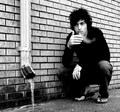
| 12/13/2005 03:11:50 PM | Too late in the year to be wearing sandalsby stare_at_the_sunComment: Lots to like here, though I also have a few reservations. It feels forced into the challenge - it would, in the rush of voting, be easy for many to miss the sandals without your title, but images that rely on titles always seem to make for weak entries. Photographically, however, as a portrait I like this - and I'm no particular fan of portraits per se. There's an unpretentious moodiness you've captured - fortunately without resorting to the ridiculous 'grunge' thing that is infecting dpc. It's impossible to know, but if those a red bricks, I wonder if a different channel mix conversion might have allowed you to keep more detail in the shirt without blowing out the brickwork - that lack of depth is a little shame, I think. Composition if fine, and functional - my main grouch is just the lack of tone in the progression of the contrast here. Neat work though. | | Photographer found comment helpful. |
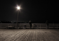
| 12/12/2005 08:20:28 PM | never a night too late for the fishermanby art-ineptComment: Whilst there's an awful lot to like about this - and like it i do, certainly, one of the best I've seen in this challenge - I can't help feeling that the framing and the crop are a touch arbitrary. Is so much gained from the inclusion of the boardwalk that you mightn't have placed the fishermen and the rail more orthodoxly within frame? You'd have saved some of teh distortion of the angle of the lamppost, and wouldn't have lost the boards completely, and i think the shot would have been more about the fishermen than this slightly strange composition which appears to be about the boards as much as the people - it almost feels wilfully an odd composition, and I think the image would be strong enough not to need that. | | Photographer found comment helpful. |
| 12/12/2005 07:30:51 PM | Too late by BrinComment: Is this a deliberate tug at the heart-strings I'm feeling? I think your composition moight have been stronger - the cross is toofar into frame for real effect. Nice techncial work, in a scene I really don't like at all, personally. | | Photographer found comment helpful. |
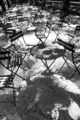
| 12/12/2005 07:05:05 PM | Too late for lunch in the Parkby samchadComment: Whilst smaller sizes in vertical images perhaps help for those on low resolutions, this realy comes across as very very small on a high-res screen. I suspect there's a kertesz-like interplay of shapes here - he had some fine images of Washington Square in the snow, and of the Tuileries playing on similar themes. | | Photographer found comment helpful. |
| 12/12/2005 06:59:10 PM | Oh no... There goes my train! :-(((by nessnajComment: The first thought is that its impossible to know whether the train is coming or going. The second is that if this isn't a set-up, which I suspect it isn't somehow, then I think you perhaps need to go into b/w territory: it at least gives an edge of reportage that makes the ordinary more interesting - and this is fairly ordinary, really; and perhaps use processing to pull out the sense of those out-stretched arms, whicha are the real point of this scene - they're what communicates your message here. Keeping the far side of the tracks properly exposed is useless if it means relegating her pose into the shadows. If it was set-up, then you needed to capture some motion in the train, at the very least, as well as putting more into the compositional elements. | | Photographer found comment helpful. |
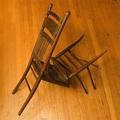
| 12/12/2005 06:53:32 PM | I meant to re-glue those rungs...by rioloboComment: Poor light - very flat, very uninteresting. there's a certain weirdness of shapes and angles here that might have been brought out so much more effectively with a more directional sot light. | | Photographer found comment helpful. |
|
Showing 901 - 910 of ~2866 |
Home -
Challenges -
Community -
League -
Photos -
Cameras -
Lenses -
Learn -
Help -
Terms of Use -
Privacy -
Top ^
DPChallenge, and website content and design, Copyright © 2001-2025 Challenging Technologies, LLC.
All digital photo copyrights belong to the photographers and may not be used without permission.
Current Server Time: 08/20/2025 07:07:13 PM EDT.
|