| Image |
Comment |
| 06/03/2006 07:52:57 AM |
Angelfireby vtruanComment: I see your point, but I don't know that I would have looked hard enough without your title: cropping the image to make that shape more obviously the centre of attention might have helped. |
 Photographer found comment helpful. Photographer found comment helpful. |
| 06/03/2006 07:51:39 AM |
Chainsby dgpilotComment: Nice tonality, but not the kind of thing that does it for me, really. |
| Photographer found comment helpful. |
| 06/03/2006 07:43:14 AM |
Enlightened Writingby diablo2097Comment: Solid work - that deep blue is usually popular here. Unsure about the composition, as there seems a great deal of dead space to image left, and i can't quite see a use for it. |
| Photographer found comment helpful. |
| 06/03/2006 07:40:20 AM |
Something To Lean Onby beamComment: I keep hoping for something to emerge from those shadows, like a stick-figure leaning on the crutch, but it isn't happening. It's a competent shot, well lit and nicely enough detailed, but I can't see it as an engaging image. |
| Photographer found comment helpful. |
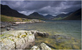
| 06/02/2006 03:28:46 PM |
Here Comes The Sunby PixelstateComment: Nice landscape, though a little more shape to the foreground rocks would have been nice - the light has become just a bit flat there; a touch more contrast might also help the feel of the title in the shot. |
| Photographer found comment helpful. |
| 06/02/2006 03:27:22 PM |
Strawberry "Fields Forever"by sherpetComment: I like the graphic lines and the contrasty quality of the light on the leaves - I'm less sure about the over-done arrangement of strawberries bottom left. I think I'd have believed they werer strawberry plants without that - and there's an incongruity about these berries collected with a bunch of not-in-fruit plants. |
| Photographer found comment helpful. |
| 06/02/2006 03:25:58 PM |
Mother Nature's Sonby k4rpComment: As a landscape I like this - the great DOF is effective, adding an element of graphic interest as well as simply the view. The contrail in the sky - the vertical one - works slightly clumsily against the effect of the rest of the lines in the shot, perhaps. Fine tonality, though a little judicious shading might have helped emphasise your subject for the DPC voters. |
| Photographer found comment helpful. |
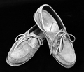
| 06/02/2006 02:52:00 PM |
There's a chance that we may fall apart before too longby LenaComment: It's difficult to say that there's anything actually wrong with this per se - but it isn't an appealing image, nevertheless. The total isolation of tha black background is very well done, but it really exposes any composition to close scrutiny, and this doesn't work for me: the two diagonals suggested by the shoes conflict quite a bit - being neither symmetrical nor off-centred, but somewhere between; the light, for me, is too flat to really show details of the textures that would speak of batteredness - I think that's simply the use of too much fill light - rather than the usual problem of direct flash - so that the shadows are wiped out rather more than would really be effective. |
| Photographer found comment helpful. |
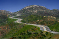
| 06/02/2006 02:46:54 PM |
The Long and Winding Roadby BradComment: Whilst it's perfectly fitting for the challenge, the main problem this image suffers from is the simple quality of light when you took it. It's clearly country accustomed to intense heat, but that very over-head sun doesn't do anything to really illuminate this landscape - it simply makes it visible. At a later time of day, the more sloping light would cast shadows on those contours that would make the shapes of the landscape more understandable in a photograph - it's a shadows that enable us to determine the shapes of things, and in this light, there are none. |
| Photographer found comment helpful. |
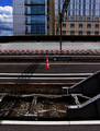
| 06/01/2006 07:06:08 PM |
Day Tripperby jjbeguinComment: Oh, I can just imagine that comments box filling up with wails of non-understanding. I wonder if, in a composition so full of the incidence of lines, a little correction to the lens distortion might not have been valid? Sure, it's slight, but it seems to my weak eye that the main force of this is in the rigid geometry of most of these structures - even in the diagonal of the wiring gantry and its shadow, which we know, actually, to be just as right-angled as the rest (another point follows) - and that slight curvature of the extremities brins a warp to the whole idea that I don't quite understand. I'm prepared to accept that the failing there is my own, mind you.
That rigid geometry is of course broken primarily by the ubiquitous and non-rigid cone, and utilising that subtle trick of making the dead centre of image the strong point - because we can go anywhere from there, and yet of course the sheer day-glo brightness of it drags the eye repeatedly back to that point: we can go industrial in the foreground, to the city-scape, or even as far as the clouds, and yet we ar made to return to the humdrum every time. What could be a better day trip than that? Infinite possibilities, and the promise of one's own bed at the end of it.
Glorious stuff. |
| Photographer found comment helpful. |
Home -
Challenges -
Community -
League -
Photos -
Cameras -
Lenses -
Learn -
Help -
Terms of Use -
Privacy -
Top ^
DPChallenge, and website content and design, Copyright © 2001-2025 Challenging Technologies, LLC.
All digital photo copyrights belong to the photographers and may not be used without permission.
Current Server Time: 08/18/2025 06:10:48 AM EDT.