|
|
|
Showing 511 - 520 of ~2866 |
| Image |
Comment |
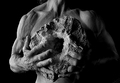
| 10/14/2006 06:32:32 AM | Rockmanby beafliesComment: This is good - your choice to emphasise the extraordinary/bizarre muscle structure of the shoulder works well, and the bluntness and strength of the fingers; hands are, one would say, even more expressive than faces: we're used to composing our expressions, both as photographers and as the photographed - but life and experience show more in the hands. The subtlety of the missing finger end, the half-lit nature of it, just adds impact. |  Photographer found comment helpful. Photographer found comment helpful. |
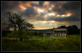
| 10/12/2006 07:17:56 PM | Out to Pastureby NeilComment: ex officio Critique Club
An almost defiantly DPC image - and, as seems the general case, that guarantees you a strong finish, without quite breaking the higher echelons. What it is about those images that the site takes to it's heart still mystifies me completely.
I could take few guesses at the reasons for this one's missing the ribbons, but they'd be just that - guesswork, and you've been here long enough not to need my guidance in that, Neil.
Nice - the word used advisedly - landscape work seems to me a combination of factors: in the main, research, fortune, and patience. Research (and, obviously, an eye) to find the location, to know how the light might strike it, to see a composition; the fortune to be able to return to it at the right time, and to be granted the right weather, and the patience to wait for those opportunities. But really good photography should surely show us more than that - to my mind, should allow us a wondow on a world we hadn't quite considered, that hadn't struck us, that, most simply, we hadn't seen before...
Now, that's not a request for outrageous originality from every single photograph. Well, actually, it is - but not in the way that this place seems to understand originality, which is best summed up as 'new tricks for new dogs'. I absolutely believe that each one of us experiences our world in a different way, that the sum of our experiences make each and every one of us fundamentally different people, and that therefore what we percieve as worthy of record varies from each to the other. Therefore, any truly committed photograph should be a work of staggering originality, as no-one else would have thought it worth the press of the shutter.
And my problem with this shot, and this presentation and processing of this shot, is precisely that - that I've seen it before. Maybe not quite so dark as this one, and maybe with a better balance of foreground tree and building, and maybe with with less plain dodge and burn work, and maybe with the house less enveloped in the horizon line, but fundametally the same thing. It seems only to be a technical exercise - not any kind of expressive endeavour - and a technical exercise carries the expectation not only of the existence of an assessment of success, but actually of the necessity of that assessment. It is as though there are boxes to be ticked, and once those have been implacably completed, then surely we must have a perfect image, no?
But what if the intent showed through - somewhere in the tiniest details of composition, of scenic assessment, in the choices made in post-processing? What if there's really a little tell-tale sign that this isn't a work of the heart, but of the head?
I don't know where this goes. I don't know that I'm right to say there must be a heartfelt committment to one's subject, that these burnt images only pander to the masses here, that I'm right in seeing landscape photography simply as crowd-pleasing (and I wouldn't knock that) - pleasing the crowd is something we all resort to.
But you asked for a critique). | | Photographer found comment helpful. |
| 10/12/2006 06:44:54 PM | Don'tby fotomann_foreverComment: Nice work here. I like the non-glamourousness of it very much, and the framing of the head with the flash reflection is a nice touch. I think, as a suggestion, a more rigorous crop might have paid dividends, though i can see your point with what you've done. | | Photographer found comment helpful. |
| 10/12/2006 06:43:16 PM | The Grandmotherby TiberiusComment: Fun shot, and beautifully processed. I'm unsure of how much of the grandmother's personality this shows though - to be picky - it perhaps rather puts her down, as though she were only defined by her relationship to her grandchild. Perhaps we need something more of her hands? | | Photographer found comment helpful. |
| 10/11/2006 06:01:16 PM | Admiring Her Treasuresby idnicComment: Is the double entendre deliberate? Your framing actually suggests so, in which case I make this a very clever shot. I would wish it had a bit more punch, but I'm a high contrast fan, so that's an ignorable comment. | | Photographer found comment helpful. |
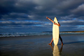
| 10/11/2006 05:58:14 PM | Dawnby John WhiteComment: Quite fun, and with a certain obsessive madness feeling that I certainly associate with surfers. There's a stange sugestion of nudity - simply because all visible body is unclothed, and we're inculcated with the idea that any concealed area of flesh must therefore be unclothed. | | Photographer found comment helpful. |
| 10/10/2006 06:52:44 PM | Suspended Lifeby ShannonLeeComment: This has a feel almost of the Polaroid camera. I like it - a proper simplicity of composition. Almost Gursky-esque. | | Photographer found comment helpful. |
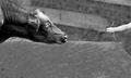
| 10/08/2006 06:42:38 PM | Synapseby posthumousComment: Originally posted by posthumous:
Originally posted by e301:
Interesting; My first reaction is that the exposure lacks some control - has the impression of being brought back too far from over-exposed, or something, and I find the visibility of the cow's shoulder unsettles the composition a bit - my eye can't help but be pulled there - a slightly tighter crop might have made that balance more comfortable. background is something of a problem, not working with your subjects very happily; but the idea, overall, I like, and it's been a lot more fun to look at than most. |
damn, that's a good comment. wow, yes, I did bring it back from overexposed. you've done a great job of listing the problems of this shot. I just didn't know how to overcome them. |
The secret is RAW. Then you get the 2 stops or so leeway with exposure. You also get to work in 12-bit with black and white, which is so much richer than the 8-bits of jpeg - like we really think there are 256 shades of grey?
But I'm really glad you put this up - and what a finish, all the way up at 516! I've only onve cracked the 400 mark myself.
e | | Photographer found comment helpful. |
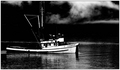
| 10/08/2006 05:29:02 PM | The Championby bryanbrazilComment: A fine documentary shot. Has a feeling reminiscent of the 1950's, or of any period of soot-infested industrial heydays, with their seemingly inherent decline. | | Photographer found comment helpful. |
| 10/08/2006 05:27:08 PM | | | Photographer found comment helpful. |
|
Showing 511 - 520 of ~2866 |
Home -
Challenges -
Community -
League -
Photos -
Cameras -
Lenses -
Learn -
Help -
Terms of Use -
Privacy -
Top ^
DPChallenge, and website content and design, Copyright © 2001-2025 Challenging Technologies, LLC.
All digital photo copyrights belong to the photographers and may not be used without permission.
Current Server Time: 08/16/2025 02:57:54 PM EDT.
|