| Image |
Comment |
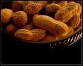
| 02/18/2004 09:17:39 AM |
AAHH..Nutsby tfarrell23Comment: Not bad. Real feeling of warmth, like firelight. Detail and lighting are all as they should be on those nuts (boy I'm glad I didn't go with my nut idea). Placement in frame seems a bit odd - maybe your picture is way brighter than what I'm seeing (though I am gamma-corrected), but the bottom of frame seems to be dead space, and I don't see a compositional use for that. |
 Photographer found comment helpful. Photographer found comment helpful. |
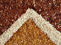
| 02/18/2004 09:15:02 AM |
Flax Pyramidby sgsprayComment: More about the construction than the photography, to my eye. Beyond shininess I get little impression of texture here. Colour is good, but there's no real detail. |
| Photographer found comment helpful. |
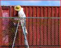
| 02/18/2004 09:13:44 AM |
Shipping Crate Cezanneby muur88Comment: Hate that red border - makes the red in the image look dull. Annoyed that the top of the crate isn't parallel with the fence or the frame. This approaches a fascinating composition though - something, beyond those two points, just disturbs it though. It may be as little as the location of the fence-pole, but there's an impression of the image being weighted very heavily to the left side, leaving a lack of interest to the right. Shows real signs of an appreciation of proper composition though, and would not need a whole heap changing to become good photography. 6 |
| Photographer found comment helpful. |
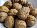
| 02/18/2004 09:09:22 AM |
Nutsby bormicComment: Oh hurrah, decent lighting at last. I've only had to get through about 45 images to find one. The softlight (daylight?) really enhances the shape and texture of these. colour rendition seems superb, and the slightly cold blue of the bowl (?) serves well to add some warmth to the subject by contrast. Not completely convinced by the close-cropping, think I'd rather have preferred a more still-life exhibition, and perhaps that is only because of where you've allowed us to see the edges of the nuts - fill those areas also and it might feel less arbitrary. Might ... not sure. First truly competent shot I've seen though. |
| Photographer found comment helpful. |
| 02/18/2004 09:05:32 AM |
monkey of mineby djcathyComment: Good illustrative shot. Mixing warm and cold light is a nice trick, though perhaps the cold is a touch overdone here, but it still allows definition of shape without loss of light. Good sense of texture, but a somehow unsatisfying image: perhaps just too bland a subject, in the end. IMO, of course. |
| Photographer found comment helpful. |
| 02/18/2004 08:59:42 AM |
Forth Bridgeby TallblokeComment: Gives some impression of the size and complexity of the bridge. Wouldn't say that it communicates texture, exactly - it would need to be less silhouetted for that, to show the steel rather than the outlines of it. |
| Photographer found comment helpful. |
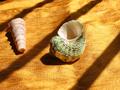
| 02/18/2004 07:26:28 AM |
Sea Shells on a Silk Shoreby johnnydpcComment: Odd to have placed that green shell so centrally when this screams out for a thirds composition - especially as it's pushed the other shell to such a weak area of frame. If that's silk then it looks more like canvas. Reasonable go, though. |
| Photographer found comment helpful. |
| 02/18/2004 07:22:21 AM |
Eye of the Beholderby spectre013Comment: Good work. Really captured the wiriness of the animal's fur. , especially over the eye and to the left of frame. Not convinced, photogrphaically, about the benefits of the very shallow DOF, mostly where the hiar to the left of the eye comes forwards of the focal plane. Confuses my eye a little. |
| Photographer found comment helpful. |
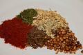
| 02/18/2004 07:20:18 AM |
Spice of Lifeby ddmckinney1954Comment: Cookbook shot, especially that v shallow DOF - very trendy these days. Doesn't do much for me in terms of texture. Within the focal plane the sharpness seems extreme - a granular quality has come in, which loks processed to me and has reduced the subtlety of the detail there. |
| Photographer found comment helpful. |
| 02/18/2004 07:14:56 AM |
my kind of.....by nordicComment: Moderately striking image - though the emphasis is more on light than texture. I think with shiny smooth subjects the best way to show the texture of them is to reflect light from them, rather than passing light through like this - which doesn't really show much of the surface at all. |
| Photographer found comment helpful. |
Home -
Challenges -
Community -
League -
Photos -
Cameras -
Lenses -
Learn -
Help -
Terms of Use -
Privacy -
Top ^
DPChallenge, and website content and design, Copyright © 2001-2025 Challenging Technologies, LLC.
All digital photo copyrights belong to the photographers and may not be used without permission.
Current Server Time: 08/15/2025 04:39:55 PM EDT.