| Image |
Comment |
| 02/20/2004 09:14:25 AM |
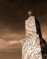
1887 Graniteby cbellerComment: Good composition - very strong on graphic elements. The light is too harsh, too directional to promote a sense of texture though - simply enough, with the inscription being barely distinct you're harly likely to have captured a feel of the surfces of that stone. |
 Photographer found comment helpful. Photographer found comment helpful. |
| 02/20/2004 09:12:46 AM |
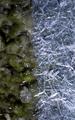
Layers.....by DrakeComment: Some degree of texture comes through, despite the lack of finer detail and the overall blurriness of it - it seems like you might have used too close to a 1:1 magnification of your original image, has that kind of quality to it, |
| Photographer found comment helpful. |
| 02/20/2004 09:09:38 AM |
Tooth Picksby JackoComment: The best so far of these rhythmic compositions. Real sense of texture in those wooden points, and a real sense of movement through the image. Sufficient regularity to work as a composition, and sufficient small differences to create some visual imterest. No fear of the simplicity of it, either. Good work. |
| Photographer found comment helpful. |
| 02/20/2004 09:08:08 AM |
Ice Age - again... ;)by Amor_E_MorteComment: Good abstract - good toning. Don't really get a tactile sense from this though, so much as a patterning, though there is an impression of roughness and smoothness, on a longer look. Not a strong sense though - I feel I may have willed it to be there more than been shown it. |
| Photographer found comment helpful. |
| 02/20/2004 09:05:19 AM |
Fuzzy lil' Friendby MadMordegonComment: Good sense of the surfaces, and effective depth of field. The compromise between filling the frame with the thing and getting all of it in has left an unhappy situation with those bits that go out of frame, for me. Slavishly following the 'thirds' rule requires a little more balance in the other half of the frame, in my view, and here here is really nothing going on there. |
| Photographer found comment helpful. |
| 02/20/2004 09:02:40 AM |
The wall of texturesby terjeComment: Good toning, and good colour capture. Slight barrel distortion visible in that bar at the bottom. The 'real' texture of the wall is too much masked by the graphic though, you haven't quite got the balance of that painting and the real structure right to my eye. |
| Photographer found comment helpful. |
| 02/20/2004 09:00:46 AM |
She Sells.....by vtruanComment: Despite the focus, there is a sense of differing textures here - or perhaps more accurately differing shapes. Not convinced by the compositional arrangement of them though - seems quite bluntly organise dinto two bands, and the lines and forms don't lead the eye comfortably through the picture. 5 |
| Photographer found comment helpful. |
| 02/20/2004 08:57:34 AM |
Paper Tapesby jealbornComment: Good sense of texture here, marred by a confusing and overly busy composition. There are too many different planes of paper, too many shapes angling in different doirections to give any real sense of flow through the frame. |
| Photographer found comment helpful. |
| 02/20/2004 08:31:27 AM |
Tombstones in the Graveyardby mizzdragonflyComment: Small image, indistinct detail, and very poor lighting - on board flash IMO never looks very inofrmative on close-up shots. Even were it more clear, that flash would I suspect have wiped out any detail in the textures here. |
| Photographer found comment helpful. |
| 02/20/2004 08:19:15 AM |
Harmony in stoneby RUEDISCHMUTZComment: The 'floating in space' thing doesn't work for such an obviously weighty and real thing, in my mind. It looks too muc like it's simply an illustration, rather than a artistic work of photography. You light is a bot too overall even to be really effective on those texture also, for me - perhpas from a more extreme angle woth the key-light, or perhaps not filling quite so much might have let more come through. |
| Photographer found comment helpful. |
Home -
Challenges -
Community -
League -
Photos -
Cameras -
Lenses -
Learn -
Help -
Terms of Use -
Privacy -
Top ^
DPChallenge, and website content and design, Copyright © 2001-2025 Challenging Technologies, LLC.
All digital photo copyrights belong to the photographers and may not be used without permission.
Current Server Time: 08/17/2025 09:23:49 AM EDT.