| Image |
Comment |
| 05/18/2004 04:29:42 AM |
The eye of God (Just a title)by cimarron98Comment: One of remarkable few images so far to display an understanding of the requirements graphically of a centred composition. There is a problem for me in the overall sense of lack of clarity - the eye itself is so comparatively dark that it is difficult to fix my eye on any detail there. I think perhaps some dodging/burning work might have helped the balance of brightness in the shot. 5 |
 Photographer found comment helpful. Photographer found comment helpful. |
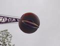
| 05/18/2004 04:25:55 AM |
Headache Ballby DrakeComment: Exceptionally sparse composition, though i think you could have afforded to brighten the whole thing to a greater extent: your sky is only mid-grey, and absolutely featureless - might have had more impact if you had taken this closer to a silhouettte. Perhaps what will most let your score down is that this is not really an image suited to a centred composition, you've just cropped it that way. 3 |
| Photographer found comment helpful. |
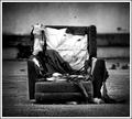
| 05/18/2004 04:20:57 AM |
scrapby jus6681Comment: Graininess gives a certain photojournalistic quality, especially with the vignetting. get a sense that there might have been some fascinating textures available here, but that you may have wiped them out a little with that level of contrast. 7 |
| Photographer found comment helpful. |
| 05/17/2004 06:18:51 PM |
Self Reflectionby t_onlineComment: There's a sense of liquidity in the flesh around the eye that is both rather distracting and rather unpleasantly death-like, especially in the desaturated colour. I find it unappealing, I'm afraid. Doesn't say anything to me. 3 |
| Photographer found comment helpful. |
| 05/17/2004 06:08:38 PM |
Sharing Wisdomby soccerdadComment: Some strong elements here - think I would have composed a little more carefully to include the pawns in the background more evenly, as their apparently sniggering expressions are priceless. Technically, some sense of over-sharpening, pixelation along the brights of his hat etc. just makes it seem a touch heavily cropped, or over-processed. 6 |
| Photographer found comment helpful. |
| 05/17/2004 06:06:42 PM |
Just Dandyby ellamayComment: so nearly submitted a shot starting from the same idea myself. So maybe I'll be a touch harsh on you having played with dandelion macros for a couple of days myself. It lacks a fine edge of impact (only just) - perhaps I mean more a sense of texture, a sense of really being close to the thing, involved with it. Fine detail in the seeds is good, but the finenness of the head itself is missing. Is this actually pushed up against the lens? Can't work out how you've lost no seeds, but at the same time they're not in the way ... 6 |
| Photographer found comment helpful. |
| 05/17/2004 06:03:30 PM |
The Early Bird !by Dim7Comment: Lacks - well a bunch of stuff really, other than a difficult moment to catch. I'm not sure that difficulty provides enough imapct to overcome the shortcomings of the shot however. Focus, detail, plasticity are all missing, and frankly it doesn't really call out for a centred composition - doesn't depend on it for its impact, if you see what I mean. 5 - for some sense of personality. |
| Photographer found comment helpful. |
| 05/17/2004 06:01:09 PM |
The Dawn Of Timeby wkoffelComment: Good sense of some sort of texture, though it might well be due to processing rather than your shot, as far as it looks. God, what an awful attempt to say what I mean :-)
There is interest here; but it isn't a shot that does anything for me photographically, must be final judgement. 4 |
| Photographer found comment helpful. |
| 05/17/2004 05:58:47 PM |
Antiquatedby trying2bstillComment: An odd entry. Not that it's a bad subject: that dial cries out for a centred composition. However your lighting lets you down, as nothing here portrays the texture of the bakelite, and you seem to have compromised betweeen a full image of the 'phone and a closer concentration on the dial, and I cannot concieve of a good reason for this halfway crop. |
| Photographer found comment helpful. |
| 05/17/2004 05:54:24 PM |
Away from it Allby elsapoComment: To my eye, you've taken this slightly too far in contrast, and certainly in the decision not to rotate the shot to keep the bench horizontal. There are areas where the light is entrancing - around the left leg of the bench for example, but otherwise it seems to bluntly a dull portrait. |
| Photographer found comment helpful. |
Home -
Challenges -
Community -
League -
Photos -
Cameras -
Lenses -
Learn -
Help -
Terms of Use -
Privacy -
Top ^
DPChallenge, and website content and design, Copyright © 2001-2025 Challenging Technologies, LLC.
All digital photo copyrights belong to the photographers and may not be used without permission.
Current Server Time: 08/19/2025 12:28:50 AM EDT.