| Image |
Comment |
| 05/20/2004 07:41:56 AM |
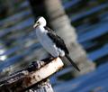
Wild Life Centreby mrblobbyComment: Couldn't work out what the apparent motion blur was at first, but I guess it's just the out of focus water, yeah? The tilt absolutely makes this: balances the composition nicely, allowing those shapes to give movemnt through the frame rather than blocking them all to one side and one edge. Good work there - wonder how many comments will criticise it? Either your processing or your exposure causes me some problems though - the eye is so dark it feels like a 'wrong' photo - and the eyes are essential in almost all wildlife photos. Perhaps if you'd under-exposed and then brought the highlights back in post-processing? Might give you more range of detail, without losing that level of contrast completely. 6 |
 Photographer found comment helpful. Photographer found comment helpful. |
| 05/20/2004 07:01:44 AM |
Moyer at Leisureby daisy77Comment: I think you fall into a slight trap here of just finding a subject and centring it, rather than finding a subject that benefits from being centred. Whilst there is some interest in framing him against pure grass, and the very slight leading lines of the cut pattern help, there isn't enough to suggest a demand for a centred composition. Technically accomplished though - and perhaps there are things here the British eyes miss. 5 |
| Photographer found comment helpful. |
| 05/20/2004 06:58:10 AM |
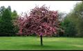
Treeby redmoonComment: I like the strange depth of field here - well, perhaps not strange, but kind of antique, if you follow me. Love the almost model-like sense of detail and tidyness: makes it look so small. Aided by that film-like border, this has a real subtletly that I fear will be lost on the 10 second voters. Not sure that I wouldn't personally have tried to avoid the blown-out sky, either with some kind of graduated filter or framing the subject against a solid background of other trees. But it's lovely work as it is. 8 |
| Photographer found comment helpful. |
| 05/19/2004 07:23:24 AM |
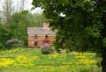
Springtimeby emorgan49Comment: why not crop out the entirety of the tree-trunk picture right? It would leave you with a genuinely centred composition, instead of the halfway-there shot, and would to my eye balance the composition more evenly. Not a bad image at all, but lacking in much real mood, either of drama, or gentleness, or peace. Perhaps needed a different light to caryy it off, or failing that more processing work to give it some punch. As it stands, it is fairly ordinary to me. 5 |
| Photographer found comment helpful. |
| 05/19/2004 07:20:07 AM |
Centred Sunny Centreby gerdagriceComment: Works compositionally, effectively a simple leading lines shot, but none the less effective for that. The glancing light is effective in rendering the shape and texture for the most part, but the image right petals have a muddy quality that might have been lifted with a little bounced fill-light perhaps. Not quite enough fascination to hold my interest for long, but a good shot all the same. 6 |
| Photographer found comment helpful. |
| 05/19/2004 07:17:59 AM |
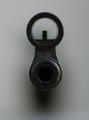
"A picture where the main subject is dead center ... ". Take care ;o)by PatochComment: Blunt, simple, and suitable to a centred composition. The light is almost ideal, although badly let doen by the indistinct end of the barrell - perhaps a little extra light there, from a reflector or even another light source would help. The extremely shallow depth of field helps in some ways, but it is so extreme as to miss the end-sight, and yet there isn't enough detail in the very end of the barrell to hold attention for me. 5 |
| Photographer found comment helpful. |
| 05/19/2004 07:15:38 AM |
Rosy Centerby KylieComment: Has a weird sensation of not being absolutely symmetrical ... just enough to make it slightly unsettling to look at, like there's some distortion somewhere. Colour saturation hasn't been dealt with terribly well, lots of pixelation in the pinks around the brightest areas. Jaggedness from perhaps over-sharpening on the hard lines too. All that said, it has potential as a geometric image i think, but too many things interrupt the cleanness of the presentation for me. 4 |
| Photographer found comment helpful. |
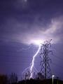
| 05/19/2004 05:35:44 AM |
Unbridled versus Restrained by BikeRacerComment: It doesn't actually seem to have been commented on, in a quick glance through, but it's the streetlight that makes this shot for me. The high-voltage lines (which would have been the title had it been my shot) are generally, and certainly in photographic terms, percieved as a bad thing - but here you also illustrate the use we make of that power. It has a message about the use we make of out technology - and not a straightforward message either, suiting a not-straightforward debate. Part of the crowning glory of our civilization, or is the world going to take its revenge? Very pleased to see such a challenging shot win this challenge. Don't suppose the visually spectacular nature of it hurt, either :-) |
| Photographer found comment helpful. |
| 05/18/2004 05:59:34 PM |
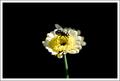
The Arrivalby moviemanComment: The large amount of negative space certainly helps to make the centred composition work - good imagination there. I like the incidental, real-world feel of this shot, and the level of detail (especially in the colouring) on the fly. There's something ... kind of casual about the whole thing (in a good way) that I can't quite explain. Speaks of lazy summer days somehow. Must be the light. It's always the light. |
| Photographer found comment helpful. |
| 05/18/2004 02:53:24 PM |
quiet reflectionby ursulaComment: my first reaction, sitting back from the monitor and therefore seeing far too dark an image, was - whoa, someone's superimposed an audio waveform over a picture. obviously much clearer at proper viewing angle, but that impression remains, and is actually quite intriguing. Interaction of slopes and angles and progression of trees is interesting. |
| Photographer found comment helpful. |
Home -
Challenges -
Community -
League -
Photos -
Cameras -
Lenses -
Learn -
Help -
Terms of Use -
Privacy -
Top ^
DPChallenge, and website content and design, Copyright © 2001-2025 Challenging Technologies, LLC.
All digital photo copyrights belong to the photographers and may not be used without permission.
Current Server Time: 08/19/2025 02:48:41 AM EDT.