|
|
|
Showing 1761 - 1770 of ~2866 |
| Image |
Comment |
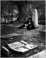
| 08/31/2004 10:17:36 AM | The Keeperby JPRComment: Now then. I like the shot, in a way - certainly admire the technical achievement of it, at least. But I dislike the posed-ness of it, the fabrication of it. Too much to do with fashion photography, the rule of style over content, a kind of contrived moodiness, and perhaps an over-simplification of, well, everything. It wouldn't look out of place as a Prince album-cover, I shouldn't imagine - which is exactly what I think I don't like about it. Probably an 8 for technique (lacking a true touch of the bizarre, that killer composition). Creatively - a 3. |  Photographer found comment helpful. Photographer found comment helpful. |
| 08/29/2004 04:30:45 PM | Gloriousby BooZonComment: From an occasional critique clubber ...
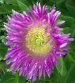
Quite why so very many people decided that a Botany challenge should be a Flower challenge defeats me ... but you've nevertheless done an OK job with this. Your notes are useful in telling why it didn't do better, actually - I can't imagine that 'auto' both levels and contrast is really going to give you satisfying texture in your final image - they are processes designed to bring everything to visibility, and real depth of texture and detail in a shot require a great deal more fine-tuning. I would imagine that playing with the other controls in PS would give you some idea of what you might have got out of the shot; certainly in a dpc-friendly sense - the shot needs more sense of drama - more progression of light and shade, more three-dimensionality, than it has.
I also think your sense of composition here is slightly askew - in that this is a very straightforward depiction of the flower. A good look through all the winning shots shows that there is a much more intense focus on shadow work, on a sense of landscape in the shots that have scored well than you have achieved here. Imagine, if you had focussed more clearly on the centre of the flower, and used the outer petals to frame that area, you would have the recognisable subject all the same, but with more immediate photographic impact.
All of which presumes you are aiming simply to score well here, rather than submitting for any other reason.
Outside of dpc-world, there is a feeling of odd light that I like very much in the centre of the flower: the very centre of the stamens seems to glow, and gives the impression of the flower emerging from the light of that area. However, even in this sense, I think you still need a greater sense of light and shade in the image. Along the stems of the petals there doesn't seem to be much graduation between what should have been light areas and should have been dark ones - again, I suspect that this is as much a function of the auto-thing as of your capture of the image. Also, the inclusion of the greenery works against this - making more of the fact that it is simply a flower, rather than of the extraordinary elements at it's centre - and puts the shot into a different category - one that is more of simple illustration. Whilst there is nothing wrong with that, it never seems to do that well here.
It could perhaps have been worked into something that would have scored better, but as it stands, i think if fully deserving of it's 'average' score.
Ed | | Photographer found comment helpful. |
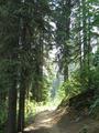
| 08/27/2004 05:22:17 AM | Around the Bendby wahsabiComment: I like this as a study for this challenge - much less obvious than most. I think you would need a more ethereal light to make it work well - here there is little magic in the trees, and the very bright light behind them makes the exposure very tricky to control. Perhaps it simply needs editing that isn't allowed for this one :-) | | Photographer found comment helpful. |
| 08/27/2004 05:18:01 AM | Please Mum ...by ScantyNebulaComment: Wonderfully well done technically, especially for basic editing. Too twee, for me, to be a really exciting image, but it's a good average. | | Photographer found comment helpful. |
| 08/27/2004 05:12:46 AM | "I Hope He Looks at Me..."by librodoComment: Good work. Not quite sure about the balance of the tight ccrop on her face and the negative space image left - feels sllightly uncomfortable, but I guess that's not an un-useful effect here. You might have titled it 'I hope he stops following me' and had a more sinister image, which just goes to show the impact of titles I suppose. | | Photographer found comment helpful. |
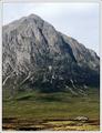
| 08/18/2004 08:22:47 AM | View from King's Houseby BobsterLobsterComment: The only thing I notice from your compression problem is the ghosting along the mountain's edge - some patient and careful cloning could fix that, perhaps? Wonderful tonality in the grasslands and the rocks, and as Gordon has said the composition is wonderful. Tried bringing the sky down a touch? A ND-grad effect or simply some burning might just add that touch more drama - which would I think help to emphasise the height yet more? Great stuff. | | Photographer found comment helpful. |
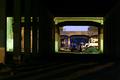
| 08/16/2004 05:56:38 PM | bridges over nothingby krazyComment: Like this very much - structurally, colour, thematically. Ideally, of course, you might have tried to bring up tose crazy forground shadow angles. I'm not completely sure about the collection of whatever it is between the bridges - looks like a trailer or something - and it's perhaps that lack of definition that hurts the image for my score. | | Photographer found comment helpful. |
| 08/16/2004 05:51:05 PM | Going away ...by smr78Comment: Oh very dpc! Sure you'll do well - great colours, great sense of depth, effective composition, gently witty. The smallest point, but that blue sky could do with a touch of cleaning up. | | Photographer found comment helpful. |
| 08/16/2004 05:46:27 PM | Vanishing into a 'white hole'by johnmkComment: Good work. Nice to see a decent use of burn out, and certainly meets the challenge. lacks any great interest, or difference however - some special moment of light, or composition - to break out of the 6 bracket for me. | | Photographer found comment helpful. |
| 08/16/2004 03:38:50 PM | Reachby JesuispeureComment: Neat, well done image. I personally like the distribution of weight added by the tilt - although it doesn't make it stand out special - and I fear the punters won't get it at all. Something to do with the sense of vertigo one can get from looking up at things like this. Nice stuff, but lacking in an element of delight - perhaps that light is just a touch too ordinary. 6 | | Photographer found comment helpful. |
|
Showing 1761 - 1770 of ~2866 |
Home -
Challenges -
Community -
League -
Photos -
Cameras -
Lenses -
Learn -
Help -
Terms of Use -
Privacy -
Top ^
DPChallenge, and website content and design, Copyright © 2001-2025 Challenging Technologies, LLC.
All digital photo copyrights belong to the photographers and may not be used without permission.
Current Server Time: 08/19/2025 06:47:17 PM EDT.
|