|
|
|
Showing 1631 - 1640 of ~2866 |
| Image |
Comment |
| 11/19/2004 07:56:06 PM | Augustby ZoomdakComment: From the Critique Club
Hi Thomas - just spent a diverting minute or several trawling through your favourites. Good to be writing for a lover of the sydney harbour Bridge shot :-)
Strong organisation of elements here - solid compositional skills brought to bear with strong balance and effective cropping. There is the very slightest tilt to the horizon, though I wouldn't have noticed it had it not been mentioned in comments, and I had to scroll the image to the edge of my page to proove it. I wouldn't have though it a big deal, but I wonder if it doesn't perhaps add a subconscious element of uneasiness to the shot?
My dislike of it - no, that's a touch strong: I don't 'dislike' it - what it that makes it not-terribly-appealing to me, is, I think, that it seems to be sending a certain message, communicating a certain mood, but that there are strong elements that work against that, and that don't seem to work toward a particular contrast or useful contradiction.
On first look it has that feel of the ending of a good sunny summer's day. A calm sea, a gentle, smooth deserted beach (oh, and it most certainly did not require the presence of a couple hand-in-hand to make it, by the way: that would have made it trash sentimentality). But the presence of those sharp lines of the dune grass, too strongly present to be simply a fill for the negative space there, and too chaotic to be compositionally contributory to the feeling, and the small line of clouds, perhaps take away from that impact, though what they work towards is beyond me. It leaves the shot without either the hyper-simple composition of a more graphically-oriented image, nor the great detail and strong sense of focus (in terms of subject) of a landscape.
I think also that the graphic elemnts that are present here perhaps work against you. The strongly dark areas (not black, but almost - could have used a touch of levels to go one way or the other perhaps?) do not form a coherent basis for the shot - especially the way in which the shpaes of the exposed sand and the leaves interact - they seem arbitrarily overlaid, with little sense of drving the eye through the frame. The strongest point, which seems to me to be the tonality of the lower sky and the reflections in the water, are intruded on massively by those leaves and banks of sand.
In the end, I think you did well to score so highly with this (I wonder, did the sunset help you there?) :-)
hope some of that confused and rambling thinking is of use
Ed |  Photographer found comment helpful. Photographer found comment helpful. |
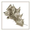
| 11/19/2004 07:28:46 PM | Novemberby JondorComment: From the Critque Club
Well, welcome ot the dpc world Gerhard. Prepared for the frustrating adn hugely rewarding trip that it can be here?
I like the idea of the parallels between photography and line drawing: I'm intrigues about where it is that one draws that line myself. A couple of my own shots from challenges here are working around the sense of the computer rendered/photographed image, and what it is that distinguishes the former from the latter for us.
I can certainly see where you're headed here - though I didn't, during the challenge, get the sense of framed art, nor of line drawing, from the shot. I found it more intriguing that it was plainly an autumn leaf, although the element that one would expect to provide that sense (the colour) has been removed. It suggests, by that means, that there are other, un-thought of elements to the seasonal decay of our world, that we do not necessarily see, and I liked being prompted to that thought very much.
Where I think it falls down is that it doesn't have that sense of terribly smooth progression of light and shade that a fine line drawing (I'm thinking of the great draughtsmen, like Escher) would achieve. The amount of reflected light, it seems to me, is a phenomenon of photography alone, though adopted by some schools of art more recntly, but only after the advent of photography. Quite what, in terms of shade, it is that constitutes that is difficult to say - perhaps it is simply that whole thing thends too much to white to give a sense of deliberate shading. Perhaps the black point in the image is too high. But something here certainly makes it blatantly photographic. I'd be almost certain that a less waxy textured leaf would have seemed far more effective for the idea of approaching a drawing.
I find something about it unsatisfying. It might be a simple as not liking that waxy, shiny texture you've caught, it might be more complicated, verging on the sense of not finding anything new here. A sense that this is not a shot that shows me anything I can revel in: sure the realisation I talked about at the beginning is a good strong element of this for me, but I think my personal tast is more for the rougher textures, the subtle graduations that speak more to meof the organic rather than the shiny and smooth (despite my predeliction for shots of cutlery).
I wonder if the graininess evident in the shadow areas has something to do with that feeling also? i would like to see it smoother in that sense, to see what the impact would be on the apparent texture of the leaf itself ...
I hope this is as useful to read as it has been fun to spend some time with your photo.
Ed | | Photographer found comment helpful. |
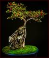
| 11/17/2004 07:07:43 PM | Bonsai Kai: November Cotoneasterby ImagineerComment: From the Critique Club
Now here's a thing, my friend: haven't written a club critique for some time, and look who pops up for my first one back.
I wondered, as I voted, whether this was a shot of yours (simply from knowing your bonsai enthusiasm) - I think, if memory serves, that I decided it wasn't, as it seemed far too straightforward to be your work.
The light is decidedly regular for a 'painting with light' process - perhaps too regular? It has, largely, the feel of a simple, well-lit image, and there is little to give away the technique, and perhaps little that really benefits from the technique: one would hope for more high-lighting, more emphasis, more effect, in simple terms. There are of course areas where the use of light shows - the dappled nature of the moss (?) in the pot, a slightly organic sense to some of the light across the leaves: but i think this might have benefited from a more radical use of the method, more light and shade, perhaps.
As an image, without knowledge of the techniques, it seems to me little more than highly competent studio work. The blacks are black, the highlights add definition and three-dimensionality just where one would want them. The colours are strong, well-organised. The composition is fine - you've chosen a strong angle from which to shoot the tree. The balance of the red berries and the blue pot makes for a satisfying counterpoint to the profusion of green. The detail is all present, and the processing is accurate and precise, and well controlled. The subject - and as you know i know little of the way of bonsai - seems like a good example. That kind of purity of form and structure would be as I would imagine a fine bonsai to need to be. And of course, in terms of the challenge, the berries add a suitably seasonal note.
The score? Well, I don't know. It seems to me we're in the grip of one of dpc's periodic dalliances with the cute and with the blatantly dramatic, and with photography magazine images. There was a time when a shot such as this would garner a deserved 6.2, or .3. Never winning, unless you happened to have hit on some bizarre magic formula, but at least garnering the kind of high average score that such competent work deserves. I mean - look at the results from this challenge.
That said, there is grounds for considering those shots as suitable winners. Isn't the cute, the blatantly dramatic, and magazine photography just exactly what the calendar compilers would put together to find a big seller? It left difficult open territory as a challenge: those who put out a bit further, who avoided the mass market, were marked down for it, as far as I could tell. This of course, was a perfect calendar shot - as was, for instance, Tony Wright's shot. Both of you scored in a similar region.
But I know that's not your concern, really. It is, however, a fascinating area of study :-)
My final judgement on this shot would be (and what's the point of a critique if not to pass judgement? Oh, the power...): Documentary, and certainly so by your standards.
All the best
Ed | | Photographer found comment helpful. |
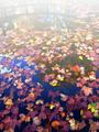
| 11/16/2004 06:45:32 AM | Fall Sceneby jjbeguinComment: The curve in the reflection nicely quotes the Water Lillies, and I do like the array of tones in the fallen leaves. Photographically, I find it a touch too washed out as it moves up the image: I think you perhaps had enough here to speak of 'impressionism', without that extra push, be it from natural light or from processing. I don't know that I wouldn't have warmed the colour temperature of the whole thing a little either - it just has a slightly cold feel to it, slightly too far to blue.
But it works for the challenge, nicely, of course. The drfit, as the eye rises, from a genuinely photographic feel into a world of paint-like appearance (and a world I fully expect to see over-used in this challenge), makes a subtle point. Enjoyable. | | Photographer found comment helpful. |
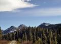
| 11/13/2004 08:18:14 PM | Octoberby TressiderComment: Lacks the punhc, the highly orthodox standard photographic approach to landscape that I'd expect of a calendar. A good enough scene, in itself, and in your chosen composition (although I think a more draatic cloudscape would be effective), but the light is not great - no sense of shape to the mountains, no warmth, and a sense of the image being cropped too high. You've done well howeever, to place the horizon strongly in frame, and to find those parallele shapes of tree-line and hills. Close - but it needs to be more imposing, to my eye. | | Photographer found comment helpful. |
| 11/13/2004 08:14:07 PM | Novemberby geewhyComment: This looks like Gordon Whyte's trick with NI - most specifically in the resultant texture of those leaves. I can go with the kind of soft/non-soft feel of it for a calendar shot, but I'm not great fan of it photographically, I'm afraid. It'll garner a 6 though, for aptness, at least. | | Photographer found comment helpful. |
| 11/12/2004 07:05:53 PM | Januaryby cabaComment: To me, this seems like the photographic equivalent of a sketched idea for a shot - 'how about we set this thing up, you know, gloved hands, bowl of soup' kind of thing. Your execution leaves an awful lot to be desired, I'm afriad. The questions it throws up for me: the colour structure of it - black gloves, muted purple fleece, red cup? Was there no more coherent structure you could have found? The lighting - simple on-board flash is soblunt, so head-on, leaves those strong and ugly shadows, and doesn't have the angle or the softness to add grace to the scene. The composition and the set-up: was it really better to have gloved hands anyway? Was a completely symmetrical composition so very effective - would it perhaps not have been more effective to show more of the person? Did the contents of the bowl have to be quite so ugly-looking - and certainly not warming in appearnace? wouldn't captureing the steam coming off that bowl have given a greater sensation of coldness in the air than is implied simply by gloved hands?
I appreciate that this is a 'real' scene - but photography of the 'real' is not necessarily a matter of simply finding a moment that is so blatantly representative and shooting it any old how. | | Photographer found comment helpful. |
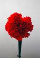
| 11/12/2004 06:58:11 PM | April 25, 1974 (Carnation Revolution)by DiscraftComment: The very irreality of this makes it a strong shot - the unlikeliness. I'm not a huge fan of it, Iwould have changed a number of things, mostly the dirtiness and graininess of the background, but I can see absolutely where you're coming from and what you have achieved. I'm certain you'll be knocked by the unthinking for that vase/shadow, although it is essential to my eye, and for the non-blatant calendar reference. I hope it finds it's audience, it deserves to have fans, this shot. 7 | | Photographer found comment helpful. |
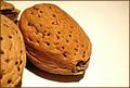
| 11/10/2004 06:34:16 PM | No bugs or flowers? AW... NUTS!by birdyblueComment: The light seems a bit strong, and the high-key background doesn't quite work for me, especially with those partially visible elements to the left. I would have thught a softer light would give a gentler feel to the image - I don't mean less bright, just more diffuse, to lighten the extremities of those shadows. | | Photographer found comment helpful. |
| 11/10/2004 06:32:06 PM | One cube or twoby pumaComment: good detail, and I like the fact that you've used just the barest hint of light to show the shape of the bottle here. - gives it a warmth and subtlety that appeals. | | Photographer found comment helpful. |
|
Showing 1631 - 1640 of ~2866 |
Home -
Challenges -
Community -
League -
Photos -
Cameras -
Lenses -
Learn -
Help -
Terms of Use -
Privacy -
Top ^
DPChallenge, and website content and design, Copyright © 2001-2025 Challenging Technologies, LLC.
All digital photo copyrights belong to the photographers and may not be used without permission.
Current Server Time: 08/20/2025 06:21:51 PM EDT.
|