| Author | Thread |
|
|
11/19/2004 07:28:46 PM |
From the Critque Club
Well, welcome ot the dpc world Gerhard. Prepared for the frustrating adn hugely rewarding trip that it can be here?
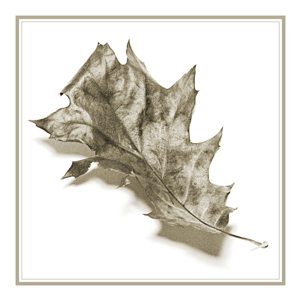
I like the idea of the parallels between photography and line drawing: I'm intrigues about where it is that one draws that line myself. A couple of my own shots from challenges here are working around the sense of the computer rendered/photographed image, and what it is that distinguishes the former from the latter for us.
I can certainly see where you're headed here - though I didn't, during the challenge, get the sense of framed art, nor of line drawing, from the shot. I found it more intriguing that it was plainly an autumn leaf, although the element that one would expect to provide that sense (the colour) has been removed. It suggests, by that means, that there are other, un-thought of elements to the seasonal decay of our world, that we do not necessarily see, and I liked being prompted to that thought very much.
Where I think it falls down is that it doesn't have that sense of terribly smooth progression of light and shade that a fine line drawing (I'm thinking of the great draughtsmen, like Escher) would achieve. The amount of reflected light, it seems to me, is a phenomenon of photography alone, though adopted by some schools of art more recntly, but only after the advent of photography. Quite what, in terms of shade, it is that constitutes that is difficult to say - perhaps it is simply that whole thing thends too much to white to give a sense of deliberate shading. Perhaps the black point in the image is too high. But something here certainly makes it blatantly photographic. I'd be almost certain that a less waxy textured leaf would have seemed far more effective for the idea of approaching a drawing.
I find something about it unsatisfying. It might be a simple as not liking that waxy, shiny texture you've caught, it might be more complicated, verging on the sense of not finding anything new here. A sense that this is not a shot that shows me anything I can revel in: sure the realisation I talked about at the beginning is a good strong element of this for me, but I think my personal tast is more for the rougher textures, the subtle graduations that speak more to meof the organic rather than the shiny and smooth (despite my predeliction for shots of cutlery).
I wonder if the graininess evident in the shadow areas has something to do with that feeling also? i would like to see it smoother in that sense, to see what the impact would be on the apparent texture of the leaf itself ...
I hope this is as useful to read as it has been fun to spend some time with your photo.
Ed |
|
 Photographer found comment helpful. Photographer found comment helpful. |
|
|
11/16/2004 04:58:41 AM |
First of all I would like to thank everybody for their comments.
For those who have problems with borders: Usually I keep my borders simple, a single line with some white or black depending on the content. But this is because I usually do stillifes with a modern and very minimalistic style. The simple border matches that. A Rembrand of Vermeer needs a heavy golden frame to match the tast of the period.
This image tried to go back to the pen drawings from before the camera and the border had to match this.
So for those who just don't like borders because they are borders: please try to imagine why it is there and what it tries to accomplice. Just comment that it would be so much better without (as the first comment did) simply will not do! |
|
|
|
11/15/2004 06:59:06 AM |
|
This was my only 10 of the challenge, a lovely and extremely simple shot, and worthy of a yearly botany calender :) |
|
| Photographer found comment helpful. |
Comments Made During the Challenge  |
|
|
11/14/2004 11:09:43 AM |
|
Appropriate to the time of the year (november) |
|
| Photographer found comment helpful. |
|
|
11/13/2004 09:43:03 PM |
|
Lovely, the boarder really brings it to life. Very nice 9 |
|
| Photographer found comment helpful. |
|
|
11/12/2004 07:03:57 PM |
|
Far and away my favourite entry in this challenge. I love the lighting, the grainy texture, the toning and the clean background. Only thing I'm not keen on is choice of border. Beautiful, elegant, simple image. |
|
| Photographer found comment helpful. |
|
|
11/12/2004 02:07:43 PM |
|
Very simple, very elegant. The duotone is excellent. The shadow is good, it gives it a 3D effect. The grain adds interest and gives atmosphere AND I think the border is wonderful, very nice touch. Well done a six from me. |
|
| Photographer found comment helpful. |
|
|
11/12/2004 01:14:31 AM |
|
Simple elegance. An entire calendar using this style would be amazing. |
|
| Photographer found comment helpful. |
|
|
11/11/2004 06:54:13 PM |
keep the border simple.
intresting entry - i like it.
good luck |
|
| Photographer found comment helpful. |
|
|
11/11/2004 02:59:02 PM |
|
| Photographer found comment helpful. |
|
|
11/11/2004 10:32:00 AM |
|
a bit of a colored background should improve this beautiful pic, ie, imho. still deserving a good score which you get. |
|
| Photographer found comment helpful. |
|
|
11/09/2004 11:12:03 PM |
|
I like everything about this, especially the tones and how the border matches the leaf colors perfectly |
|
| Photographer found comment helpful. |
|
|
11/09/2004 10:52:30 PM |
|
I like this. The texture really works, adds a bit of interest in place of color. |
|
| Photographer found comment helpful. |
|
|
11/09/2004 07:59:13 PM |
|
Slightly grainy, but I like this photo. 8. |
|
| Photographer found comment helpful. |
|
|
11/09/2004 04:49:13 PM |
|
Clever - quite what it is that speaks of autumn here, rather than simply a black and white shot of a leaf at any time is difficult to say. I suppose the border woudl be acceptable for a calendar, though it still behoves me to say how little I like it. I've enjoyed the shot though, for all those criticisms. |
|
| Photographer found comment helpful. |
|
|
11/09/2004 02:20:12 PM |
|
Good composition. Would have liked to be able to see more of the leaf's texture. |
|
| Photographer found comment helpful. |
|
|
11/09/2004 03:25:58 AM |
|
Perfect callendar picture here! Clean, simple, communicative, dimensionally and spatially brilliant frankly. The frame sets this picture off perefectly. Well done! 10. |
|
| Photographer found comment helpful. |
|
|
11/08/2004 11:47:19 PM |
|
I like the quality of this very much. It feels like a pen and ink drawing. I can definitely see this on a calendar. Elegant take on the topic. |
|
| Photographer found comment helpful. |
|
|
11/08/2004 05:04:17 PM |
|
I really like this picture a lot. The coloring is great, and even tho most dpc'ers seem to hate frames, I think when they are done right, they really add. This frame is perfect for this picture. It doesn't quite fit what I'd expect to see on a calendar, but I rated it really high anyway because it's such a nice composition. |
|
| Photographer found comment helpful. |
|
|
11/08/2004 03:44:14 AM |
|
woulda been much better without the frame |
|
Home -
Challenges -
Community -
League -
Photos -
Cameras -
Lenses -
Learn -
Help -
Terms of Use -
Privacy -
Top ^
DPChallenge, and website content and design, Copyright © 2001-2026 Challenging Technologies, LLC.
All digital photo copyrights belong to the photographers and may not be used without permission.
Current Server Time: 06/29/2026 11:50:44 AM EDT.