| Image |
Comment |
| 02/22/2005 03:16:14 PM |
Consumedby casualguyComment: Oh. I had this second by a similar margin to which I had JJ's shot first; had it not been for the resident genius this would have been by far the most interesting shot in the challenge. Unfortunately, as I also found, the general voter's definition of 'portrait' doesn't quite agree with yours. You sir, in the brit vernacular, was robbbed. |
 Photographer found comment helpful. Photographer found comment helpful. |
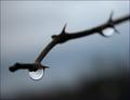
| 02/17/2005 06:52:54 AM |
~ The Last Breath ~by ImagineerComment: So how's the 'breath' done? A print? Projection? The reflections make me think the latter. The only thing I would have changed, or done slightly differently, would have been to find some way to have at least one 'breath' appearing in front of your face, perhaps looping up and round to leave image left bottom. No idea how that would be achieved (glass perhaps?). Stunning in both conception and execution Jon. |
| Photographer found comment helpful. |
| 02/16/2005 11:21:15 AM |
|
| Photographer found comment helpful. |
| 02/16/2005 11:18:46 AM |
Life is Goodby jbsmithanaComment: Solid detailing, natural pose, strong sense of the real. You could sure have used some additional light though, to give some sense of depth to it all - this appears to be a single source direct from the camera angle, and it could have been really interesting with more shaping. |
| Photographer found comment helpful. |
| 02/16/2005 11:13:42 AM |
My Muse and Iby ArtysteComment: I think you may have fallen between two stools here, to my mind. I love the basic idea of it, and the vast part of the execution, but the extreme high-key thing is what bothers me - most specifically on your face; the blown areas seem too arbitrary, areas with and without definition don't seem to follow any particular plan, serving to both mask and emphasise facial shape, bone structure, in different areas. Lots of good stuff otherwise though, like it. |
| Photographer found comment helpful. |
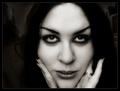
| 02/16/2005 11:08:38 AM |
I see you . . .by mocabelaComment: Intriguing. well lit, well executed photograph, of course. Thevisibility of the background, or otherwise, confuses me a little - but that's probably the differences of viewing angle of a TFT screen. that single, differently placed finger really pulls the eye: don't know why you've done that, there doesn't seem to be anything there that warrants that draw. Fine photograph though. |
| Photographer found comment helpful. |
| 02/16/2005 11:03:29 AM |
|
| Photographer found comment helpful. |
| 02/16/2005 11:00:03 AM |
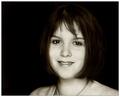
Me A Name I Call Myselfby riotspyneComment: Nice work. The sensed tonality in the hair - as viewed on my screen at least, if I brighten things too much it's clearer - adds a really involving touch. Good solid light, detail, and sense of honesty. |
| Photographer found comment helpful. |
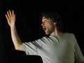
| 02/16/2005 10:43:30 AM |
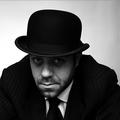
Suits You Sirby mrmorrisComment: Marvellously done - evocative, contradictory, and very arresting. That sharpening halo around the high-contrast edges is REALLY annoying, for me at least - one of my major bugbears. The quality of this otherwise is enough to overcome it though. Just. |
| Photographer found comment helpful. |
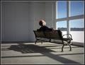
| 02/15/2005 04:26:50 AM |
Consumedby casualguyComment: Wonderful work; love the composition, the light, the strange room, sense of space. |
| Photographer found comment helpful. |
Home -
Challenges -
Community -
League -
Photos -
Cameras -
Lenses -
Learn -
Help -
Terms of Use -
Privacy -
Top ^
DPChallenge, and website content and design, Copyright © 2001-2025 Challenging Technologies, LLC.
All digital photo copyrights belong to the photographers and may not be used without permission.
Current Server Time: 08/22/2025 07:06:40 PM EDT.