| Image |
Comment |
| 03/10/2005 02:48:45 PM |
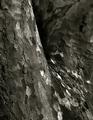
Skin Tonesby ImagineerComment: Perfect, for the challenge at least. It has that trade-mark slightly centred-feeling composition, great sense of both tone and texture, a near-abstract interest which i find in a lot of his closer work. Great movement throughout frame too. lovely work. |
 Photographer found comment helpful. Photographer found comment helpful. |
| 03/10/2005 02:46:45 PM |
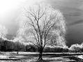
Willow Tree Out Of Seasonby spreadcomComment: A fine attempt, except I can't really connect that sky, both the burnt-out area of it, and the seemingly darkened side of it, with the AA style. The tree, and your treatment of the light effect there, is absolutely spot-on, as is your composition, I would say. I wonder to what extent that angle of light is absolutely necessary for that effect - could getting the light a litle earlier/later have kept it out of shot without losing the effect? A very nice attempt. |
| Photographer found comment helpful. |
| 03/10/2005 02:40:02 PM |
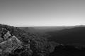
as far as the eye can seeby Dan the manComment: In the sense of the tonal results of the zone system, this image works fine. where it falls down, for me, is that I can't imagine AA ever shooting with so bland a sky, and including so much of it. He did favour a more cnetred composition than we often see here, and there are strong elements of texture that he would have appreciated, but compositionally this misses. |
| Photographer found comment helpful. |
| 03/05/2005 04:39:10 AM |
Got Milk ?by soupComment: Originally posted by gwphoto:
this is not 640x320 |
>sigh/< |
| Photographer found comment helpful. |
| 03/01/2005 03:10:43 PM |
The Trailby rileyComment: I like this, despite it consisting of a number of things I have little time for - perhaps rather, I should say, because of that: the hyper-smoothness is taken so far, the selective de-sat is so almost arbitrary, the sharpenin artefacts in the trees (and their associated wonderful effect in the image right trees. That halo-ing around the branches image left is the only thing that stops me thinking this is rather a work of acccident than genius. I shall, if i have time, have to comback to it to decide what I really think. |
| Photographer found comment helpful. |
| 02/24/2005 05:58:46 AM |
Horizonby tazzaComment: Love the light on the sea, not so sure about the blue tones of the more distant clouds. Your cropping, or framing, has reduced the impact of that ragged edge of the top clouds though - I would think the impact would come more from the passing of them, and there just isn't enough of them in shot to generate that impact. |
| Photographer found comment helpful. |
| 02/24/2005 05:54:26 AM |
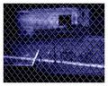
Bannedby BradComment: Striking stuff. I love the high contrast work on the wire, and the tonality overall, though I'm no fan of the scne behind - it has a pencil sketched quality, that I think works rather to remove any sense of the photographic from the image. It could of course be for all sorts of reasons, but the final effect of it takes it too far from having a sense of the 'real'. It's clearly the work of someone with expertise though. |
| Photographer found comment helpful. |
| 02/23/2005 07:24:57 PM |
|
| Photographer found comment helpful. |
| 02/23/2005 05:35:58 PM |
Broken Vowsby BudComment: This kind of concentration on details really requires hyper-careful preparation: somehow, the tiniest things stand out. |
| Photographer found comment helpful. |
| 02/23/2005 05:29:39 PM |
magnum opusby whiteroomComment: Now, i really like this - a really striking visual sense of the graphic. The colouration doesn't do a lot for me personally - I think that parallel of spae would have a greater impact if left alone, as it were: it's quite weird, surrealistic, gothic enough, surely, without resort to these colours? It's a wonderful composition too. As much for the sake of I think everyone else is going to vote this down horribly, I'm giving you a high score, but i really would rather not have the colour ;-) |
| Photographer found comment helpful. |
Home -
Challenges -
Community -
League -
Photos -
Cameras -
Lenses -
Learn -
Help -
Terms of Use -
Privacy -
Top ^
DPChallenge, and website content and design, Copyright © 2001-2025 Challenging Technologies, LLC.
All digital photo copyrights belong to the photographers and may not be used without permission.
Current Server Time: 08/22/2025 04:23:39 PM EDT.