| Image |
Comment |
| 01/29/2008 07:00:38 PM |
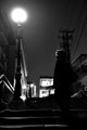
week-4.jpgby LanndonKaneComment: Think it was noticed, but perhaps it was a little early to start commenting. Not sure if all the overlays are helping, but there are a lot of nice patterns here. |
 Photographer found comment helpful. Photographer found comment helpful. |
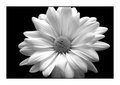
| 01/29/2008 06:53:39 PM |
Daisy-0031by RedDotComComment: I agree about the hotspots. Always easier to get than to get rid off. Perhaps a kind of underlighting would help (but I'm not an expert) or some HDR thing (still trying to learn that myself). But, forgetting all that, it's a wonderful flower but indeed a little bit too centered. |
| Photographer found comment helpful. |
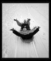
| 01/29/2008 06:19:36 PM |
Weee k 1by SonifoComment: This is just fun, so it's fits very well in this challenge. The faces are just wonderful, contrast is nice and there's still a lot of detail in the snow. Great photo! |
| Photographer found comment helpful. |
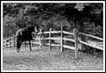
| 01/29/2008 06:11:42 PM |
Week1 - Is It Feeding Time Yet?by CapeSailComment: As a late commenter there's not much to add. I do like the environment, but (just translating the horse expression): Can't I get a closeup? But you got the expression! |
| Photographer found comment helpful. |
| 01/29/2008 05:53:08 PM |
Contre-jour Silhouette (b&w 2008 #1)by nikolaosComment: My first impression, where's the focus? Taking a closer look it's very nice on the face, but I think all the lights are too disturbing. Putting my hand in front of all the lights and it's really a great photo. |
| Photographer found comment helpful. |
| 01/29/2008 05:47:05 PM |
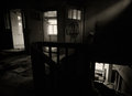
by MephistoComment: Too bad you didn't make the deadline. Think it's a little dark, but I like the light shining from the top right and for me the bottom right is just amazing. The left side is also very nice, but looks like a different story. |
| Photographer found comment helpful. |
| 01/29/2008 05:08:55 PM |
WK 4.jpgby salmiakkiComment: I like the colored version, but the B&W looks a lot colder. I'm completely ignoring the word "mild". Brrrr...... |
| Photographer found comment helpful. |
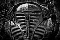
| 01/29/2008 04:53:56 PM |
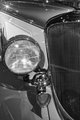
Week 04 - Studebakerby KenComment: Just wondering how you got all those nice stars here. Just the lights or some filter? Nice sharp shot, perhaps a little too much of the radiator (don't know if that's the right name, but I mean that thing on the right). |
| Photographer found comment helpful. |
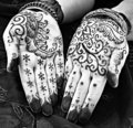
| 01/29/2008 04:36:33 PM |
Henna by AliciaComment: Didn't know anything about this, so yet another thing I learned (Googled it a little). Very nice drawings in B&W. Probably also nice in color. |
| Photographer found comment helpful. |
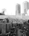
| 01/28/2008 03:19:08 PM |
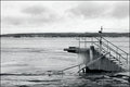
Graveyardby kolasiComment: Can't add much to the other comments. Perhaps you should add more contrast. Dark from the bottom to light in the sky. |
| Photographer found comment helpful. |
Home -
Challenges -
Community -
League -
Photos -
Cameras -
Lenses -
Learn -
Help -
Terms of Use -
Privacy -
Top ^
DPChallenge, and website content and design, Copyright © 2001-2025 Challenging Technologies, LLC.
All digital photo copyrights belong to the photographers and may not be used without permission.
Current Server Time: 08/11/2025 10:20:56 PM EDT.