| Image |
Comment |
| 05/04/2004 11:08:25 PM |
Tree Treasureby PoobaComment: Greetings from the Critique Club!
This was a hard challenge. Serendipity can mean this - finding money growing on a tree. However, this SHOT was not serendipitous. You planted it and thus it violates the SPIRIT of the challenge, if not the rule. As to the pic itself - why not put the money on a tree bud? Like it's actually "growing on trees." Or something similar.
The lighting is kinda flat and overall the shot could use a bit more interest. I like the idea, but it could use refining.
Happy shooting,
Mav |
 Photographer found comment helpful. Photographer found comment helpful. |
| 04/29/2004 05:30:32 PM |
Breakersby ImagineerComment: Greetings from the Critique Club!
Hi Jon - nice to meet you!
You rocked the score, so what is there to say? Well, I would have liked to seen any shots you got of those other 25 that were with you standing a bit more to the right, kind of behind where the waves were breaking.
I think I would have also preferred a closer crop - forcing the sun and the crashing waves to be the only real things in the photo, making each more powerful.
The color and lighting here are what this image holds itself up by. They are superior and very cool. I would have liked to see this IRL.
Nice job here as always, happy hunting and good luck! |
| Photographer found comment helpful. |
| 04/29/2004 05:22:24 PM |
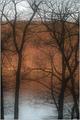
silhouetted viewby shutterflyComment: Greetings from the Critique Club!
Hiya Wendy, long time no speak!
I have to agree with two of the comments on this shot - the branches are distracting to a beautiful view, though they provide nice shapes to silhouette. The photo does need contrast though the lack gives it a slightly dreamy feeling.
Something else I noticed here - the view is nice, but not spectacular. I think this photo needs a more concrete subject than a nice view into a sorta nice lake. Maybe a canoe or a fisherman. Not sure, but something to add context.
Good luck and happy shooting!
Mav |
| Photographer found comment helpful. |
| 04/29/2004 05:18:28 PM |
Wild Blue Yonderby pmichaudComment: Greetings from the Critique Club!
Hi Patsy!
As this image is your highest rated yet, I find it almost amusing to try and tell you how to improve it. Instead, I'll focus on what I see and don't see.
What I see is that it looks like you used a gradiant fill from top right to bottom left. While these are nice effects and I use them as well, the black doesn't fit and the lines it creates in an image like this are distracting. You could have cleaned them up with a healing brush, though admittedly that's more work.
I also see a stunning shot with 3/4 of an inch off both the top and right margins. These areas aren't adding anything to the photo - get rid of them and make the subject larger as a portion of the image.
I don't see a pilot looking into the sun. I don't see the wing. And I don't see anything on the right side of the image to balance this composition except the streak in the upper right.
This is a wonderful image and congrats on your best yet score! Keep shooting and good luck!
Mav |
| Photographer found comment helpful. |
| 04/29/2004 05:14:42 PM |
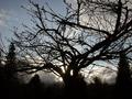
Untitledby spillerComment: Greetings from the Critique Club!
Nice to meet you, Lorraine. :)
This is a hard image to critique because I don't know if I wish you'd stepped 10 feet closer or 10 feet back. As it is, you aren't close enough to force the subject to be the ONLY real thing in the photo, yet you aren't back far enough to have captured the entire tree.
This is a nice silhouette, but I believe silhouettes are mostly about the shape created by the blackness. As such, the tree is a tad thick around the middle and is kinda 'blobby' down there. Perhaps a shot with more branches would have been more interesting, compositionally.
I think the clouds at the bottom of the image detract from the clear blue skies upper left. I would have preferred one or the other.
Happy shooting!
Mav |
| Photographer found comment helpful. |
| 04/29/2004 05:10:33 PM |
Waitingby artvetComment: Greetings from the Critique Club!
Hi Art!
DPC and "art" don't really belong together. It's a good site to learn some cool stock photography ideas, though. Now ya know, as JPR said.
As far as the image itself, if you're going to clean it up, why not go all the way and clean the rest of the brightest spots? It seems speckled in some places it should not be. The composition and lighting are great and I hope you continue to submit interesting shots.
Mav |
| Photographer found comment helpful. |
| 04/29/2004 04:59:36 PM |
For Which It Standsby hstegComment: Greetings from the Critique Club,
Hi Harrison, nice to meet you.
First things first: egillibsen's comment is his opinion, but a silly one. I think he gave you a 1 because it's an AMERICAN flag, not the Icelandic national flag. *shrug* Shooting the flag will always get a polar reaction. Oh well.
Thoughts - the toy part on bottom could have been cut off/removed so that we couldn't see how silly it looks as a toy. *shrug* Just a minor thing, but the diff between a 4.5 and a 6.5 is image quality and details, NOT in your idea, usually.
Given that this is a silhouette and the background is meant to look like something, I'd have preferred this bg be in focus and the subject be silhouetted but also sharp. The soft focus and partial overexposure on the left detracts from the image.
I don't like the thick border, but that's just my opinion. All borders are subjective and usually detract on dpc.
Mav |
| Photographer found comment helpful. |
| 04/29/2004 11:58:22 AM |
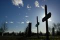
Final restby Mad-DComment: Greetings from the Critique Club!
Hiya Marino, nice to meet ya.
My first thought on this shot is that it needs a major crop. One of the most common problems in shots here on DPC is that the subject isn't focused on in a photo. Imagine a vertical crop from just left of the line of tombstones near the center of the image that extends just barely to the right of the last tombstone on the right, top to bottom just as it is. This new image would have none of the emptiness on the left side of the image and would have a very strong composition with the cross near the right-center of the image. As the cross is taller than it is wide, the vertical crop would enhance its shape (shape is what silhouettes are all about, non?)
Otherwise a fantastic image. Add about +5 on contrast and see how you like it. :)
Good luck and keep shooting,
Mav |
| Photographer found comment helpful. |
| 04/29/2004 11:54:56 AM |
Sunny Swanby WildpurpleComment: Greetings from the Critique Club!
Hi Carl, nice to meet you.
I'm not sure why you applied the blur, at all. I don't know that it added anything, but I'd have to see the sharper image. The blur here does nothing for me.
Also, why not pull back a bit from the bird, get more of the bird in front of the sun and shoot the whole curvature of the neck? It would seem a good plan.
The light is a bit bright, a bit harsh. Maybe if there were other background elements such as the sky or a horizon, we'd have more perspective.
Good luck and keep shooting!
Mav |
| Photographer found comment helpful. |
| 04/28/2004 08:07:10 AM |
|
| Photographer found comment helpful. |
Home -
Challenges -
Community -
League -
Photos -
Cameras -
Lenses -
Learn -
Help -
Terms of Use -
Privacy -
Top ^
DPChallenge, and website content and design, Copyright © 2001-2025 Challenging Technologies, LLC.
All digital photo copyrights belong to the photographers and may not be used without permission.
Current Server Time: 08/27/2025 11:16:52 AM EDT.