| Image |
Comment |
| 10/19/2009 03:10:06 AM |
Boat House View by Len ScapComment: Well how often does one of my favourites appear on the front page - let alone win!? Well done indeed :):) |
 Photographer found comment helpful. Photographer found comment helpful. |
| 10/14/2009 03:04:07 AM |
|
| Photographer found comment helpful. |
| 10/13/2009 09:52:10 AM |
A Refreshing Twistby wkdesignsComment: Hi from the Critique Club!
I like the idea behind your entry and I think that it fits the challenge well. You've made a good job of 'freezing' the water with a fast shutter speed. I don't feel that the main water flow is sufficiently sharp to grab attention, and like other commenters, I find the background distracting. I think it's definitely something you should work on, with different lighting, backgrounds, composition etc You've got the basic structure it just needs some polish - I look forward to seeing more! |
| Photographer found comment helpful. |
| 10/12/2009 04:15:28 PM |
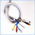
My Umbilical Cordby wdammanComment: Hi from the Critique Club!
I thought those tube things were supposed to stop your wires getting twisted?! ;)
A nice clean image that fits the challenge well. The composition, colours and focus are good, my eye keeps getting drawn to the area of blown highlight on the yellow jack. It's difficult to deal with this in Basic Editing as it's such a localised problem, I presume it's something you would have tackled without these constraints. You may already do this, but I find the adjustment brush in Camera Raw really useful for locally recovering highlights, without affecting the image as a whole. (I suspect this is illegal for Basic Editing so don't use it there - just a general observation)
Overall a good image that might have lost a few DPC points for being a bit 'stock'! |
| Photographer found comment helpful. |
| 10/12/2009 03:53:48 PM |
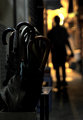
As an Arrowby DaleFrazierPhotographyComment: Hi Dale from the Critique Club!
I love the colours and lighting in your image, very rich and seductive. I usually like a shallow DOF but I don't feel it works well in this picture, the point (excuse the pun ;) ) of focus is at the very edge of the frame and my eye spends most of it's time elsewhere and there's nothing comfortable to rest my eyes on. The double reflection makes me feel a bit funny too, as though I'm going cross-eyed. A cleaner reflection, a larger DOF and a different placement of point of focus might turn this from a good image into a stunning one!
I hope that doesn't sound too negative, I really enjoyed spending time with your image :) |
| Photographer found comment helpful. |
| 10/12/2009 02:57:38 AM |
|
| Photographer found comment helpful. |
| 10/12/2009 02:57:32 AM |
|
| Photographer found comment helpful. |
| 10/10/2009 08:44:00 AM |
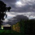
[CON] [VERGE]by ericwooComment: Hi from the Critique Club!
Well, there's not a lot to not like about this image and your score and placement reflect that!
The composition is very strong and the b&w conversion is excellent. The one thing that detracts from the image, for me, is the border. I checked that I actually did prefer it without the border by cropping it off and I preferred the resulting image. But that is a minor detail and very subjective!
Overall an excellent image and one to be proud of :) |
| Photographer found comment helpful. |
| 10/10/2009 02:52:26 AM |
Streetsby raishComment: I like the idea of lighted windows in the dark, but I don't think there is quite enough detail here to make an interesting shot. |
| Photographer found comment helpful. |
| 10/10/2009 02:51:20 AM |
|
| Photographer found comment helpful. |
Home -
Challenges -
Community -
League -
Photos -
Cameras -
Lenses -
Learn -
Help -
Terms of Use -
Privacy -
Top ^
DPChallenge, and website content and design, Copyright © 2001-2025 Challenging Technologies, LLC.
All digital photo copyrights belong to the photographers and may not be used without permission.
Current Server Time: 08/21/2025 02:38:52 AM EDT.


![[CON] [VERGE]](https://images.dpchallenge.com/images_challenge/1000-1999/1098/120/Copyrighted_Image_Reuse_Prohibited_824681.jpg)