| Image |
Comment |
| 11/22/2006 09:54:37 AM |
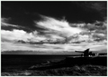
Gathering storm ,1941by fredandaudComment: Sorry for the low vote. The subject (tank) is just too dark for my taste. I think it would have been effective to have either a lower view point and create a silhouette or expose the tank more to gain more detail thus separating the tank. Also the clouds don't seem to be that much in focus. I don't know what f-stop you used, but perhaps you could have stopped it down? Mabye this could have been a good chance to use hyperfocal distance? |
 Photographer found comment helpful. Photographer found comment helpful. |
| 11/22/2006 09:39:56 AM |
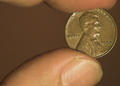
IMO...It was a good year!by SpitfyrComment: Good composition, but I think I would have liked it better with a little more finger on top to frame it out. Also about the background color...I think it compliments the coin very nicely. |
| Photographer found comment helpful. |
| 11/22/2006 09:34:44 AM |
|
| Photographer found comment helpful. |
| 11/22/2006 09:31:45 AM |
"Age of Aquarius"by birdyblueComment: No year in the title? How did you get such great feel with basic editing? A 10 for me except for the harsh shadow going up the nose and the bare shoulder breaking up the great read hair. |
| Photographer found comment helpful. |
| 11/22/2006 09:28:20 AM |
|
| Photographer found comment helpful. |
| 11/22/2006 09:27:10 AM |
|
| Photographer found comment helpful. |
| 11/22/2006 09:25:54 AM |
|
| Photographer found comment helpful. |
| 11/21/2006 11:42:44 AM |
The Littlest Cowgirlby NobodyComment: Great lighting and composition. The bokeh is distracting though and the huge area of bright on her right and to a lesser degree left are distracting. I would love to see the eyes brightened but I know this is basic editing only. I can't wait to see what lense was used. I've gone back and forth between 8 and 9...and I think I'll stick with 9 because of the emotion it stirs... |
| Photographer found comment helpful. |
| 11/21/2006 11:36:24 AM |
Style Classiqueby jdannelsComment: This is a solid 9.5 in my book but I'm very stingy with 10s. The only thing I can add as constructive critisism is the hat band is a little bright and the left side and the bright/shadow on her kneck is a little distracting. Also the tiny bit of bright light on her shoulder. I know that is nitpicking...
I love where you cropped; composition, lighting, texture and tone are all wonderful. |
| Photographer found comment helpful. |
| 11/21/2006 11:28:25 AM |
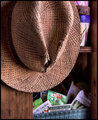
'Til Next Yearby glad2badadComment: Great photo! The lighting, framing and composition are excellent. The only reason I didn't give this a perfect 10 is because of the pots in the upper right. They are just a little distracting to me. Perfect title and (near) perfect picture. |
| Photographer found comment helpful. |
Home -
Challenges -
Community -
League -
Photos -
Cameras -
Lenses -
Learn -
Help -
Terms of Use -
Privacy -
Top ^
DPChallenge, and website content and design, Copyright © 2001-2025 Challenging Technologies, LLC.
All digital photo copyrights belong to the photographers and may not be used without permission.
Current Server Time: 09/03/2025 09:11:40 PM EDT.