| Image |
Comment |
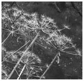
| 11/20/2006 02:09:28 AM |
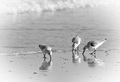
Inspect Carefullyby ElGordoComment: 5.5640 and 177th? You was robbed! Seriously, 'though, I really don't get this result - it is such a classic black and white and would make a superb print. |
 Photographer found comment helpful. Photographer found comment helpful. |
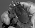
| 11/19/2006 01:35:28 PM |
Don't forget about meby MarellaComment: I have left this one til last to vote on, as I just haven't been able to work out what it is I am looking at. The subject is presumably the white thing on top of the rock, but I am still unable to make it out.... |
| Photographer found comment helpful. |
| 11/17/2006 11:39:10 AM |
Krissyby FalcComment: Excellent range of tones, utilising the black and white theme well. 9. |
| Photographer found comment helpful. |
| 11/17/2006 11:38:29 AM |
|
| Photographer found comment helpful. |
| 11/17/2006 11:37:59 AM |
Simple Faith by StuckOnTheFarmComment: I gave this a 9 on my first voting run through, but I am raising it to a 10 - I can find nothing that I would change, or that I wish had been done just that little bit better - Perfect. |
| Photographer found comment helpful. |
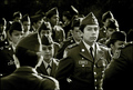
| 11/17/2006 11:35:46 AM |
Defianceby violinist123Comment: Looks like the drill sergeant is givimg them a hard time! A well captured moment with good lighting. It is a shame that the chap at the centre back and the girl to the right of the main subject aren't looking in the same direction as the others, as it does take away some of the impact. Good work, though. 9. |
| Photographer found comment helpful. |
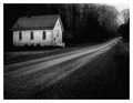
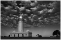
| 11/17/2006 11:32:34 AM |
Light house by FirstyComment: A starnge photo - the sky seems somehow seperate from the rest of the photo. Nonetheless, as a black and white photo it utilises the full range of shades from b through to w, and is earning an 8 from me. |
| Photographer found comment helpful. |
| 11/17/2006 11:30:52 AM |
|
| Photographer found comment helpful. |
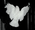
| 11/17/2006 07:52:56 AM |
Satin Wingsby NikonJebComment: You have caught some good detail in the bird, which is always difficult with white plumage, but the composition is dull and uninteresting. |
| Photographer found comment helpful. |
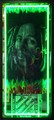
| 11/16/2006 02:46:08 PM |
Neon Music Shop Windowby SheryllComment: I gave you a 3 for this, although it was a very close run thing to a 4 - don't be too disheartened though, because I did vote consistently lower than my average throughout this challenge. Ivo has pretty much summed up my feelings - you have competently photographed someone elses artwork, but haven't brought anything of yourself to it. I note that you say you had originally wanted to photograph the series of three panels, but that someone was sat in front of one of them - I wonder whether there might have been a photo opportunity in that. Hope this explains one of your votes. |
| Photographer found comment helpful. |
Home -
Challenges -
Community -
League -
Photos -
Cameras -
Lenses -
Learn -
Help -
Terms of Use -
Privacy -
Top ^
DPChallenge, and website content and design, Copyright © 2001-2025 Challenging Technologies, LLC.
All digital photo copyrights belong to the photographers and may not be used without permission.
Current Server Time: 09/03/2025 05:07:08 PM EDT.