| Image |
Comment |
| 09/07/2012 11:23:41 AM |
|
 Photographer found comment helpful. Photographer found comment helpful. |
| 09/07/2012 11:23:17 AM |
|
| Photographer found comment helpful. |
| 09/07/2012 11:22:55 AM |
|
| Photographer found comment helpful. |
| 09/07/2012 11:22:21 AM |
|
| Photographer found comment helpful. |
| 09/07/2012 11:21:46 AM |
|
| Photographer found comment helpful. |
| 09/07/2012 09:09:02 AM |
|
| Photographer found comment helpful. |
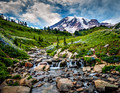
| 09/06/2012 08:39:18 PM |
Jeanetteby kawesttexComment: I will be honest, I find the crop completely wrong on this. The top half of the image seems wasted to me, as if you haven't done any cropping at all. Maybe you wanted the branches above her to 'frame' the scene, but they are too far away to help you IMO.
She's a very pretty lady and you captured her nicely, but there are blown out section on her hand that are a bit unfortunate.
|
| Photographer found comment helpful. |
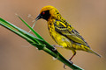
| 09/06/2012 04:07:33 PM |
Seanby Tommy_MacComment: While I think you did a fine job of balancing the amount of light on your son and allowing the sunset to still be visible and well exposed, the choice of on camera flash caused a harsh look. Further, the use of an appropriate gel to modify the color of the light from the flash to better match the light from the sunset would have really evened out the light.
For me, the balance of the colors of the light (harsh blue flash light and the soft warm oranges from the sunset) conflicted with each other.
Like others have stated, it is a great photo of your son and you SHOULD be proud of it. But for next time, get a set of gels so you can really make this one stand out for the rest of us! |
| Photographer found comment helpful. |
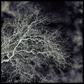
| 09/06/2012 03:42:22 PM |
Babelby tomeComment: I thought this one was brilliant when I saw it during voting. And at first, I thought it might very well be a combination of multiple images. I think you hit this one out of the park on attempting to achieve the startling and intense look of Peter Funch in a single snap. Well done! |
| Photographer found comment helpful. |
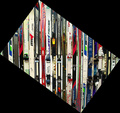
| 09/06/2012 02:10:14 PM |
tis the seasonby bmartuchComment: First off - I really like the IDEA of the shot. The repeating shapes of the various skis with the unique color patterns is a great subject. But I really can't stand the border at all (it was too much for me). I think I get the humor of it (angled without being angled), but those big black blobs in the corners really kills it for me.
|
| Photographer found comment helpful. |
Home -
Challenges -
Community -
League -
Photos -
Cameras -
Lenses -
Learn -
Help -
Terms of Use -
Privacy -
Top ^
DPChallenge, and website content and design, Copyright © 2001-2025 Challenging Technologies, LLC.
All digital photo copyrights belong to the photographers and may not be used without permission.
Current Server Time: 08/25/2025 08:13:08 PM EDT.