| Image |
Comment |
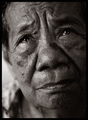
| 03/15/2007 04:41:40 PM |
Born 1900by facesastheycomeComment: the high contrast on this really works great. I like the angle you took to photograph this handsome person. |
 Photographer found comment helpful. Photographer found comment helpful. |
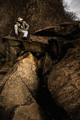
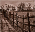
| 03/15/2007 04:35:26 PM |
Grainy Daysby JPRComment: well composed image. i like the tones and the lighting on the man and the rocks in the foreground. 7 |
| Photographer found comment helpful. |
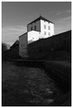
| 03/15/2007 04:32:46 PM |
Medievalby EkenborgComment: The perspective is very well done - it makes the building seem very imposing. I wish the water in the foreground were just a little brighter so that I could see a little more detail. For example, my monitor is pretty bright and I really have to work to see any detail at all in the wall. |
| Photographer found comment helpful. |
| 03/15/2007 04:22:55 PM |
Painby hotpastaComment: What a wonderful portait - the grain adds so much humanity to the image. |
| Photographer found comment helpful. |
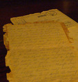
| 03/15/2007 06:58:16 AM |
Feldpost: 8/8/1944; Last letter Homeby dsternerComment: This is an incredibly awesome message. The major flaw I see is that the grain/ noise in the photo is a strange color. I pick up some greens and pinks in the grain, making this very important letter looks strange.
Edit - I would recommend trying this is B/W and using sepia (coloration of the b/w image) to bring out the old feel of it. |
| Photographer found comment helpful. |
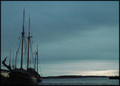
| 03/14/2007 09:39:37 PM |
Minimal Edit PAD 6 "Pelican Prow"by noranekoComment: I like the angle of the shot - looking down the bow of the boat works really well. Your decision to underexpose makes a lot of sense - you have a lot of white in this photo and you can dodge/ burn or selectively brighten areas of this a little to pop it more. |
| Photographer found comment helpful. |
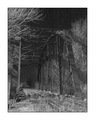
| 03/14/2007 09:17:21 PM |
|
| Photographer found comment helpful. |
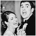
| 03/14/2007 09:15:11 PM |
Humor Meby ThingOneComment: Wonderful image -love the expressions and the choice of processing. This could easily be a hollywood movie set from the 1950's. Great job 9 |
| Photographer found comment helpful. |
| 03/14/2007 09:09:01 PM |
|
| Photographer found comment helpful. |
| 03/14/2007 09:06:32 PM |
|
| Photographer found comment helpful. |
Home -
Challenges -
Community -
League -
Photos -
Cameras -
Lenses -
Learn -
Help -
Terms of Use -
Privacy -
Top ^
DPChallenge, and website content and design, Copyright © 2001-2025 Challenging Technologies, LLC.
All digital photo copyrights belong to the photographers and may not be used without permission.
Current Server Time: 08/25/2025 05:26:14 PM EDT.