| Author | Thread |
|
|
03/21/2007 10:21:02 AM |
|
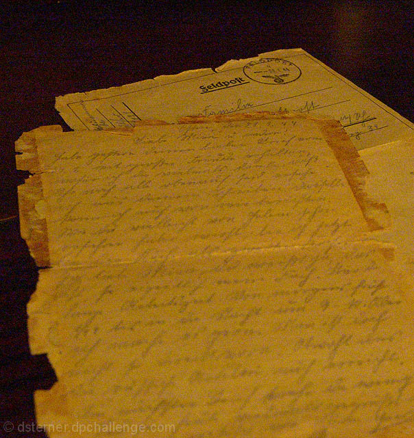
Hi Deb - I liked your idea here. I think the black background actually detracts from the picture. It's too harsh of a contrast. Since you are going for an old-time feel here, I would like to have seen this on a lighter table, maybe wood even, and then gone sepia. And then tone down the grain a tad, since the paper is already old. Also, I would have liked to have seen the sharp focus on the foreground rather than the background. Not a bad placement for a challenge this large! :o) |
|
 Photographer found comment helpful. Photographer found comment helpful. |
Comments Made During the Challenge  |
|
|
03/16/2007 04:51:30 PM |
|
Great Idea, to me DOF could have been better |
|
| Photographer found comment helpful. |
|
|
03/15/2007 06:58:16 AM |
This is an incredibly awesome message. The major flaw I see is that the grain/ noise in the photo is a strange color. I pick up some greens and pinks in the grain, making this very important letter looks strange.
Edit - I would recommend trying this is B/W and using sepia (coloration of the b/w image) to bring out the old feel of it. |
|
| Photographer found comment helpful. |
Home -
Challenges -
Community -
League -
Photos -
Cameras -
Lenses -
Learn -
Help -
Terms of Use -
Privacy -
Top ^
DPChallenge, and website content and design, Copyright © 2001-2026 Challenging Technologies, LLC.
All digital photo copyrights belong to the photographers and may not be used without permission.
Current Server Time: 06/30/2026 03:35:41 PM EDT.