| Image |
Comment |
| 05/03/2007 07:37:10 PM |
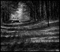
incomingby PhilComment: what amazing grain and color on this image - so foreboding and dark - love it (and I read your comment that you didn't like the processing!) |
 Photographer found comment helpful. Photographer found comment helpful. |
| 05/03/2007 07:35:05 PM |
|
| Photographer found comment helpful. |
| 05/03/2007 07:30:44 PM |
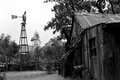
Boyce Arboritim Shackby BAMartinComment: love the perspective following the front of the shack lines back to the windmill. the bright empty sky actually adds to the desolation of this image - very very solid. |
| Photographer found comment helpful. |
| 05/03/2007 07:16:30 PM |
Day 3 - Book Storeby meneleComment: Boy, do I love b/w images of brick buildings - the have some many great textures and details that a typical color photo doesn't really show. I would really think this could be a little stronger of an image with a little more contrast and a little more definition of the bricks themselves - maybe on the unresize image with some USM say at 25,50,0 to bring out the contrast just a little. I think your idea about reshooting this is a good one - but I think it would actually be better with a little more shadow across the image - more dramatic that way. |
| Photographer found comment helpful. |
| 05/03/2007 07:10:27 PM |
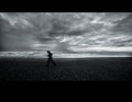
runby boysetsfireComment: The whole image is really cool - I even like the border on the top - but it seems to get a little unclear due to the dark sand/rock |
| Photographer found comment helpful. |
| 05/03/2007 04:38:00 PM |
With Back Turnedby lovethelightComment: I gave this a 6 during voting. The bokeh in the background is really nice and smooth. The interlocking flowers has a really sweet and gentle quality about it and the intersection of the two stems is really nicely placed at the upper third. The colors are really rich and deep - especially the golden hues of the flower. I think a little more separation of light between the subjects in focus and the background would really make this one stand out much more. Nice work. |
| Photographer found comment helpful. |
| 05/03/2007 03:20:08 PM |
PAD B&W Day 2 Untitledby noranekoComment: i like the grain and strong contrast work really well on the vast majority of the photo. But as others have noted, the halo around the hair is a problem. I almost think the vignetting accentuates the halo effect a little. One option is to dodge in the background to smooth out the halo so the entire background is lighter. Another nice effort - and three that are REALLY different from each other... |
| Photographer found comment helpful. |
| 05/03/2007 02:22:20 PM |
day 01by FirstyComment: wonderful shot - the tones, textures and contrast are really well done |
| Photographer found comment helpful. |
| 05/03/2007 01:31:34 PM |
Body languageby MelethiaComment: I am not sure what people were looking at saying this didn't follow rule of thirds. Maybe people are interpreting the rule to apply only in the vertical direction?!
I gave this a 7 for clearly meeting challenge (in both horiz and vertical, by the way) but that I didn't find it a 'wow' photo that could have bumped it up to 8... |
| Photographer found comment helpful. |
| 05/03/2007 11:54:30 AM |
Day 2by edmengComment: The crispness and depth of the focus is very impressive and the conversion to B/W provides very nice contrast and good tones and textures. That sigma lens sure seems to work pretty good! |
| Photographer found comment helpful. |
Home -
Challenges -
Community -
League -
Photos -
Cameras -
Lenses -
Learn -
Help -
Terms of Use -
Privacy -
Top ^
DPChallenge, and website content and design, Copyright © 2001-2025 Challenging Technologies, LLC.
All digital photo copyrights belong to the photographers and may not be used without permission.
Current Server Time: 08/26/2025 10:57:36 PM EDT.