| Image |
Comment |
| 07/28/2003 07:42:55 AM |
Pocket Change...by StevePaxComment: Composition: With the image fairly 'flat' in terms of what to focus on my eye was instantly drawn to the dark top-right coin/shadow.
Technical: Reasonable focus and colour. It looks slightly over-sharpened though, unless that's the coins themselves.
Meets challenge: Yes
Overall impression: An interesting image.
[ If this style of comment is useful, please leave a few yourself! www.calcaria.net/dpc.html ] |
 Photographer found comment helpful. Photographer found comment helpful. |
| 07/28/2003 07:40:43 AM |
What is That?by pepsipepsibabyComment: Composition: Nice angle of image - improves the shot dramatically for me.
Technical: I would have preferred more DOF, but this may be a camera limitation. Good colour and contrast where in focus.
Meets challenge: Mostly
Overall impression: Nice image only let down by DOF.
[ If this style of comment is useful, please leave a few yourself! www.calcaria.net/dpc.html ] |
| Photographer found comment helpful. |
| 07/28/2003 07:39:05 AM |
organicby sanandanComment: Composition: Interesting use of portrait.
Technical: The colour is great, but the flower is out of focus unfortunately.
Meets challenge: Yes
Overall impression: The photo looks a little dark, which most likely won't help focus. When this happens try and hold the camera steady and push the shutter button slowly. Or use a tripod, or rest your camera on something solid. Good effort.
[ If this style of comment is useful, please leave a few yourself! www.calcaria.net/dpc.html ] |
| Photographer found comment helpful. |
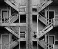
| 07/28/2003 07:36:44 AM |
Exposed Staircaseby d14Comment: Composition: Interesting choice to put the brickwork slightly off-centre and off a third, but it doesn't detract at all. I may have cropped a little tigher on the top edge, as the darkness top-right draws my eye.
Technical: Contrast is nice, but I would have tried a little sharpening to improve clarity.
Meets challenge: Yes
Overall impression: I love this style of photo but that small lack of clarity lets it down.
[ If this style of comment is useful, please leave a few yourself! www.calcaria.net/dpc.html ] |
| Photographer found comment helpful. |
| 07/28/2003 07:34:41 AM |
A Rose is a Rose is a Roseby mariomelComment: Composition: Good centralisation of the middle of the rose supported by the sharpness of the leaf to the left.
Technical: Nice DOF and colour. Really don't like the border - you will very rarely get higher scores for adding a shaded border - best to stick with simple ones.
Meets challenge: Yes
Overall impression: The subject is unfortunately a little imperfect, making an otherwise fairly flawless photo look a little poorer.
[ If this style of comment is useful, please leave a few yourself! www.calcaria.net/dpc.html ] |
| Photographer found comment helpful. |
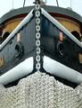
| 07/28/2003 07:32:06 AM |
Need a Push?by DrakeComment: Composition: Bold choice of a fairly centralised photo.
Technical: The colour of the boat makes it look a little dark, so I would have been tempted to take the photo more from the left, on the lighter side of the hull.
Meets challenge: The sky at the top lets it down a bit..
Overall impression: Interesting subject, I would maybe have tried a different composition.
[ If this style of comment is useful, please leave a few yourself! www.calcaria.net/dpc.html ] |
| Photographer found comment helpful. |
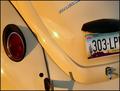
| 07/28/2003 07:29:21 AM |
'67 Beetleby tfarrell23Comment: Composition: May have tried to use the ROT's a little more, although I appreciate the parts are a little far apart.
Technical: Nice contrast and lighting. Interesting shadows too. Around the bumper and numberplate it looks stepped - poor resize?
Meets challenge: Yes
Overall impression: It's rare for car shots to look nice, but this is a good example. Let down slightly technically, but otherwise spot on for me.
[ If this style of comment is useful, please leave a few yourself! www.calcaria.net/dpc.html ] |
| Photographer found comment helpful. |
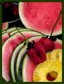
| 07/28/2003 07:24:19 AM |
Fill Me With Fruitby fleenkComment: Composition: Good choice of a portrait shot and layout and centre-most skewer (?) and slided melon to lead the eye
Technical: Looks a little dark, which almost makes you think the melon is noisy. The thing in the top-left is obscured by darkness.
Meets challenge: Yes
Overall impression: You had a lot of elements right, but I think increasing the light and playing around more may have helped.
[ If this style of comment is useful, please leave a few yourself! www.calcaria.net/dpc.html ] |
| Photographer found comment helpful. |
| 07/28/2003 07:20:57 AM |
Mikeby jimmyn4Comment: Composition: Nice close crop and good choice of angle.
Technical: Nice lighting and good focus.
Meets challenge: Yes
Overall impression: Nice, but I can't help looking at the dust on the eye.
[ If this style of comment is useful, please leave a few yourself! www.calcaria.net/dpc.html ] |
| Photographer found comment helpful. |
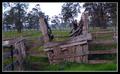
| 06/26/2003 04:56:32 PM |
Stock Rampby LuckydogComment: Composition: I think the lack of straight lines makes this really hard to shoot. Nice work with what you had, but I might have tried a different angle or subject.
Technical: Good focus and colour - and it is COLOUR!
Meets challenge: Yes
Overall impression: Nice pic. Slightly issue with leading the eye towards left? |
| Photographer found comment helpful. |
Home -
Challenges -
Community -
League -
Photos -
Cameras -
Lenses -
Learn -
Help -
Terms of Use -
Privacy -
Top ^
DPChallenge, and website content and design, Copyright © 2001-2025 Challenging Technologies, LLC.
All digital photo copyrights belong to the photographers and may not be used without permission.
Current Server Time: 08/26/2025 09:56:13 PM EDT.