| Image |
Comment |
| 11/19/2003 05:39:01 PM |
Hallowed Groundsby fisheyeComment: Greetings from the Critique Club: This certainly meets the challenge and the image is shot from an more interesting angle than not. The color of the Headstones is mellow and gentled by the light. The sky is kind of washy and it would have been good to use a filter to intensify the tones. The upper right section of the image begins to wash out a bit as well. It is a bit difficult to determine your intent with this image: was it for the serene and time-honored feel or did you mean it to have more intensity? The intensity is just not there for me and yet the marking of the unknown soldier tells me I should have more of a reaction. I do, however, get the sense of peace and tranquility that is marked out by the many tombstnes. Interesting image. |
 Photographer found comment helpful. Photographer found comment helpful. |
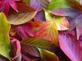
| 11/18/2003 08:31:10 PM |
Under the garden treesby puyaComment: Greetings from the Critique Club: this is a lovely image and an interesting approach to the challenge. The colors are clear, compelling, and the composition (natural or artful or a combination) is satisfying. There is a nice leading movement for the eye toward the light. The light gets a little cold but it is acceptable given the seasonal naure of the image. Focus is good. It is also nice that there is depth to the image and not just one flat layer in the composition so that the whole image maintains some interest. |
| Photographer found comment helpful. |
| 11/17/2003 05:00:12 PM |
San Filipe de Neriby Firstrich1Comment: lovely image that I didn't pay enough attention to during the challenge. Congratulations on the top ten placement. Anne |
| Photographer found comment helpful. |
| 11/17/2003 12:30:26 PM |
Narcissistic Potato Masherby QuadrajetComment: Welcome from the Critique Club: To begin with, for me the title is pretentious. I don't think of Narcissim as 'fancy dress' but rather as an intensely lonely and gapingly empty place constantly rewounded by the effect of others. Technically the image is well-lit, has good texture and color, but the overall composition is stiff and top-heavy. Have you thought of flipping it on its side where, for this viewer, it has more wow factor? It also appears to be able to flex its muscles a bit where it is crowded as it is. I realize that this image placed very well in the Challenge but at the time and on review it didn't grab me quite as much as it did others. As far as fit for the challenge, with the above caveats I think it is an interesting and creative challenge response. |
| Photographer found comment helpful. |
| 11/17/2003 07:56:50 AM |
|
| Photographer found comment helpful. |
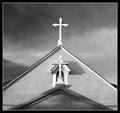
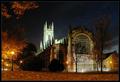
| 11/17/2003 07:56:07 AM |
Reflections on Eternityby dsidwellComment: Congratulatons on this. I didn't recognize it although I was there for the Olympics. I like the 180 degree turn, your wife must be very wise (lol) |
| Photographer found comment helpful. |
| 11/17/2003 07:53:59 AM |
|
| Photographer found comment helpful. |
| 11/17/2003 07:41:11 AM |
|
| Photographer found comment helpful. |
| 11/16/2003 10:19:57 PM |
Something blue...by amazoneeaComment: Greetings from the Critique Club: Something Old Something New, Something Borrowed, Something Blue...I appreciate the scene you set for this image. Using the blue netting to carry out the theme is very successful, it adds texture and just the right amount of color. The focus is crisp but the silver underlay that catches light in hotspots gets overpowering in the upper right corner. Perhaps that could have been pulled back and softened a bit. The composition overall is quite graceful and the hard lines of the shoe balance the softness of the roses. This composition also raises a question, however, and that is what is the mood or emotion that you wish to express? Is this a happy memory or a sad reminder, or is the shoe a different statement altogether? While I want an image to raise questions I would appreciate a bit more emotional direction, a little more clarity and intensity. Very interesting image and worth taking time to view. |
| Photographer found comment helpful. |
| 11/15/2003 10:16:43 PM |
The Sands Of Time by QuadrajetComment: Greetings from the Critique Club:
Well, searching frantically for something I can take issue with I notice a small, small need for a tiny crop on the upper right. The image is quite wonderful, meets the challenge with originality and with distinction. The use of the blue gel in front gives an unearthly look that balances well with the gold/yellow. The waves in the sand are a nice background for the rounds of the watches. The light painting technique is very successful here, and understated as it should be. A very satisfying submission. Message edited by author 2003-11-15 23:28:32. |
| Photographer found comment helpful. |
Home -
Challenges -
Community -
League -
Photos -
Cameras -
Lenses -
Learn -
Help -
Terms of Use -
Privacy -
Top ^
DPChallenge, and website content and design, Copyright © 2001-2025 Challenging Technologies, LLC.
All digital photo copyrights belong to the photographers and may not be used without permission.
Current Server Time: 08/29/2025 12:23:23 AM EDT.