| Image |
Comment |
| 06/19/2003 12:52:55 PM |
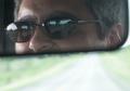
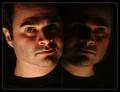
The rear viewby Dim7Comment: Interesting idea, but the mirror cuts the photo too sharply in half, in my opinion. I like that the road is more clearly reflected in the sunglasses than out the window, though. That's interesting! |
 Photographer found comment helpful. Photographer found comment helpful. |
| 06/19/2003 12:51:15 PM |
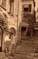
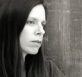
Back to the old daysby ewebComment: I like the feel of this photo, but I would a) kick up the contrast a little to go for an even more dreamy effect, and b) make yourself more of the subject of the photo than the architecture. I like the photo overall, but I'm not sure "self-portrait" is what jumps to mind because you almost blend into the background and don't really stand out as the subject. |
| Photographer found comment helpful. |
| 06/19/2003 12:49:30 PM |
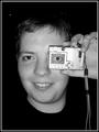
More than meets the eyeby finnurComment: Very creative and more than a little creepy, that eye on the LCD. :) Nice composition and feels overall pretty clean. When you can do your own edits, get that white speck out of the upper-left corner. It's very distracting! |
| Photographer found comment helpful. |
| 06/19/2003 12:47:42 PM |
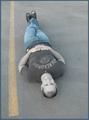
The Devil in Bluejeansby PedroComment: I like the hand-painted feel that you get from the low saturation, but the composition doesn't do a lot for me. The concept is unusual and interesting -- guess I don't get the asphalt thing, though. Feels like you're lying in the middle of the road? Which, if one is smiling, kinda lends an insanity to it that detracts from the nice smile. |
| Photographer found comment helpful. |
| 06/19/2003 12:43:56 PM |
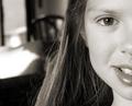
Just thinking...by gcosueComment: The DOF really adds something to this photo, makes your left eye really pop out (in a good way, I mean, hmm, that sounds weird) :) I might have tried to get just a bit more on the top edge, because it's cropped SO close on the right eye that it feels cut off. |
| Photographer found comment helpful. |
| 06/19/2003 12:42:43 PM |
Me, Myself and ...by mariomelComment: I love the lighting here! Might have cropped higher on the bottom, since it feels like there's too much space there compared with at the top where you're kind of cut off. |
| Photographer found comment helpful. |
| 06/19/2003 12:41:40 PM |
Seriously Thirty Somethingby PaigeComment: Very clean and sharp, the contrast of the skin tone against the backdrop is great! I like the off-center composition and I think that desaturated was definitely the way to go. Good work! |
| Photographer found comment helpful. |
| 06/19/2003 12:40:39 PM |
Is This Really Me?by mcraelComment: Comments: you look uncomfortable in this pic, which is a minus. Wistful would work, or happy, better. Would like the rose to be more prominent -- looks like it's an afterthought in this pic. Like the backdrop very much (looks like steps or something), as well as the lighting. The composition also works, because of where your gaze is directed. |
| Photographer found comment helpful. |
| 06/16/2003 07:31:44 PM |
Taylor, Home at Homeby PaigeComment: Of all the faces this week, I found this one the most interesting. The negative space on the left looks like a dining-room table, or something that definitely indicates "home," which the title confirms. I like how this is cropped -- you don't feel like you are losing anything even though it's only half of the face. |
| Photographer found comment helpful. |
| 06/16/2003 07:26:03 PM |
Rarified Airby ToddhComment: The top of the person's head at the bottom kind of ruins this photo for me, because I can tell it's been tilted (the cloud also gives it away). With the head cropped out, I think this would be a pretty good shot! |
| Photographer found comment helpful. |
Home -
Challenges -
Community -
League -
Photos -
Cameras -
Lenses -
Learn -
Help -
Terms of Use -
Privacy -
Top ^
DPChallenge, and website content and design, Copyright © 2001-2025 Challenging Technologies, LLC.
All digital photo copyrights belong to the photographers and may not be used without permission.
Current Server Time: 08/23/2025 05:30:53 PM EDT.