| Image |
Comment |
| 11/20/2006 01:00:18 AM |
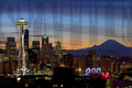
Seattleby cabaComment: Lovely photo. Though it might be nice to see the blue and red a little more desaturated because it draws my attention to that. The sky is also nice, I think it's much nicer than if there would have been large pillowy bright clouds, because that would have been a bit busy. The use of text is pretty cool, very "postcard." |
 Photographer found comment helpful. Photographer found comment helpful. |
| 11/20/2006 12:58:40 AM |
|
| Photographer found comment helpful. |
| 11/20/2006 12:56:20 AM |
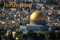
Flashpoint of the worldby LevTComment: I really love this challenge because I get to see all these places I've never been! Lovely photo. And I like how you used the same color in the text. The one thing I might have done is included more to the left and less to the right, to get the...is it a templa?..more off to the side. |
| Photographer found comment helpful. |
| 11/20/2006 12:55:08 AM |
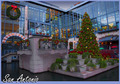
Feliz Navidad!by SandyPComment: The image really does give the Chirstmas vibe! The colors are really nice. Though the image looks a bit dark and blue...could just be my screen though. Cuz all my images look yellow on everyone elses monitor. |
| Photographer found comment helpful. |
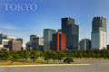
| 11/20/2006 12:53:22 AM |
Tokyoby postoakinversionComment: Does that one building have a hat on? haha, jk. Looks like it's under construction or something. Everything looks so nice. You know how most adds of models are "perfect" as far as wrinkles, blemishes etc, that's how this shot looks. The trees look perfect. The grass. The ground...The building...A very "groomed" city if you will! Nice capture. And I like that the text isn't overpowering because of the opacity change. |
| Photographer found comment helpful. |
| 11/20/2006 12:51:47 AM |
|
| Photographer found comment helpful. |
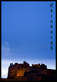
| 11/20/2006 12:51:23 AM |
Well you didn't come for the weatherby mambaComment: The text fits with the subject, but I can't read it! Ah, now I got it. Edinburgh? (Sorry...i'm not trying to be snide!) I like the lighting of the castle, it adds a nice contrast to the blue. And the nice big blue sky makes it nice and simple. |
| Photographer found comment helpful. |
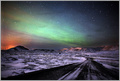
| 11/20/2006 12:49:56 AM |
Welcome to the North Pole by LalliSigComment: WOWOWOWOWOW! I can almost guarantee this will ribbon! HOLY CRAP! This is by far one of the coolest photos I've seen on this site. I'm adding it to my favorites.
I pretty much love everything about it...WOW 10+++++ |
| Photographer found comment helpful. |
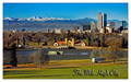
| 11/20/2006 12:48:46 AM |
Denver - The Mile High Cityby CutterComment: Hey, my home town is a mile high too! But I can't tell you which city or I would reveal my entry :) I really like the use of foreground, mid ground (I don't think that's a word, but whatever!) and background. There is also a lot of nice detail in the mountains in the back. |
| Photographer found comment helpful. |
| 11/20/2006 12:47:28 AM |
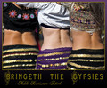
Bringeth the Gypsiesby fotomann_foreverComment: He he! I like your creativity with the subject. I like the repetition in the bodies and outfits. There almost perfectly spaced out. The one thing I might fix is making the "Mobile Renaisance Festival" text different. Keep the style because it totally goes with the subject, just make it less curly cue or something. 8 |
| Photographer found comment helpful. |
Home -
Challenges -
Community -
League -
Photos -
Cameras -
Lenses -
Learn -
Help -
Terms of Use -
Privacy -
Top ^
DPChallenge, and website content and design, Copyright © 2001-2025 Challenging Technologies, LLC.
All digital photo copyrights belong to the photographers and may not be used without permission.
Current Server Time: 06/17/2025 10:15:50 AM EDT.