| Image |
Comment |
| 04/13/2004 10:35:26 PM |
The Shining Crescentby tyt2000Comment: Seems slightly tilted. I would have gotten rid of the light on the sides all together. The composition here is fantastic. You have a great eye. I don't care for the sepia in this image, it does nothing for me. 8 |
 Photographer found comment helpful. Photographer found comment helpful. |
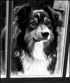
| 04/13/2004 10:34:19 PM |
Does anyone care that it's raining out here?by admart01Comment: What a face. I love to see people submit GOOD pet shots. I hate how people bitch (no pun intended) and moan about it all the time. Dogs can do no wrong by me, only photographers that think any photo of their dog is good. You get a 10 from me because this really is good and quality photography like this should never be frowned upon no matter how cliche the subject. |
| Photographer found comment helpful. |
| 04/13/2004 10:31:54 PM |
Ray Of Lightby qmdiComment: Beautiful. Perfect. Nothing to say really. Might get scored low since the view is not out the window or reflected in the window, hence it is not a window view, but I still give it a 10. |
| Photographer found comment helpful. |
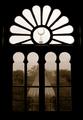
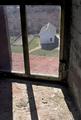
| 04/13/2004 10:31:04 PM |
window to the pastby nordicComment: The washed out sky and the straightline at the top really take away from this fantastic image. If this is somewhere near where you live you absolutely must go out here when the lighting is perfect. Perhaps a slightly wider crop would add more balance. 9 |
| Photographer found comment helpful. |
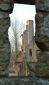
| 04/13/2004 10:29:18 PM |
A Glimps Back in Timeby LtHousLadyComment: The more I look at this image the more i like it. The off-kilterness adds to the feeling of vertigo looking down as if falling into the past. The lines of the window, wal, ledge, shadows, and horizon make interesting shapes. I can tell a lot of thought was put into the composition. 9 |
| Photographer found comment helpful. |
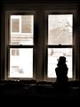
| 04/13/2004 10:26:55 PM |
Waitingby mariomelComment: I like the contrast of highkey and lowkey here and the silhouette with the hat is very effective. I need to go out and buy a cool hat for the silhouette challenge I think! 10 |
| Photographer found comment helpful. |
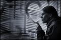
| 04/13/2004 10:26:00 PM |
the Prowlerby spydrComment: Great idea. I like the blue light from the television set and the fact that the tv is actually seen reflected in the mirror. Get rid of that bright spot on the door and give it a gentle run through neatimage. 9 |
| Photographer found comment helpful. |
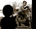
| 04/13/2004 10:23:31 PM |
I want to ride too...by cbellerComment: This is one of the best shots in the challenge, one of the few in which the off center placement of the blurry windowframe actually works as it is balanced by the kids silhouette. The vintage sepia look works well with the candid nature of the shot and the timelss horse. 10 |
| Photographer found comment helpful. |
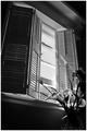
| 04/13/2004 10:22:02 PM |
a Room with a viewby NazgulComment: Love your toning. I'd love it if you could share your editing workflow to achieve the tone after the challenge is over. 10 |
| Photographer found comment helpful. |
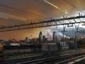
| 04/13/2004 10:21:14 PM |
|
| Photographer found comment helpful. |
Home -
Challenges -
Community -
League -
Photos -
Cameras -
Lenses -
Learn -
Help -
Terms of Use -
Privacy -
Top ^
DPChallenge, and website content and design, Copyright © 2001-2025 Challenging Technologies, LLC.
All digital photo copyrights belong to the photographers and may not be used without permission.
Current Server Time: 06/26/2025 05:27:16 PM EDT.