| Image |
Comment |
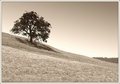
| 09/12/2006 06:19:01 PM |
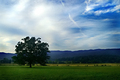
Solitudeby PhilComment: Too much sky, and some overexposed spots in the sky to boot. Composition is ok, if uninspired. Just not much going on here to pull me in. Good luck. |
 Photographer found comment helpful. Photographer found comment helpful. |
| 09/12/2006 06:17:46 PM |
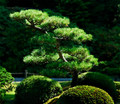
Zen Garden Pineby Dr.ConfuserComment: This is the sort of photo I would expect to see in a gardening book or magazine. 'Here is what a zen garden pine looks like'. Nothing more, nothing less. A photo that serves one narrow, informational purpose. In such a publication, a shot like this has both place and purpose. Here in a photo challenge, I'm afraid it offers nothing at all and is probably going to score poorly as a result. Lighting here is a bit rough with some very dark shadows and very bright higlights working against each other. Bit too much etail left in the background which clutters up the image. Might try a larger aperture next time and/or crop the photo tighter so that your main subject is more prominent. Good luck. |
| Photographer found comment helpful. |
| 09/12/2006 06:14:21 PM |
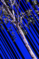
Tree on Blue & Blackby sfaliceComment: Very unappealing lighting. Your idea here isn't a bad one, but the fact that the tree doesn't follow the same angle as the blue and black stripes sort of makes it all fall apart. |
| Photographer found comment helpful. |
| 09/12/2006 06:13:11 PM |
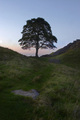
Sycamore Gapby AngelisComment: Not bad. I like the bits of wall and rock that break up the photo. I do think this would have been about 4,000 times more appealing had you arrived earlier or stayed later to get the full effect of that sunrise/sunset that is going on in te background. Good luck. |
| Photographer found comment helpful. |
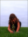
| 09/12/2006 06:06:28 PM |
Hope For Tomorrowby taterbugComment: Nice concept. Soft focus glow is alright but I'm not sure what purpose it serves here. I think a tighter crop would also highlight the girl and her tree and reduce the amount of harsh whightness at the top of the sky. Also the grass in front of her hands and the tree should have been dealt with so that the true subject of the shot is not obscured. Good luck. |
| Photographer found comment helpful. |
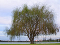
| 09/12/2006 06:04:01 PM |
Tree With a Viewby Delta_6Comment: Composition is a bit rough here. One massive tree with a little bit of interesting shoreline tucked away behind it. Also looks like the tree is a bit out of focus. The tree itself has some interesting detail, and I think this shot would have worked better if composed more or less along the line of the rule of thirds. Tree off to the left, a nice clean view of some of the shoreline buildings leading off to the other edge, etc. Good luck. |
| Photographer found comment helpful. |
| 09/12/2006 06:01:37 PM |
Fading Lightby Faye PekasComment: USM halo around the tree is distracting. Composition is nice, if rather unoriginal and uninspiring. I do think the BW processing works in this shot, though a stronger touch of contrast might have brought out the fence rails a bit more which would really work well here. Would also have darkened the shadow beneath the tree which wouldn't be a bad thing either. Good luck. |
| Photographer found comment helpful. |
| 09/12/2006 05:59:30 PM |
Rebirthby BeeCeeComment: Like the lighting and I like the concept. I think a bit of a tighter crop would have worked better here, particularly one that lopped off a bit of the growth at the bottom left to give even more attention to the highlighted piece of plant in the center (which the lighting has basically put a spotlight on). Nice shot, good luck. |
| Photographer found comment helpful. |
| 09/12/2006 05:56:22 PM |
In The Beginningby ltlmschrisssComment: I guess you either like selective desat or you don't. I'm probably in the minority as it doesn't really float my boat. That aside, this is a nice photo with an original take on the challenge theme. The highlights on that hand, particularly on the thumb, are a bit bright but I do like the shadows created by the harsh lighting. Very good focus and good choice of aperture here. I'm sure this shot will do well, good job. |
| Photographer found comment helpful. |
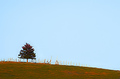
| 09/12/2006 05:54:29 PM |
Lone Tree on the Hillby lifternessjtComment: Oversharpened is the biggest problem with this photo. Second to that is the mass of unappealing sky sominating the photo. I do like the fence posts or whatever they are lining the ridge. I think this might have worked quite a bit better if either shot closer to the tree or cropped so that the tree is muc larger and the sky is much less prominent. Something is wrong with the colors here as well. The composition itself, while as unoriginal as the other photos exactly like this one in the challenge, is technically correct so your eye is working for you in that regard. Hope these comments are helpful. |
| Photographer found comment helpful. |
Home -
Challenges -
Community -
League -
Photos -
Cameras -
Lenses -
Learn -
Help -
Terms of Use -
Privacy -
Top ^
DPChallenge, and website content and design, Copyright © 2001-2025 Challenging Technologies, LLC.
All digital photo copyrights belong to the photographers and may not be used without permission.
Current Server Time: 06/19/2025 02:03:23 PM EDT.