| Image |
Comment |
| 04/25/2005 10:02:18 PM |
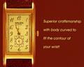
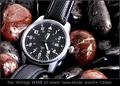
Graceby gudbjargarsonComment: Nice use of negative space. There could have been a little more lighting on the jewelry. |
 Photographer found comment helpful. Photographer found comment helpful. |
| 04/25/2005 10:01:07 PM |
|
| Photographer found comment helpful. |
| 04/25/2005 09:57:22 PM |
|
| Photographer found comment helpful. |
| 04/25/2005 09:55:50 PM |
|
| Photographer found comment helpful. |
| 04/25/2005 09:54:51 PM |
|
| Photographer found comment helpful. |
| 04/25/2005 09:51:43 PM |
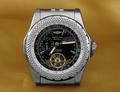
CGby whiteroomComment: Nice. Could be inserted in Vogue and nobody would know the difference. |
| Photographer found comment helpful. |
| 04/25/2005 09:51:14 PM |
|
| Photographer found comment helpful. |
| 04/25/2005 09:49:34 PM |
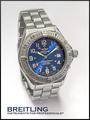
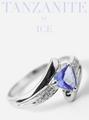
Iceby bruskiComment: Nice. Looks like a magazine sales ad. |
| Photographer found comment helpful. |
| 04/25/2005 09:48:24 PM |
|
| Photographer found comment helpful. |
| 04/25/2005 09:47:26 PM |
Fidelityby ergoComment: The text could be a little larger. It kind of looks out of place. I like the concept though. |
| Photographer found comment helpful. |
Home -
Challenges -
Community -
League -
Photos -
Cameras -
Lenses -
Learn -
Help -
Terms of Use -
Privacy -
Top ^
DPChallenge, and website content and design, Copyright © 2001-2025 Challenging Technologies, LLC.
All digital photo copyrights belong to the photographers and may not be used without permission.
Current Server Time: 08/22/2025 11:28:34 PM EDT.