| Image |
Comment |
| 09/05/2006 07:24:24 PM |
Until you are dead, dead, DEAD.by Delta_6Comment: Hello from the Critique Club,
I think the comments you received during the challenge pretty much take care of the technical issues with your entry. One thing the voter�s at DPC are sticklers for is solid black backgrounds. Your lighting of the rope is excellent and the detail visible on the rope is also very good.
As for the subject and title chosen for your entry, obviously you touched a few raw nerves, as your histogram is heavy on the 1�s and 2�s. This image does not deserve a sub-five score based on its technical merits, so the subject had to play a large factor when all is said and done. The judging was rough for any shot that wasn�t extremely creative and even rougher when the subject wasn�t voter friendly. Keep shooting and I look forward to seeing more of your entries.
Tim
|
 Photographer found comment helpful. Photographer found comment helpful. |
| 09/05/2006 02:39:55 PM |
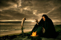
The Angel Of Beauty!!by KitaComment: Hello from the Critique Club:
I didn�t vote on this challenge, so this is my first time looking at your image. First I must commend you for taking on the tougher of the two open challenges and you did it with a self image. I�ve really never dabbled in soft focus before but I believe you choose one of the most suited subjects for this style, a portrait of a person. Over all your technique is as good as I would have expected for this challenge. As a few of the comments you received during the challenge mentioned, the positioning of your arms probably had a small negative effect on your score. I applaud you for trying for a certain effect and although you didn�t quite achieve the look you were going for, you still managed a very strong entry. Nice job.
Tim
|
| Photographer found comment helpful. |
| 08/28/2006 02:08:11 PM |
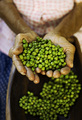
Peaceby BoltiComment: Hello from the Critique Club.
Looking at the voting histogram for this image I must confess that I am confused. How five people could score this a one I have no idea. Your subject was peas and definitely met the challenge. The idea was simple but well executed. A person would have to be blind to miss the humor. The lighting was well done, as the peas have good color, texture, and the shadows help to give a three-dimensional look to the peas. The only suggestion I have for improvement would be to use a square crop for this image, as the negative space to the right doesn't really add to the composition. Your score was solid for such a simple idea but it should have been higher IMHO.
Feel free to PM me if you have any questions regarding this critique.
Tim
|
| Photographer found comment helpful. |
| 08/28/2006 01:54:13 PM |
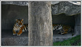
A Rare Sighting of the Mysterious 20 Foot Long Tigerby timfythetooComment: Hello from the Critique Club.
What can I say? You took what could be considered a snapshot and made it into a very good challenge entry. You knew going in that this didn't have enough Wow Factor to win but it is nice to see that the voters can reward a good image with a good score. All of the technical aspects are well done, focus, cropping, post processing.
The only suggestion I have is to take some studio lights and a generator with you next time and light the lion's den properly ;-). Nice job.
Feel free to PM me if you have any questions regarding this critique.
Tim
|
| Photographer found comment helpful. |
| 08/28/2006 07:40:16 AM |
ZORIAby nikmaticComment: Hello from the Critique Club.
This image has so many positive things working for it, the shallow depth of view concentrating on the peas, the texture of the hands, the arms providing nice leading lines for the viewer's eyes to follow. However, I find my eyes moving towards the bottom part of the image because the pile of peas in the bowl is larger than the pile in her hands. I think you will find that by cropping the image to remove part of the bowl will help keep the viewer's eyes on the peas in her hands. I would suggest cropping so that the peas on the left side of the bowl are removed. Since these peas are in better focus than the ones at the bottom of the bowl, they become a competing focal point to the peas in her hands. This will also help shift the peas in her hand from the center of the image to a point that meets the rule of thirds.
Feel free to PM me if you have any questions regarding this critique.
Tim
|
| Photographer found comment helpful. |
| 08/25/2006 12:03:02 PM |
Overkillby timfythetooComment: Hello from the Critique Club.
I didn't vote on this challenge so this is the first time I've looked at your image critically. With your experience at DPC, I'm sure you aren't all that disappointed with the score for this image. You know what it takes to win and this image didn't quite have what it takes.
The composition of this image is spot on, the intersection of the roasting fork with the lower right corner, the border, all help make the center framing of the flame work. Probably the thing that affected your score the most is the lack of detail in the flame. The dark space formed by the two merging flames is wonderful and really adds to the image but as your eyes follow the merged flame, the appeal diminishes because of the blown highlights. I'm not sure if this would work but it would be interesting to see if a spot light of some sort could be placed on the marshmallow and thus allow for a shorter exposure time to prevent the blown highlights.
Feel free to PM me if you have any questions regarding this critique.
Tim
|
| Photographer found comment helpful. |
| 08/25/2006 11:42:52 AM |
Summoning the flames by TUBORGComment: Hello from the Critique Club.
Well isn't this my lucky day. First I get assigned Judi's Fire II challenge entry and now the image that won the blue ribbon. What can I say about an image that scores a 7+? Congratulation! Nice Job! Wow! Bet you haven't heard any of these regarding this image. When someone produces an image of this quality, the score and placing are more a factor of the voter's tastes than the technical aspects of the image. You put all the pieces together and the voters loved it. With fullest sincerity, Congratulation! Nice Job! Wow!
Feel free to PM me if you have any questions regarding this critique.
Tim
|
| Photographer found comment helpful. |
| 08/25/2006 08:15:05 AM |
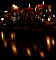
Candlelight Reflectionsby andrea22_alsComment: Hello from the Critique Club.
I didn't vote in the Fire II challenge so this is the first time I've taken time to look at your image critically. Overall you chose a very strong subject for this challenge that should have scored higher than the five that it did. This would indicate that there were technical or compositional issues with your image. It is my belief that the primary issue was compositional. My first impression when I looked at your image was "Wow, there is a lot going on in this picture". In your image there are two primary focal points competing for the viewer's attention, the side reflected candles on the left and the back reflected candles on the right. Since the back reflected candles are more aesthetically pleasing than the left reflected candles, this image should have been cropped to eliminate the reflected candles on the left. You might want to consider using a square crop to eliminate the reflections off the shelf as well, as these reflections also compete against the wonderful grouping of candles on the right.
Feel free to PM me if you have any questions regarding this critique.
Tim
|
| Photographer found comment helpful. |
| 08/24/2006 12:20:42 PM |
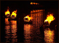
Battle of the Elementsby bgrinbergComment: Hello from the Critique Club.
I didn't vote on this challenge so this is the first time I've looked at your image critically. My first impression of this image is "Wow, this has a lot of stuff going on". To the voter, this means that there isn't one true focal point to the image to lock in on visually except for the color. And in this challenge, the color is pretty common. There are a couple of areas within this image that are competing with each other and neither one wins. First, there are the two fire pots on the left. The spacing difference between these two pots and the two on the right make it difficult to choose which group is more important. Second, the pots at the top of the image almost look like they were partially cropped off (Most probably something is blocking the view). Actually cropping the top fire pots might have helped the image but leaving their reflections in the water would have looked odd. When all is said and done, you probably should have simplified the composition by zooming in on just one of the groups.
On the technical side, I agree with the one commenter that you need to use as much of the 150 kb file size as possible. It can only help the quality of your images. Second, it looks like you might have overexposed this image or oversaturated during post processing, as the flames have a strange look to them (blown highlights and flat looking yellow areas).
Feel free to PM me if you have any questions regarding this critique.
Tim
|
| Photographer found comment helpful. |
| 08/24/2006 12:00:12 PM |
Old Flameby JacquiDComment: Hello from the Critique Club.
I didn't vote on this challenge so this is the first time I've looked at your image critically. I'm impressed by the number of comments your entry generated. This shows that this image has a lot of character for such a simple subject. It is easy to tell that this is a candle that is actually used and has been for some time. The angle of the wax drippings show that this candle was not repositioned for the challenge. I like that aspect. The one suggestion you could try if you decide to ever shot a similar subject would be to shine some soft light on the body of the candle. This could be from a flashlight or any small light reflected from a distance. What this would do is provide additional light to the image, which would allow you to increase the shutter speed slightly and would produce a bit more detail within the flame. However, for this challenge that might not have improved your score, as it would have given the body of the candle more prominence and the flame might not have be seen as the primary subject. I really do hope you attempt to re-shoot this entry, as this candle could really shine with a little experimentation.
Tim
|
| Photographer found comment helpful. |
Home -
Challenges -
Community -
League -
Photos -
Cameras -
Lenses -
Learn -
Help -
Terms of Use -
Privacy -
Top ^
DPChallenge, and website content and design, Copyright © 2001-2025 Challenging Technologies, LLC.
All digital photo copyrights belong to the photographers and may not be used without permission.
Current Server Time: 06/20/2025 12:16:34 PM EDT.