|
|
|
Showing 411 - 420 of ~986 |
| Image |
Comment |
| 09/26/2006 07:22:09 AM | Long time ago.....Vintage Lookby ShauryaComment: Hello from the Critique Club,
Congratulations on your top 20 placement. I really like the composition and post processing of this image. Even the wide border works well, as it helps to draw out the black tones scattered throughout the image. The one weakness I see is that the depth of focus is really shallow. The sharp focus on the handwriting was critical for this image, as it provides the focal point in the image as to why all of those objects are together. But the soft focus on the larger objects, in particular the metallic one at the bottom of the image, tends to hold my attention longer than the handwriting itself. I see by your camera settings that your aperture is relatively wide open. Stopping down just a bit would have helped the soft focus issue. Of course, this is only my opinion and anytime your score is above a 6, your final placement is often related to how people connect to the photo more than on the small technical shortcomings. Nice job and a wonderful entry.
Feel free to PM me if you have any questions regarding this critique.
Tim
|  Photographer found comment helpful. Photographer found comment helpful. |
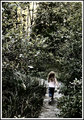
| 09/18/2006 11:14:57 AM | A Walk in the Woodsby bucketComment: Hello from the Critique Club,
During the challenge, I rated this image a 5. My first impressions were that the subject met the challenge but the post processing made the image look scary instead of pleasurable. Coming back to review this image, it dawned upon me that the scariness could have been muted by cropping out half of the negative space above the girl. This would have made the trees look a little less ominous and by eliminating the bright light coming through the trees, provided a softer feel to the image to reflect the intentional desaturation.
Feel free to PM me if you have any questions regarding this critique.
Tim
| | Photographer found comment helpful. |
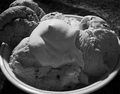
| 09/18/2006 10:48:39 AM | Cookies 'n Creamby SquishyBComment: Hello from the Critique Club,
Go figure, I just commented on your image earlier this AM and now it comes up at random as my Critique Club assignment. Since I've already posted my critique, feel free to PM me for a free critique on any image in the future.
Tim | | Photographer found comment helpful. |
| 09/18/2006 08:39:21 AM | L E A D I N Gby RoosterComment: Hello from the Critique Club.
Glad this image did better than you predicted, as it definitely deserves higher than a mid-5 score. I gave you a six on this image. On the positive side, the lighting, placement, and focus on the ladybugs are spot on. The only real negative, as I'm sure you are more than aware, are the blown highlights on the top leaves of the plant. Everything else is subjective, as I thought this image had a bit too much negative space for my tastes (I don't score down for personal preferences - don't you wish everyone was that open minded?). If this wasn't a Rule of Thirds challenge, I could easily see this image with a square crop. Nicely done and enjoyed revisiting your image.
Feel free to PM me if you have any questions regarding this critique.
Tim
| | Photographer found comment helpful. |
| 09/18/2006 06:52:04 AM | Cookies 'n Creamby SquishyBComment: Lila,
You received several comments during the challenge on what could be improved with this entry. I agree with those that think this subject would have been better presented in color. But, reading your forum post, I realize that you didn't like the colors and decided to do a B&W conversion. First, you had two of the best help you improve your image as a B&W so I won't rehash that information. However, there is an excellent tutorial by fotomann here that should help you do it yourself next time.
First, lets address why you didn't like the color version, red tablecloth, white ice cream, brown cookie. I'm going to assume the bowl was white as well. If you could have found a bowl with a complementary color (light blue, green, red) for the cookies, it would have acted as a natural frame for the main subjects. Then you could have used a black or white background to highlight the bowl. Another option would be to shoot this image more from the side. This would have given the ice cream some depth by providing height to the main subject. This would have allowed you to shoot the bowl in profile and bring more color into the image.
One other suggestion, whenever I shoot a still life, I throw away my flash unit. Generally, still lifes look better if the lighting comes somewhat from the side. I bought a couple of halogen work lamps and reflect them off walls or poster board to help soften their light. These can be purchased at any home improvement store for $10 to $15 a piece. Please note, if you plan to do this you will probably need a tripod as well.
Let me know if you have any questions regarding my comments.
Tim
| | Photographer found comment helpful. |
| 09/18/2006 06:31:22 AM | The Kissby SquishyBComment: Lila,
You received several comments during the challenge on what could be improved with this entry. However, few of them tell you how to improve the image. First, the silhouette in your image is not very strong. This is related to the figurines being to close to the light source, as evident by the light reflecting off the figurines themselves. You could have also strengthened what silhouette is there in post processing by boosting the contrast or by adjusting levels or curves. Moving the figurines further away from the light source would have helped the background as well, as being further away would have put the wall out of focus and thus, hidden the textures present. There are also some improvements that could be made with the composition. In general, figurines don't score that well but for this challenge, they work nicely could have scored in the 5+ range easily. However, you cropped the image a little tight. It is fine to crop into the bodies of the figurines like you have but it looks odd having the back of the heads cropped as they are. Plus, you have a lot of blank space (negative space in photography jargon) above the heads. This space doesn't really add to the picture and could have been removed. With the way you set up the figurines, this image would have worked well with a square crop, as that would have put the kiss at the horizontal rule of thirds.
Let me know if you have any questions regarding my comments.
Tim
| | Photographer found comment helpful. |
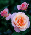
| 09/16/2006 05:26:59 PM | Pastelby TroutbearComment: Hello from the Critique Club:
The low number of 1, 2, and 3 votes you received speak strongly that you picked a subject well within the definition of the challenge. The colors are wonderful and the background provides a pleasing contrast to the roses. I think where this image is weakest is in composition. I can tell you put some thought into the composition of this image by the placement of the three roses at the rule of thirds nodes. Still something doesn�t look right. As I looked at your image for a few minutes it came to me. If you pretend that the roses are people, all three are facing out of the picture. No matter where the viewer looks, their eyes are directed away from the image instead of to its strong point, the opened rose. The best suggestion I have for this image is too crop out the two buds and focus entirely on the open rose. There is some wonderful colors and detail in this rose to work as a sole subject and hold the viewers attention.
Tim
| | Photographer found comment helpful. |
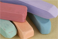
| 09/16/2006 04:51:38 PM | Pastel Pastelsby LN13Comment: Hello from the Critique Club:
I think the comments you received during the challenge sum up the strong points about your entry pretty well. The colors are wonderful and the lighting and focus are spot on. I think the score you received for this entry is pretty much what might be expected at DPC, as the image is technically strong but lacks a true focal point. Without a strong focal point, the voter�s eyes have nothing to lock upon and thus, wander around the image looking for weaknesses. It is possible you might have scored a little higher if you hadn�t cropped the end of the two of the pastels and maybe even a six plus. Overall, you have a pleasant image to look at and for a Pastel challenge, it is hard to wow anyone.
Tim
| | Photographer found comment helpful. |
| 09/14/2006 03:37:27 PM | | | Photographer found comment helpful. |
| 09/14/2006 03:37:18 PM | | | Photographer found comment helpful. |
|
Showing 411 - 420 of ~986 |
Home -
Challenges -
Community -
League -
Photos -
Cameras -
Lenses -
Learn -
Help -
Terms of Use -
Privacy -
Top ^
DPChallenge, and website content and design, Copyright © 2001-2025 Challenging Technologies, LLC.
All digital photo copyrights belong to the photographers and may not be used without permission.
Current Server Time: 06/20/2025 02:03:15 AM EDT.
|