| Photograph Information |
Photographer's Comments |
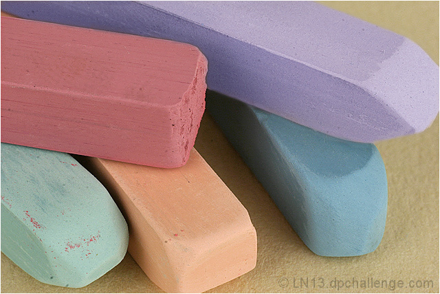
Challenge: Pastels (Advanced Editing IV)
Collection: Challenge Entries
Camera: Canon EOS-300D Rebel
Lens: Canon EF 50mm f/1.8 II
Location: My basement
Date: Sep 1, 2006
Aperture: f22
ISO: 200
Shutter: 1/3.3
Galleries: Still Life, Macro
Date Uploaded: Sep 2, 2006
|
PrismaColor NuPastels (I like having an artist for a daughter, she has some great props).
In my basement with 2000 watts of light from my work lights, aimed in to a little still life box I made from white core board. Shot from a tripod with my 50/1.8 and a 31mm extension tube.
Post - resize; select yellow pastel, hue -136, sat -54, lightness +6, clone/heal along edge of now lavender pastel to get rid of yellow edge; select red pastel, sat -25, lightness +5; slight upward curve to brighten; Master saturation -25; USM (400, .3, 0); cloned out some sensor dust, pastel dust and an imperfection in the paper; added a 2px white stroke.
I don't necessarily like that the tips are chopped off of two of the pastels, but my daughter tells me that it is an "open composition" and that's good, so we'll see. I tried it with a variety of different colored paper as the background, and they looked nice, but I liked this arrangement of the pastels better. It's the first time I ever did a selective color thing. I hope it does well. |
| Author | Thread |
|
|
09/16/2006 04:51:38 PM |
Hello from the Critique Club:
I think the comments you received during the challenge sum up the strong points about your entry pretty well. The colors are wonderful and the lighting and focus are spot on. I think the score you received for this entry is pretty much what might be expected at DPC, as the image is technically strong but lacks a true focal point. Without a strong focal point, the voter’s eyes have nothing to lock upon and thus, wander around the image looking for weaknesses. It is possible you might have scored a little higher if you hadn’t cropped the end of the two of the pastels and maybe even a six plus. Overall, you have a pleasant image to look at and for a Pastel challenge, it is hard to wow anyone.
Tim
|
|
 Photographer found comment helpful. Photographer found comment helpful. |
Comments Made During the Challenge  |
|
|
09/07/2006 07:02:15 PM |
|
Nice colours. the background is quite good too. Perhaps just remove the red dust from the lower left pale blue pastel. |
|
| Photographer found comment helpful. |
|
|
09/05/2006 09:24:05 PM |
|
Simple, tight composition, good lighting, and absolute adherence to the challenge theme. Lovely crisp sharp focus. Very good entry. |
|
| Photographer found comment helpful. |
|
|
09/04/2006 03:29:58 PM |
|
Lovely macro, nice detail and colours. |
|
| Photographer found comment helpful. |
|
|
09/04/2006 03:25:57 PM |
|
too bad the end of the purple one is cropped out |
|
| Photographer found comment helpful. |
|
|
09/04/2006 10:47:07 AM |
|
I think this could benefit from a white background |
|
| Photographer found comment helpful. |
|
|
09/04/2006 04:11:17 AM |
|
| Photographer found comment helpful. |
|
|
09/04/2006 02:50:18 AM |
|
I wanna get some of these >.< |
|
| Photographer found comment helpful. |
|
|
09/04/2006 01:39:52 AM |
|
great composition! you can really see the texture too. |
|
| Photographer found comment helpful. |
Home -
Challenges -
Community -
League -
Photos -
Cameras -
Lenses -
Learn -
Help -
Terms of Use -
Privacy -
Top ^
DPChallenge, and website content and design, Copyright © 2001-2026 Challenging Technologies, LLC.
All digital photo copyrights belong to the photographers and may not be used without permission.
Current Server Time: 06/30/2026 02:11:49 AM EDT.