Lila,
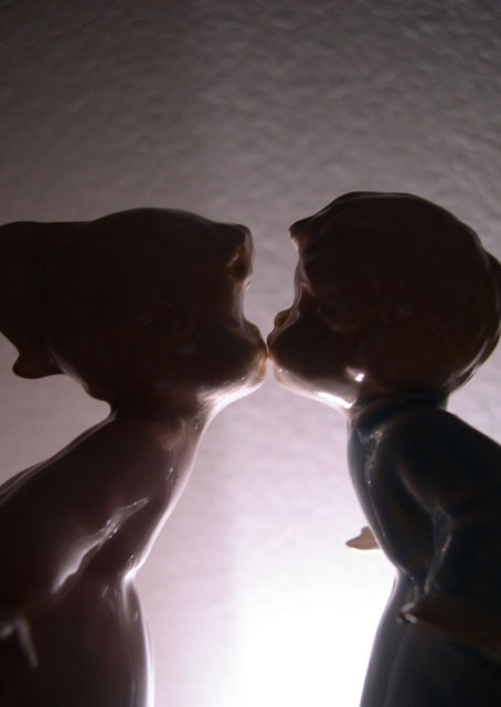
You received several comments during the challenge on what could be improved with this entry. However, few of them tell you how to improve the image. First, the silhouette in your image is not very strong. This is related to the figurines being to close to the light source, as evident by the light reflecting off the figurines themselves. You could have also strengthened what silhouette is there in post processing by boosting the contrast or by adjusting levels or curves. Moving the figurines further away from the light source would have helped the background as well, as being further away would have put the wall out of focus and thus, hidden the textures present. There are also some improvements that could be made with the composition. In general, figurines don't score that well but for this challenge, they work nicely could have scored in the 5+ range easily. However, you cropped the image a little tight. It is fine to crop into the bodies of the figurines like you have but it looks odd having the back of the heads cropped as they are. Plus, you have a lot of blank space (negative space in photography jargon) above the heads. This space doesn't really add to the picture and could have been removed. With the way you set up the figurines, this image would have worked well with a square crop, as that would have put the kiss at the horizontal rule of thirds.
Let me know if you have any questions regarding my comments.
Tim
|