|
|
|
Showing 381 - 390 of ~986 |
| Image |
Comment |
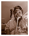
| 10/26/2006 06:40:59 AM | The A.M. Ritualby sherpetComment: Hello from the Critique Club,
For the lighting setup you choose, the post processing of this image is perfect. The shadows on the face and the lack of color gives this image a very mechanical feel and it fits well with the everyday, day in day out interaction you have with this machine. The high lighting of your face draws my focus directly to your left eye, which has the effect of personalizing your daily routine for me. There is nothing I can suggest for improving this image. That in itself tells me that your score is directly linked to how the voters related to this image. When you produce an image that conveys this much emotion and is so personal, you are bound to make some people a bit uncomfortable and they will vote accordingly. Not being a member, I did vote on this challenge but I would have given it a 10, as few pictures at DPC convey the human side of photography like this. Mine included. Excuse me as I add this to my favorites.
Feel free to PM me if you have any questions regarding this critique.
Tim
|  Photographer found comment helpful. Photographer found comment helpful. |
| 10/25/2006 06:44:13 AM | The Distinction Between Youth and Old Ageby SquishyBComment: Lila,
First, lets start out with how this image fits in relation to the challenge and the DPC game. Most voters for this challenge were expecting an image with high photographic contrast. Eight of the top ten images in this challenge were black and white or near black and white. Since your subject has a metaphorical contrast, you start off fighting an uphill battle.
Now lets look at how well you conveyed your metaphorical contrast to the voters. You have an older looking white flower that is centered in the image with pretty good focus and lots of detail. Contrasting that, you have a fresher looking yellow flower in the background that is partially cropped off and definitely not in focus. In fact, the focus on the yellow flower doesn't really provide the voter enough detail to determine if it truly is a "young" flower or a middle aged flower on its last legs, especially in the two or three seconds the typical voter will look at the image. The composition of this image doesn't help support your metaphor either, as the yellow flower looks more like background clutter than as a contrasting element to the white flower. For these two flowers to convey the age contrast suggested by your title, they need to have equal prominence in the photo, both in placement and focus. As is, without the title, I would never be able to tell that this image was contrasting an old flower to a new flower. There was a recent posting in the forums that suggested if a four year-old cannot easily tell the connection between your image and the challenge description, then you probably won't score well.
Let me finish with a few comments about what I really like about the image. First, the post processing of this image is really well done. The white flower has lots of detail and more important, texture. It would have been very easy to over sharpen this image to the point where that texture would have been lost in the detail. I also like the softness of the background. It really compliments the texture of the flower. If the yellow flower weren't there, this image would work very well with the white flower being centered and a square crop.
Watch your composition and make sure it supports the message you are trying to convey. And always, crop out those areas that don't support your message. The voters will forgive a few technical flaws if the composition and relationship to the challenge are strong.
Tim
| | Photographer found comment helpful. |
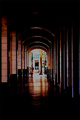
| 10/18/2006 10:55:57 AM | The Long Walkby EyesupComment: Hello from the Critique Club,
Welcome to DPC. I must admit that this image has the most detailed comments I've seen of the nearly 100 images I have critiqued. I don�t' have a lot to add, as my impressions of this image before reading the comments mirror those of the comments you received. The two items that hurt your score the most is that something doesn�t look right post processing wise and that for the majority of voters, this does not meet the challenge as a portrait. Without seeing the original image, it is hard to make suggestions as to improving the post processing. Keep trying, the composition of this image shows that you have a good eye and once you master the post processing part and learn what works at DPC, you will find your score will improve dramatically.
Feel free to PM me if you have any questions regarding this critique.
Tim
| | Photographer found comment helpful. |
| 10/13/2006 07:46:47 AM | Mosportby jduffettComment: Hello from the Critique Club,
Nice job with the panning in this image. The car has considerable detail and the background blur helps provide the motion feel needed for this kind of image. The technical aspects of this image are pretty well done. I would suggest spending a bit more time in post processing to see if the detail in the hood area could be better defined. I'm not sure if the lighting, too high of contrast, or over-saturation, is the cause for the loss of detail in this one area of the car. Even with better detail in the hood, this image still might not have scored in the 6's. The problem being that the image just doesn't have enough DPC "wow" for a 600+ free study challenge. Over 40% of your votes were 5's. That, to me, signifies people looking for literally 2-3 seconds and saying, "this picture isn't bad (so I can't give 4 or less), but it doesn't do too much for me (so I can't give 6 or more). 5".
I think you achieved your goal when shooting this image of getting better at panning. You did a nice job and achieved an image you can be proud to have in your portfolio.
Feel free to PM me if you have any questions regarding this critique.
Tim
| | Photographer found comment helpful. |
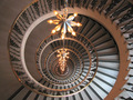
| 10/13/2006 07:30:48 AM | Round and Roundby levyj413Comment: Hello from the Critique Club,
This is an exceptional staircase image. There is enough variation in pattern, lighting, and texture to entice the viewer to look around and fully explore the depth this image offers. The composition of this image is strong enough to be in the top twenty of this challenge. So why didn't it score higher? I think it might be the overall coloration of the image. To my eyes the whole image has a copper cast to it from the chandelier. If you desaturate the red channel just a touch, the image appears to gain a significant amount of contrast and pop. Another option, desaturate the red channel and convert to B&W. This is has a lot of potential and I encourage you to play around a bit in post processing to see how many versions you can come up with.
Feel free to PM me if you have any questions regarding this critique.
Tim
| | Photographer found comment helpful. |
| 10/13/2006 07:09:27 AM | Kissby riotComment: Hello from the Critique Club,
Let me start off by saying you achieved one of the hardest things to accomplish when using non-professional models, the model looks relaxed and natural. There are two items that probably hurt your score the most on this entry, the background and the shadow on her face. One of the DPC rules when using a white background is that it should to be a clean looking white or shows an intentional gradient with a clean looking white focal point. Filler light on the background or a contrasting background would have helped here tremendously. As for the shadow, there are a couple of solutions to this problem. One would be have the lighting on the opposite side of the raised hand or to reverse the hands holding the wand and the bottle. The other would be to use a reflector to fill in the shadows. For this shot I think I would prefer that the model switch hands and blow bubbles in the other direction. I like the contrast achieved with the side lighting you set up and using a reflector would have diminished that effect.
Feel free to PM me if you have any questions regarding this critique.
Tim
| | Photographer found comment helpful. |
| 10/12/2006 08:01:33 AM | Cumulusby olbolComment: Hello from the Critique Club,
You did a wonderful job of post processing for the cloud, as it really has tremendous detail. However, the overall look of the image is flat with little depth to it. Part of that is related to the sky and ground having nearly the same contrast. Masking for the ground and giving it a slightly different contrast than the sky would have helped with this issue. Another contributor is the cropping of the image. As presented, the cloud looks like it is coming straight down instead of towards the horizon. You might want to crop the top of the image through the thickest part of the cloud. To me this would provide a stronger perception that the cloud is floating over your head and not hanging in front of your face.
Feel free to PM me if you have any questions regarding this critique.
Tim
| | Photographer found comment helpful. |
| 10/11/2006 07:54:00 AM | Lost in the Momentby TimComment: I gave this image a 10 during voting and I'm adding it to my favorites. I really love how the horn player is separated from the rest of the band just by the angle of his body. The way the light brings out the features on his face and the serene look of the closed eyes truly conveys that he is lost in the moment. Exceptional capture. | | Photographer found comment helpful. |
| 10/11/2006 06:51:22 AM | There's a Storm a Brewin'by Mr_BondComment: Hello from the Critique Club,
Not being a paying member I didn't vote on this challenge, so this is my first hard look at your image. My first impressions are that you've captured a very pleasant looking scene but it has that snapshot kind of look to it. Compositionally, the image is really strong. The placement of the log adds interest and the balance between the sky, land, and water is very nice. What is weak about this image is that it lacks any kind of depth, as the sky, water, and shore have the same saturation and brightness. In your notes you state that you did very little editing on this image. I'm not sure what photo-processing program you own but even using AutoBalance in Microsoft Photo Editor gives this image a tremendous boost. I can only imaging what could be achieved with Levels or Curves and using different adjustment layers for the sky and shore. I highly encourage you to revisit this image and play around some with post processing. This image has a lot of potential that hasn't been tapped and would serve well as a learning tool to sharpen your post processing skills.
Feel free to PM me if you have any questions regarding this critique.
Tim
| | Photographer found comment helpful. |
| 10/11/2006 06:36:11 AM | Water Colorsby Dr.ConfuserComment: Hello from the Critique Club,
Not being a paying member I didn't vote on this challenge, so this is my first hard look at your image. My first impressions are that you've captured a very pleasant looking scene but the trees look a bit over saturated or bright for the cloud cover in the image (It makes the picture look unbalanced). Compositionally, the image is really strong. The curve of the shoreline provides a wonderful leading line and the balance between the clouds, land, and water is very nice. What is weak about this image is the subject matter. Although pleasant to look at, this shot has nothing that really holds the viewer's attention. The clouds add interest to the background but don't work as a main subject. The trees haven't changed color enough to be the main subject. The shoreline shows no activity and has very little color (mostly white boats and covers). And the reflection in the water isn't strong enough to be the main subject either. So, is this a bad image? No. It is very nice and one that I would be proud to have in my portfolio. However, it doesn't have enough of that DPC look to score in the 6's, especially in a free study challenge with over 600 entries.
Feel free to PM me if you have any questions regarding this critique.
Tim
| | Photographer found comment helpful. |
|
Showing 381 - 390 of ~986 |
Home -
Challenges -
Community -
League -
Photos -
Cameras -
Lenses -
Learn -
Help -
Terms of Use -
Privacy -
Top ^
DPChallenge, and website content and design, Copyright © 2001-2025 Challenging Technologies, LLC.
All digital photo copyrights belong to the photographers and may not be used without permission.
Current Server Time: 06/19/2025 08:32:36 PM EDT.
|