| Image |
Comment |
| 12/21/2008 06:38:56 PM |
|
 Photographer found comment helpful. Photographer found comment helpful. |
| 09/18/2008 03:09:22 PM |
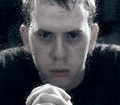
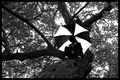
Decadent Safetyby halopesComment: Back to comment and bump: Safety is a tough subject for a challenge and after a second look; I can appreciate your take on the subject. Hopefully, the DNMC Police don't hit you too hard, as the connection doesn't hit you over the head. I think the b&w conversion is very well done. Overall, the subject is not very exciting and will make it easy for the voters to vote 5 or lower and move on. |
| Photographer found comment helpful. |
| 09/18/2008 03:07:27 PM |
Perfectly Safeby KeertiComment: Back to comment: I have to believe that the majority of voters will have trouble relating your image to safety. I find your post processing to be a bit overdone for my personal tastes. I think the blown out background has a lot to do with the overdone post processing feel. |
| Photographer found comment helpful. |
| 09/18/2008 02:16:31 PM |
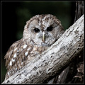
Safely Camouflagedby JedusiComment: Back to comment and bump: Safety is a tough subject for a challenge and after a second look; I can appreciate your take on the subject. Hopefully, the DNMC Police don't hit you too hard, as the connection doesn't hit you over the head. I love the post processing on this image. It has a desaturateded look to it from the natural colors that works well. Personal preference would be to have the tree in sharp focus also. I grossly underscored this image when I was voting and I am bumping you to a 6. |
| Photographer found comment helpful. |
| 09/18/2008 02:11:17 PM |
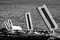
Hiding From Youby TomCubisComment: Back to comment: I have to believe that the majority of voters will have trouble relating your image to safety. I do find the overall image to be interesting. The perspective and leading lines bring you right to the umbrella. However, your b&w conversion could be better, as I would like to see more tonal range/contrast in the tree trunk. There is a great tutorial on b&w conversion in the DPC tutorial page. |
| Photographer found comment helpful. |
| 09/18/2008 02:04:30 PM |
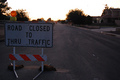
Under Constructionby _Mindy_Comment: Back to comment: You choose a tough time of day to shot this image. The bright sky and dark subject don't really work well together. Using fill flash for the sign might have helped. I also think that it is hard to relate the sign to safety because the road construction it is protecting you from is not really visible in the background. |
| Photographer found comment helpful. |
| 09/18/2008 11:00:46 AM |
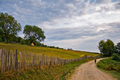
On a safe way homeby GiorgioComment: Back to comment: A lovely image with exceptional post processing. However, the image doesn't fit the challenge topic very strongly. |
| Photographer found comment helpful. |
| 09/18/2008 10:59:43 AM |
Safe in my Sweet Baby's Armsby wildirisComment: Back to comment and bump: You've found a humorous title to fit an image into a safety challenge that really doesn't relate strongly to safety. For that, I am going to give you a bump. According to the histogram on this image, the tonal range appears to be concentrated to the dark half of the histogram. A small bump of the midtones using a curve layer will both brighten and improve the colors of you image. Feel free to send me a PM if you need a better explanation regarding curves and the histogram. |
| Photographer found comment helpful. |
| 09/18/2008 10:49:52 AM |
Saftey Blanketby jdenniqueComment: Back to comment: To me, a blanket provides comfort or security, not a real strong subject for a safety challenge. On the image itself, it looks like this image was not sharpened after down sizing it for the challenge. Down sizing causes the sharpness of an image to diminish (decrease). Most people use Un-Sharp Mask (USM) after down sizing. If you have Photoshop try USM with a Radius of 1 - Amount 100% - Threshold of 3 or smaller to help the eyes of the child look nice and sharp. I also think that the composition could be strengthened a bit if some of the negative space on the left was cropped out. I would have given you a bonus point if the boy was holding a Redwing blanket instead of an Islanders blanket but it is nice to see that it is a hockey blanket.
If you have questions regarding resizing and USM, feel free to send me a PM.
Tim |
| Photographer found comment helpful. |
| 09/18/2008 10:24:54 AM |
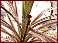
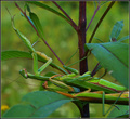
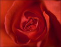
Self Protectedby rio78Comment: Back to comment: This image doesn't really fit the challenge topic very strongly. As for the image itself, the composition is a bit bland with the flower being dead center. This composition might have worked better if the lighting was more dramatic or if you could have pulled more contrast between the petals during post processing. The water drops are a nice touch, as they strengthen the composition as a focal point. |
| Photographer found comment helpful. |
Home -
Challenges -
Community -
League -
Photos -
Cameras -
Lenses -
Learn -
Help -
Terms of Use -
Privacy -
Top ^
DPChallenge, and website content and design, Copyright © 2001-2025 Challenging Technologies, LLC.
All digital photo copyrights belong to the photographers and may not be used without permission.
Current Server Time: 06/16/2025 11:12:22 AM EDT.