| Image |
Comment |
| 02/24/2003 08:56:20 PM |
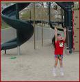
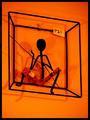
Vertically Challengedby myqylComment: I remember being a child with a similar problem and thinking it was the end of the world - an interesting take on the despair theme. The composition is good, lighting is good, and it's expressive. |
 Photographer found comment helpful. Photographer found comment helpful. |
| 02/24/2003 08:38:48 PM |
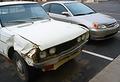
Ride Me Not Himby kris_photosComment: The crop is tight but good. The comparison with old and new is a nice addition. I can also understand the despair that the image is showing. |
| Photographer found comment helpful. |
| 02/24/2003 08:28:35 PM |
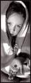
Please Missby redfigComment: The colors, or lack thereof, are a good choice for the subject. I do not really like the narrow crop, but that is more of a personal preference. I believe the challenge was met. |
| Photographer found comment helpful. |
| 02/19/2003 11:19:35 AM |
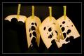
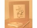
It wasn't me!by kiwinessComment: Lighting/crop/composition are all great, plus I see it is an original idea. I like it. |
| Photographer found comment helpful. |
| 02/19/2003 11:17:26 AM |
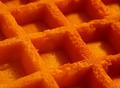
NSAIDby ChiquiComment: I dont care much for the crop, especially the tightness near the top and right side, but the lighting is good, and the yellow is quite vibrant. |
| Photographer found comment helpful. |
| 01/29/2003 05:43:40 PM |
|
| Photographer found comment helpful. |
| 01/29/2003 05:32:20 PM |
|
| Photographer found comment helpful. |
| 01/29/2003 05:21:34 PM |
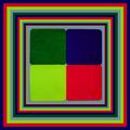
Living in a squareby GinaRothfelsComment: I like how the shadows echo the image well, but the P21 sticker is too distracting and takes away from the otherwise interesting concept. |
| Photographer found comment helpful. |
| 01/29/2003 05:17:43 PM |
Subtle Squareby BJComment: I like the image and the warm tones, although I find the focus a little too soft. I'm not sure if the white bands on either side are to make the image fit the size requirements or you added a type of border, but I find it a little too distracting. |
| Photographer found comment helpful. |
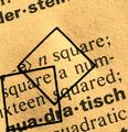
| 01/29/2003 12:37:20 AM |
-e> n square;by kiwinessComment: I would probably have cropped the top more and not been as tight on the bottom of the second square. I like how the texture of the paper shows vibrant, and the concept is interesting. |
| Photographer found comment helpful. |
Home -
Challenges -
Community -
League -
Photos -
Cameras -
Lenses -
Learn -
Help -
Terms of Use -
Privacy -
Top ^
DPChallenge, and website content and design, Copyright © 2001-2025 Challenging Technologies, LLC.
All digital photo copyrights belong to the photographers and may not be used without permission.
Current Server Time: 07/31/2025 06:19:46 PM EDT.