| Image |
Comment |
| 08/11/2003 07:50:23 PM |
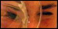
A Distorted Viewby RiderGalComment: The main problem with this is the major distortion/grain. As the title suggests a distorted view I'm not sure if that was your intention or just the left eye being distorted. It seems to look like a television when you're 2mm away from the screen. |
 Photographer found comment helpful. Photographer found comment helpful. |
| 08/11/2003 07:47:44 PM |
The Refridgerator Police are Watching!!!by GraciousComment: The lighting seems fine, and mostly everything is in focus. I like the edge of the bottle on the left. Artistically it doesnt do much for me. It meets the challenge, but it's not something I would consider hanging on my wall. |
| Photographer found comment helpful. |
| 08/06/2003 12:19:02 AM |
Shadows of Derelictionby sulamkComment: The idea is great and I like the composition, but the bricks on the left could do with a little more sharpness, the black spot is a little distracting, and there is quite a bit of noise in the image. Although not technically perfect, the composition and interest is good. |
| Photographer found comment helpful. |
| 07/14/2003 01:04:22 PM |
Reflecting on Anna by dan_pendletonComment: This is an interesting image, with the image split between color and a black and white reflection it could also have quite a few possible interpretations if someone where to look deeply enough. The tone and symmetry are good, I like the play of light and shadow along the arms. If there is one thing that I would change it would possibly be having the hands touch. Either way it is a great image. |
| Photographer found comment helpful. |
| 07/14/2003 12:13:36 PM |
Shy by mariomelComment: This is a great idea and a wonderful image. I like the tones and the symmetry, and the feet coming out of the border was a really nice touch too. It is almost like the person is coming out of the photograph. I'm not sure there is anything I would change or see negatively. I could see this hanging on a wall. |
| Photographer found comment helpful. |
| 07/14/2003 12:10:03 PM |
The Upstairs Maidby jodiecostonComment: Although my personal interpretation of nude would be nude, ie no clothing, I actually like this image. The hint of nude has more of a teasing affect than an outright nude possibly could, and coupled with the french maid outfit it's very fantasy based. As a photograph I could imagine this would have appeal to a large number of people, and even could see it on a wall someplace. |
| Photographer found comment helpful. |
| 07/14/2003 12:02:53 PM |
soft sun by DrJOnesComment: I really like this - it's simple and attractive. It's also interesting to see how much of an affect a prop can have on on the interpretation of an image. The hat really adds a sense of quiet calm. It's a nude but the pose looks completely natural, it's very tasteful and elegant. Maybe it is the tone coupled with the white background, not sure, but there is certainly something very appealing with it. |
| Photographer found comment helpful. |
| 07/11/2003 11:38:12 AM |
Tatooedby kosmikkreeperComment: This is a great shot! It's dark with a nice duotone (my fav kind!), it's uncluttered, simple, and yet complicated at the same time. It's very surreal and very interesting, and you can easily take a while just appreciating the complexity of it. The illusion is great, and having the pattern cross over onto the hands and feet gives it a wonderful flow. It has a very eastern feel to it. Not only is it visually appealing, but I can see and appreciate the time it must have took to get the right shot. If I have anything negative about the image, which isnt really a negative, it would be the 'glare' or 'harshness' of the light on the left side. It's not too bad but it does give the image a little unevenness or imbalance which I think which breaks the otherwise harmony of the picture.
|
| Photographer found comment helpful. |
| 06/18/2003 01:10:35 PM |
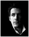
Me, Myself & Iby jonpinkComment: A very stylish image. The shadows work well and the choice of black and white is good. The upturned white collar gives it a great GQ feel. I also like the slightly off-center composition with the eyes not looking directly at the camera, adds to the broody feel of the portrait. |
| Photographer found comment helpful. |
| 06/18/2003 12:57:43 PM |
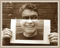
Me & myselfby pikytoComment: This is certainly funny and original! The lining up with the glasses is spot on, it really does a great job in looking 'real' - the only really petty thing is that the background vines dont show in the 'photograph' section, which may have been intentional, I'm not sure, but I think that would have just made it more of a 'wow' it's still a neat shot as is. I also like the toning. I think the 'goofy' look also helps with the jovial mood of the entire image. |
| Photographer found comment helpful. |
Home -
Challenges -
Community -
League -
Photos -
Cameras -
Lenses -
Learn -
Help -
Terms of Use -
Privacy -
Top ^
DPChallenge, and website content and design, Copyright © 2001-2025 Challenging Technologies, LLC.
All digital photo copyrights belong to the photographers and may not be used without permission.
Current Server Time: 08/02/2025 01:27:07 AM EDT.