| Image |
Comment |
| 11/17/2003 12:20:00 AM |
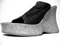
Walk a mile in my shoes...by WILDBLUEComment: I think using black and white has helped bring out the textures of the shoe. It's an unusual-looking shoe so I think that helps with bringing interest into the shot. The dark edges on either side are a little unfortunate. |
 Photographer found comment helpful. Photographer found comment helpful. |
| 11/17/2003 12:16:55 AM |
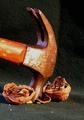
Busting a Nutby scrum8Comment: The idea is good but there are a few technical things that I think could be improved on. The background - it has texture, but I think in this case you dont want to distract from the texture of the nuts and the hammer. There are also creases in it that dont add anything to the image. The hammer/nuts are also a little too close to the back of the fabric and so there is a little too much focus on it. The hammer - it's aged, which adds character, that's good, howeve, either there are too many scratches or the light is pointed too directly at the head. The bright white is too distracting and loses the uniform color tone otherwise present. The angle and crop of the hammer could probably have been improved too. Suggestions - either shoot it in mid-swing, or put more of the handle in the frame and perhaps having it coming in at a diagonal from the upper right. The nuts are good, but the splintered shell parts just clutter up the fabric and look like flecks/spots. |
| Photographer found comment helpful. |
| 11/12/2003 02:54:58 PM |
The Heavenlies by GraciousComment: My first thought was wow, that's an amazing sky, such wonderful color, nice depth, and so pretty. But that's about it really. |
| Photographer found comment helpful. |
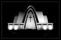
| 11/12/2003 02:50:17 PM |
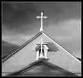
San Filipe de Neriby Firstrich1Comment: There is a wonderful feeling of texture in this shot, and I think the black and white and contrasting grays really add to that. The composition is great with very strong lines. The dramatic sky compliments the tone of the building. This is a very classic image. |
| Photographer found comment helpful. |
| 11/12/2003 02:47:07 PM |
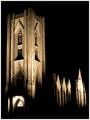
God is in the Houseby NazgulComment: I love the tones in this and the shadows really add some nice drama. It's clean, sharp, almost abstract in a way. |
| Photographer found comment helpful. |
| 11/12/2003 02:44:48 PM |
Touched by an Angelby arnitComment: I really like this. I think placing it in the center of the shadows/darkness works for this image. Black and white also compliments it well and emphasizes the simplicity of it. A nice clean, sharp image with a good matching border. |
| Photographer found comment helpful. |
| 11/12/2003 09:46:53 AM |
Rock Candyby minniedentComment: The first thing I notice that I do not really care for are the red streaks. The composition is a little haphazard with the black areas. As the whole thing has a blue theme going I think it would have been beneficial to keep a consistent (or slightly gradient) blue background. I get the feeling of low light focus problems, probably not helped much by the reflective surface of what I assume is a CD. Along with the red streaks, the light flares on the right are a little distracting. I do like the way the glass beads handle the light, although the front left bead/chip is a little dark and could probably have done with being moved a little so the light could shine through it like the others. I gave this a 5 while voting. Clearly thought and time was put into the image, but I felt like there were some technical aspects that needed improving. |
| Photographer found comment helpful. |
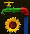
| 11/10/2003 12:34:17 PM |
Sunflowerby thelselComment: What great colors! I'm curious if this was painted specially for the challenge or you normally have a painted water tap. Either way, I think it really stands out, especially against the black background. Lighting is good, although there is a slight yellow reflection on the green. I also like the addition of the water droplet. The sunflower continues the theme of bright summer colors. The petals seem a touch on the soft side, but in a way that compliments the flower more and makes it stand out more against the tap. Very colorful and great image! |
| Photographer found comment helpful. |
| 11/10/2003 12:29:58 PM |
Just Add Breathby KoriyamaComment: Not sure how this was done but I like it. The wood tones on the recorder (I'm not a musical instrument expert) are nice and warm and very appealing to me. The diagonal composition is great. The overlayed musical notes adds a nice dimension and completes the 'package' the image presents. The matching border is good, although I'm almost tempted to say a little too bright - a duller yellow picked from the darker yellow area of the recorder may have been better. |
| Photographer found comment helpful. |
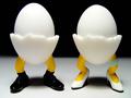
| 11/10/2003 12:26:39 PM |
Eggs Lifeby A WeaverComment: This is cute! First thing I noticed was the background - I liked the mix of black/white and how the line is not harsh but blurred/faded nicely. The shadows beneath the statue/eggs are also cute, much better there than falling off to the side, front, or back. The lighting is excellent, not overexposing the whites at all (that I can see) and yet still being bright enough to be very clear and sharp. The light highlights on his shoes are also good! Of course the fact that the subject you have chosen is also humorous, clever, and original (to me) helps, but your photographic treatment of them is great. |
| Photographer found comment helpful. |
Home -
Challenges -
Community -
League -
Photos -
Cameras -
Lenses -
Learn -
Help -
Terms of Use -
Privacy -
Top ^
DPChallenge, and website content and design, Copyright © 2001-2025 Challenging Technologies, LLC.
All digital photo copyrights belong to the photographers and may not be used without permission.
Current Server Time: 08/05/2025 02:22:21 AM EDT.