| Image |
Comment |
| 11/30/2003 07:36:01 PM |
Freesiaby banmornComment: The lighting is a little dark in places but otherwise good. The color of the flower is wonderfully vibrant and stands out against the black background fairly well. Seems a little soft but not in a bad way. The diagonal position is good, but it seems a little too close to the bottom edge. |
 Photographer found comment helpful. Photographer found comment helpful. |
| 11/29/2003 10:34:03 AM |
My son Leifurby tyrkinnComment: Skin tones are good and it looks in focus, slightly soft focus but in a good way. It's a good close up shot. |
| Photographer found comment helpful. |
| 11/29/2003 10:26:17 AM |
I Be Grateful That Freedom Of Religion Are In My Countryby MonaComment: Composition is good, i like how you've framed the shot with the trees on either side. The quality doesnt look the best, and I'm wondering if this is because it seems a little soft, possibly handheld? If you look at the wall it looks a little tilted, but the perspective of the building is fairly good. |
| Photographer found comment helpful. |
| 11/29/2003 10:22:34 AM |
My Pride and My Joyby TooCoolComment: The non-traditional angle is interesting and does add something to it. It seems a little darkly lit so I'm wondering if this was using a high ISO hence some of the noise on the skin tones. With black and white images there really needs to be a little more contrast or else have much more dramatic lighting. |
| Photographer found comment helpful. |
| 11/26/2003 01:45:52 PM |
Oh la la! Scent-sational Satsuma Perfume Oil!by ScantyNebulaComment: What appears to be a soft focus works well to give a dreamy effect. The unusual angle helps give it some interest, and follows a commonly used advertising style. The color is good and there are no obvious light reflections in the glass. Very nicely shot. |
| Photographer found comment helpful. |
| 11/26/2003 11:36:19 AM |
Shortbreadby JonathanWatersComment: I like how you've gotten close up to the cookies and yet still kept some depth to the image. Personally, I like the use of DOF used here, and I also like the tone. Very professional-looking image. |
| Photographer found comment helpful. |
| 11/26/2003 01:02:52 AM |
Pumpkin Spiceby FullyFocusedComment: There seems to be a slight tilt to the jar or else it's a perspective thing. I think this would have been much better in portrait mode where there would be more room to fill with the wonderful warm color and the smell/smoke. As it is now, it's a little too centered with too much negative space on either side that doesnt add to the image. |
| Photographer found comment helpful. |
| 11/26/2003 12:52:30 AM |
The season's scentsby Bela45Comment: Is that plexiglass? It's a cute idea and the composition is good. The white marks/reflections are a little distracting but not overly so. I'm not sure if it needs a tad more sharpness or contrast. The bright light from the top right makes the background a little uneven and forces some shadows that are a little noisy. An additional light in the bottom right may have helped a little. |
| Photographer found comment helpful. |
| 11/26/2003 12:47:09 AM |
Scent of a Womanby SinisterComment: The idea is good, compositionally it's good too. The downfall of this photo is the lighting. It seems a little dark and there is some noise on the white. I'm guessing this was partly to do with keeping down the amount of light reflections in the bottles. Most perfume shots are flooded with light and the backgrounds are very white. The dark corners/edges are where it is most noticeable. The only way I see to improve that is to use more lighting from more than one angle or perhaps trying to utilise natural light. This has the potential for being a good shot. |
| Photographer found comment helpful. |
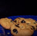
| 11/26/2003 12:42:05 AM |
Chocolate Chip Cookies. . . . fresh out of the oven.by ladpupmoeComment: I could maybe see that you left the negative space above the cookies to allow for the presence of the smell to waft upwards, however, photogenically it doesnt really do much. There is a little too much space at the top and very little at the bottom. It's good that you got in close to the subject but you needed to go all the way or else back up some. The lighting is good and the image is sharp, just needed some work on the composition, I think. |
| Photographer found comment helpful. |
Home -
Challenges -
Community -
League -
Photos -
Cameras -
Lenses -
Learn -
Help -
Terms of Use -
Privacy -
Top ^
DPChallenge, and website content and design, Copyright © 2001-2025 Challenging Technologies, LLC.
All digital photo copyrights belong to the photographers and may not be used without permission.
Current Server Time: 08/05/2025 04:07:25 AM EDT.