| Author | Thread |
Comments Made During the Challenge  |
|
|
12/01/2003 03:29:19 PM |
|
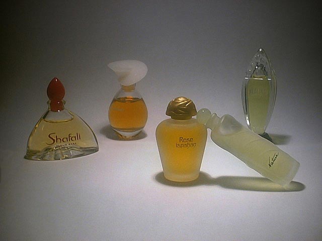
Sorry, but this is a bit dull; and just looking at bottles doesn't evoke the scents for me very well. |
|
 Photographer found comment helpful. Photographer found comment helpful. |
|
|
11/30/2003 02:38:23 PM |
|
Nice soft lighting, wish it didn't get so dark in the top corners. I don't get any feeling for why the bottles are arranged this way - random? I wish there were more meaning to the photo - a woman's arm with drops of perfume on the wrist? Flowers to represent the scents? |
|
| Photographer found comment helpful. |
|
|
11/30/2003 02:57:23 AM |
|
I feel the objects are too far apart. A tighter crop would have worked better, the lighting is too flat and doesn't flatter the objects. |
|
| Photographer found comment helpful. |
|
|
11/28/2003 11:50:28 PM |
|
nice lay out, try lighting the bottle from the side, or something to feature them more. |
|
| Photographer found comment helpful. |
|
|
11/28/2003 12:41:20 AM |
|
It is difficult to not have a reason for perfect control when doing still life - not that I am saying it is easy. Far from it as this image shows. I think the lighting could be improved and I cannot say that the composition/positioning works for me. |
|
| Photographer found comment helpful. |
|
|
11/26/2003 05:41:55 PM |
|
nice light efect but still a little dark |
|
| Photographer found comment helpful. |
|
|
11/26/2003 05:14:43 PM |
|
| Photographer found comment helpful. |
|
|
11/26/2003 01:01:07 PM |
|
Good on the subject of the challenge. There are too many things to concentrate on though. Try reducing the number of bottles and fill the frame with only 1 or 2 to make it really stand out. Maybe take the top off of 1. |
|
| Photographer found comment helpful. |
|
|
11/26/2003 11:28:06 AM |
|
Is Natuse a fallen woman?! Sorry. Just my sense of humor. Very nice shot. My only comment is that it appeared somewhat granny on my screen. . . ISO 400 or over sharpened. Ok, two comment: I might have taken off one of the caps to convey the idea of aroma also. |
|
| Photographer found comment helpful. |
|
|
11/26/2003 02:22:04 AM |
|
you could enhance the lighting, seems to greyish to me ... |
|
| Photographer found comment helpful. |
|
|
11/26/2003 12:47:09 AM |
|
The idea is good, compositionally it's good too. The downfall of this photo is the lighting. It seems a little dark and there is some noise on the white. I'm guessing this was partly to do with keeping down the amount of light reflections in the bottles. Most perfume shots are flooded with light and the backgrounds are very white. The dark corners/edges are where it is most noticeable. The only way I see to improve that is to use more lighting from more than one angle or perhaps trying to utilise natural light. This has the potential for being a good shot. |
|
| Photographer found comment helpful. |
Home -
Challenges -
Community -
League -
Photos -
Cameras -
Lenses -
Learn -
Help -
Terms of Use -
Privacy -
Top ^
DPChallenge, and website content and design, Copyright © 2001-2026 Challenging Technologies, LLC.
All digital photo copyrights belong to the photographers and may not be used without permission.
Current Server Time: 06/28/2026 04:40:23 PM EDT.