| Image |
Comment |
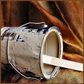
| 02/09/2004 11:06:14 AM |
Remodeling Relicby WildflowerJoyComment: I guess the background could be a pair of old drapes/curtains or something, but it looks too 'glamorous' a setting for an old stained paint can. The lighting is good, the can is nicely sharp and clear, and I like the texture of the backdrop. |
 Photographer found comment helpful. Photographer found comment helpful. |
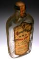
| 02/09/2004 11:03:29 AM |
Buried Treasureby mariomelComment: I think I would have preferred to see this with a different background, something with a contrasting color and interesting texture. I really like the bottle - it's full of character and the lighting is good. The 'new' background just steals the thunder of the old bottle. It's a good shot, though, could see it being used in advertising. |
| Photographer found comment helpful. |
| 02/09/2004 11:01:07 AM |
|
| Photographer found comment helpful. |
| 02/09/2004 10:16:35 AM |
Inside a Filterby iloveguamComment: Interesting abstract idea. The image looks a little blurry, especially the farther out of the image you look, I dont know if the filter was in use when you took the shot and that is the result of vibration/motion. The greyscale is also a little flat. Playing around with the brightness/contrast can add a little more depth to the tonal range of the black and white. |
| Photographer found comment helpful. |
| 02/09/2004 10:09:10 AM |
Wrapped Upby Brooklyn513Comment: The tone is good, it's just dark enough to show the details and textures of the rope. I'm wondering if this was shot a little too close to the background material as the background seems to have some texture too, or it could be the wisps from the rope. Almost looks like a noose! |
| Photographer found comment helpful. |
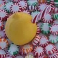
| 02/03/2004 11:25:28 AM |
Lemonadeby GolferDDSComment: I'm assuming the connection here is lemon and sugar. This certainly has creativity and it's different so I like it for that. The composition is good and I like the diagonal of the 'straw' into the lemon. I dont know if you tried a border then cropped it out or what, but there is a small thin black line at the very top of the image that seems to stand out and look a little odd. The image also looks underexposed and could have used a levels adjustment to increase the brightness. |
| Photographer found comment helpful. |
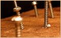
| 02/03/2004 11:19:27 AM |
Together Foreverby brett2004Comment: Yay Nikon! The composition looks well thought out and all the individual pieces compliments each other well. The yellow cast seems to add to the ageness of the shot and also goes with the tones of red and brown in the background. The only negative is the hot spots on the film cannisters. Overal it's a good capture. |
| Photographer found comment helpful. |
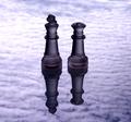
| 02/03/2004 11:15:15 AM |
King with his Queenby mrblobbyComment: I love the color and seeming glow to the chess pieces. Unfortunately I dont really care for the background. Having it shot in landscape mode gives it a lot of negative space on either side, and I'm not sure if that was your plan as it does look like clouds that certainly give a sense of expanse. As the chess pieces are vertical, especially enlongated with the shadow, I think a portrait orientation may have been better. I really do like the color/tone/lighting on the chess pieces, though! |
| Photographer found comment helpful. |
| 01/29/2004 11:55:30 PM |
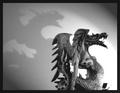
The Tenacious Dragonby brett2004Comment: I like the texture of the dragon, I looks wooden. The shadow is also interesting and adds an intimidation that normally are associated with dragons. The carving/figurine is nicely detailed and sharp. Only negative is the harsh/overexposed light coming from the lower right corner. I'm assuming you had to have the light that close to get the desired shadow, but the blown out area is very noticable and probably the best way to have avoided that would have been to move the light a little farther back and play with the EV levels. |
| Photographer found comment helpful. |
| 01/29/2004 11:51:29 PM |
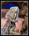
Bearded Dragonby PDavisComment: Good color, lighting, and good composition with the lizard/dragon coming diagonally from the corner. Not a real fan of the rocks, though, the dof looks kinda weird on them. The lizard/dragon has a great texture and is nicely sharp. |
| Photographer found comment helpful. |
Home -
Challenges -
Community -
League -
Photos -
Cameras -
Lenses -
Learn -
Help -
Terms of Use -
Privacy -
Top ^
DPChallenge, and website content and design, Copyright © 2001-2025 Challenging Technologies, LLC.
All digital photo copyrights belong to the photographers and may not be used without permission.
Current Server Time: 08/06/2025 10:12:47 PM EDT.